On May 17, 2006, I was in the process of defining Arabic mark positions for Nassim in a roundabout process involving a dummy FontLab MultipleMaster file, custom export scripts and Microsoft’s beloved Visual OpenType Layout Tool – VOLT. I was a Master’s student at the Department of Typography and Graphic Communication at the University of Reading and in the final third of the practical programme, adding finishing (or so I thought) touches to the regular design and completing the family’s scope. Ten years on, Nassim has established itself as a key exponent of a new generation of Arabic typeface design, a feat I would not have dreamed of back in my Reading days. Today, I am excited to announce the release of an updated and improved version of the typeface, Nassim 2.0. The new version of Nassim is a major update, reflecting its use, technical changes and my learning.
After graduation, I didn’t immediately try to have Nassim published but it won a number of prestigious awards. As I studied Arabic in Syria in 2007 I pursued other projects and commissions and left the type to rest. Not only did it provide me with some distance, refreshing my critical eye, but also allowed my appreciation of Arabic type forms to mature further. In 2008 an opportunity arose to reconsider the design and concept of Nassim as DecoType and WinSoft sought new designs for their jointly developed Tasmeem software. Here, I had the interesting and sometimes challenging task to revise parts of the Arabic design to take advantage of DecoType’s Arabic Calligraphic Engine (ACE), an approach to Arabic type with fundamentally different concepts to those found in the OpenType world. For example, ligatures are unnecessary in ACE fonts as the changing letterforms of different contexts are built dynamically from component parts – a more elegant and efficient approach to the typographic rendering of the Arabic script. Nassim was thus released with Tasmeem in the Middle Eastern version of Adobe InDesign extending the original design with numerous features and language support.
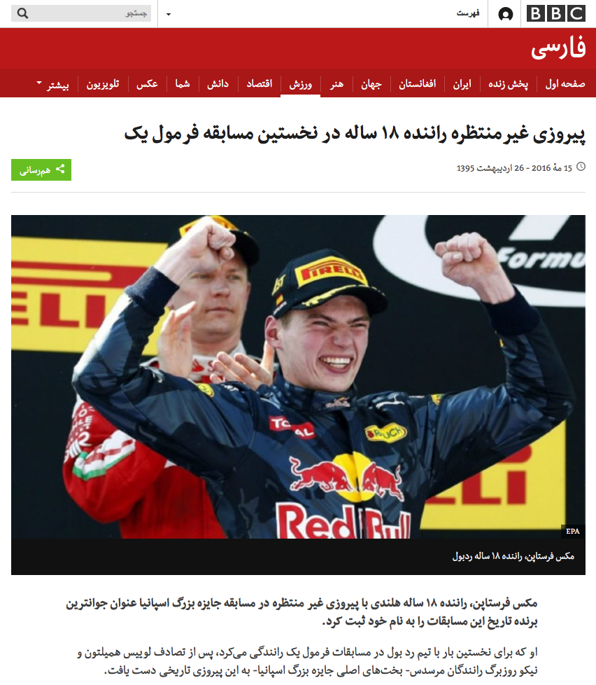
By 2010, technological changes and an entirely new area of typography opened up with the advent of web fonts. Coincidentally, Nassim became a protagonist in its early days, as it was selected by the BBC Worldservice for its Arabic-script news websites. In the process of adapting it to the client’s specific requirements – technical for screen rendering and stylistic for culturally distinct audiences – Nassim evolved further. Drawing from the approach I had learnt in the collaboration with DecoType, I rendered ligatures as contextual alternates to reduce the number of glyphs needed, and thus the size of the fonts. In addition, the work with the teams of the BBC’s language services – Arabic, Persian, Pashto and Urdu – provided insights into the various cultural typographic preferences, contributing to the continued improvements of the design. That this tailoring to specific audiences worked well is evident from the rampant pirating of the Persian BBC Nassim version for websites in Iran. The following year, the retail version of Nassim was released as an OpenType font with the Rosetta Type Foundry. It was based on the fonts I had developed for the four BBC language services, incorporating their core, localised glyph sets.

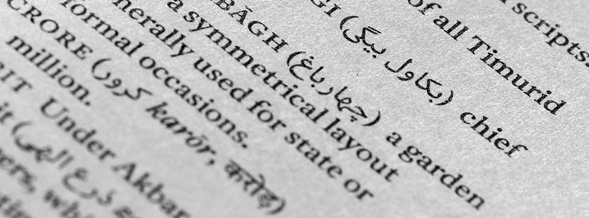
In the meantime I had begun my PhD research in Reading and embarked on other projects, leaving little time for further extensions of my retail type. But ideas for Nassim’s continuous development were aplenty, and just waiting for the right opportunity – which did not take long to present itself. In 2012 I became involved in the design of the Murty Classical Library published by Harvard University Press and designed by Rathna Ramanathan. My contribution consisted in consultation and design of the Arabic script typography of the series (in Persian, Sindhi and Urdu languages) and the typesetting of the first volumes. In the early discussions the type choice featured prominently, and Rathna and Fiona Ross – consultant and designer of the Indian typefaces – suggested to include Nassim in our tests. Initially I was hesitant – I did not see the design as a particularly literary type – but agreed to see how it suited the overall concept and how it sat with the types for the Indian and Latin scripts. Here, against my preconceived idea, Nassim actually worked well in the approach to the design of the series typography. Rathna wanted the books to be accessible and not to have an academic air, so she favoured contemporary, low contrast typefaces. Moreover, part of the series was going to be printed in India in unpredictable conditions, so a certain robustness was required. Eventually, we all agreed that Nassim worked best when paired with the choice for the English texts – Henrik Kubel’s Antwerp – and the choice was set.

So here was the occasion to extend the typeface further – in terms of language support as well as in terms of typographic features. For this purpose, swash characters were high on my list, as I knew that the books were going to be justified and that I wanted to have a better means of justification than flat Kashidas. Not only do swashes look better and make the text more lively, they are also a more authentic tool than the typewriter-style elongation. This added functionality coincides with the feature Justification Alternates being implemented in Adobe’s InDesign CC, taking a much needed step towards better Arabic typographic tools.
Another element that I wanted were drawn Arabic superior figures. I had already designed superiors that matched DecoType’s Naskh in my work for Brill – a key feature for scholarly typography – but not for my own Nassim. The Murty series was going to keep the academic apparatus to a minimum, yet there were going to be footnotes, and they should look right. And when you have superiors, it makes of course sense to also provide Arabic script fractions. By the way, I would guess that probably neither feature is found in any other current Arabic typeface.

Among the more obvious additions were numerous contextual alternates (instead of ligatures) for a selection of letter combinations, as well as stylistic variants for a few specific letters. While most retail fonts provide their ligatures and other features only for Arabic (and sometimes Persian) language support, it was a concern for me to make sure that the same functionality was offered for all languages the fonts support, so they still ended up with a fair few glyphs. Among the more subtle, but technically challenging features are the so-called raised teeth glyphs, specialised typeforms that help to increase the distinctiveness of letters where the repetition of similar shapes can lead to ambiguity. Here, the correct letter patterns had to be identified, and then translated into the OpenType code that would produce the right results. After a lengthy process of trial and error, I hope to have arrived at a satisfying implementation.
Since 2014, a beta version that incorporates these improvements has been in use for the Murty Library for the first three volumes of the Persian epic Akbarnama, the History of Akbar. But when doing an update, it is hard to stop, and thus I kept adding elements and features to the family that went beyond the immediate needs of this series.
Whereas many of the above features are deeply rooted in Islamic manuscript culture, I also added some more unconventional ideas to the design. Drawing on my experiences with the setting of substantial quantities of text, I came to the conclusion that ranging figures would be an excellent feature that Arabic typography could derive from the Latin script tradition. As the figures are of Indian origin, their proportions are not quite in sync with the letters of the Arabic abjad which use the vertical dimension very differently. As no figure descends below the baseline, and all but one have the full height of the Alif, they tend to look too big and are exceedingly prominent in a block of text. Indeed, also the Arabic figures that found their way into the Latin script remain – despite their far-reaching adaptation – difficult to blend in with the shape repertoire that derives from the Carolingian Minuscule and the Roman Capitals. But since numerals travelled wide and far and were adopted for these fundamentally different writing systems, it only seemed fitting to make the cultural influence go full-circle, and bring ranging figures to Arabic typography. After Aisha, Nassim is thus the second Arabic typeface to feature them, and I hope that more are going to follow.
On the level of language support, the typesetting for HUP called only for Sindhi (Urdu and Pashto had already been designed for the BBC), but I decided to extend the coverage to Maghrebi orthographies, Malay in the Jawi script and Uyghur. In this glyphset enlargement, care was taken to enable all typographic features for all supported languages.
Although the Murty series did not employ Nassim for the English texts, this update provided the opportunity to revise also the Latin part of the family. Here, other typographic tools like small capitals with matching figures, the typical four figure sets, superiors, fractions and some other features were added. Moreover, we finally used the occasion to release the Italic companion of Nassim. Although conceived as part of the original design, the Italics had never been published because of the focus on the Arabic. So now we had a good look at the design and revised and updated it to be in line with the upright fonts’ glyphset, bringing the family to a new level of completeness.
Ten years of experience, research and use in a range of diverse applications have thus shaped and influenced the evolution of Nassim. Today, the family is better and more complete than ever, and available for licensing. Existing users have a heavily discounted upgrade option, that I would recommend wholeheartedly. Many thanks to all the users who have given their trust to Nassim for their inspiring work, I am looking forward to seeing more of it in the future. And many thanks to all my colleagues – notably David Březina and friends from Rosetta – for their support, feedback and help.