Brill publishing
Typography
Book design and typesetting for Brill Publishing. ‘imprimée avec tous les soins qu’une grande maison d’édition peut apporter’
The Brill publishing house from Leiden in the Netherlands has a history of more than 325 years. As a strict academic publisher Brill always dealt with polyglot typography on a high level. Among its many publications for Oriental studies, the Encyclopaedia of Islam is probably the most prestigious and widely known œuvre of their collection.
In a collaboration with DecoType, we developed new typesetting schemes, at once building on a long established practice of scholarly publishing and at the same time, using the newest Arabic typesetting technology Tasmeem to elevate the quality of typesetting to one of the highest standards conceivable today.
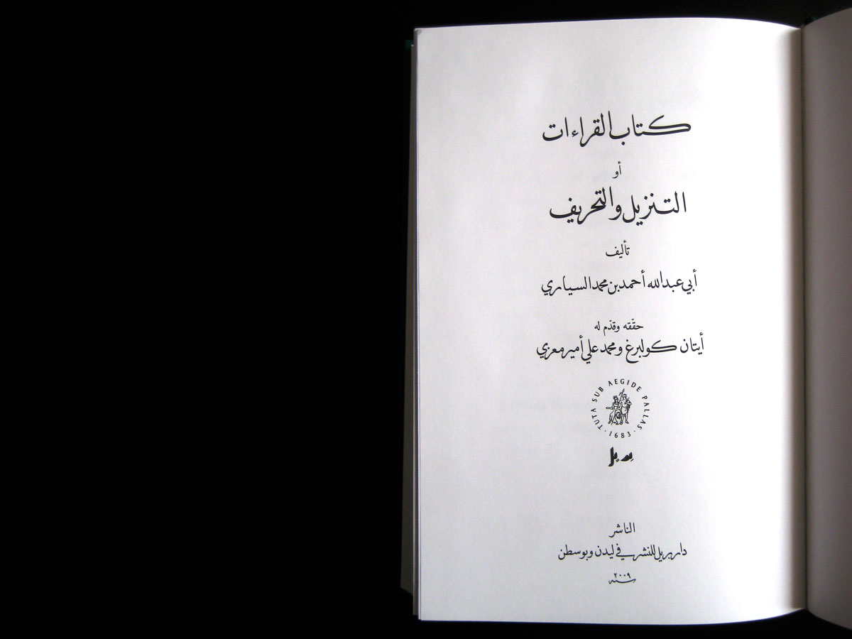
The 2009 Revelation and Falsification by Etan Kohlberg and & Mohammad Ali Amir-Moezzi was our first assignment from the publisher, taken up by us after other typesetting providers had failed at the complexity of the task. In a first step we assessed prior Arabic typesetting done for Brill for errors and potential improvements.
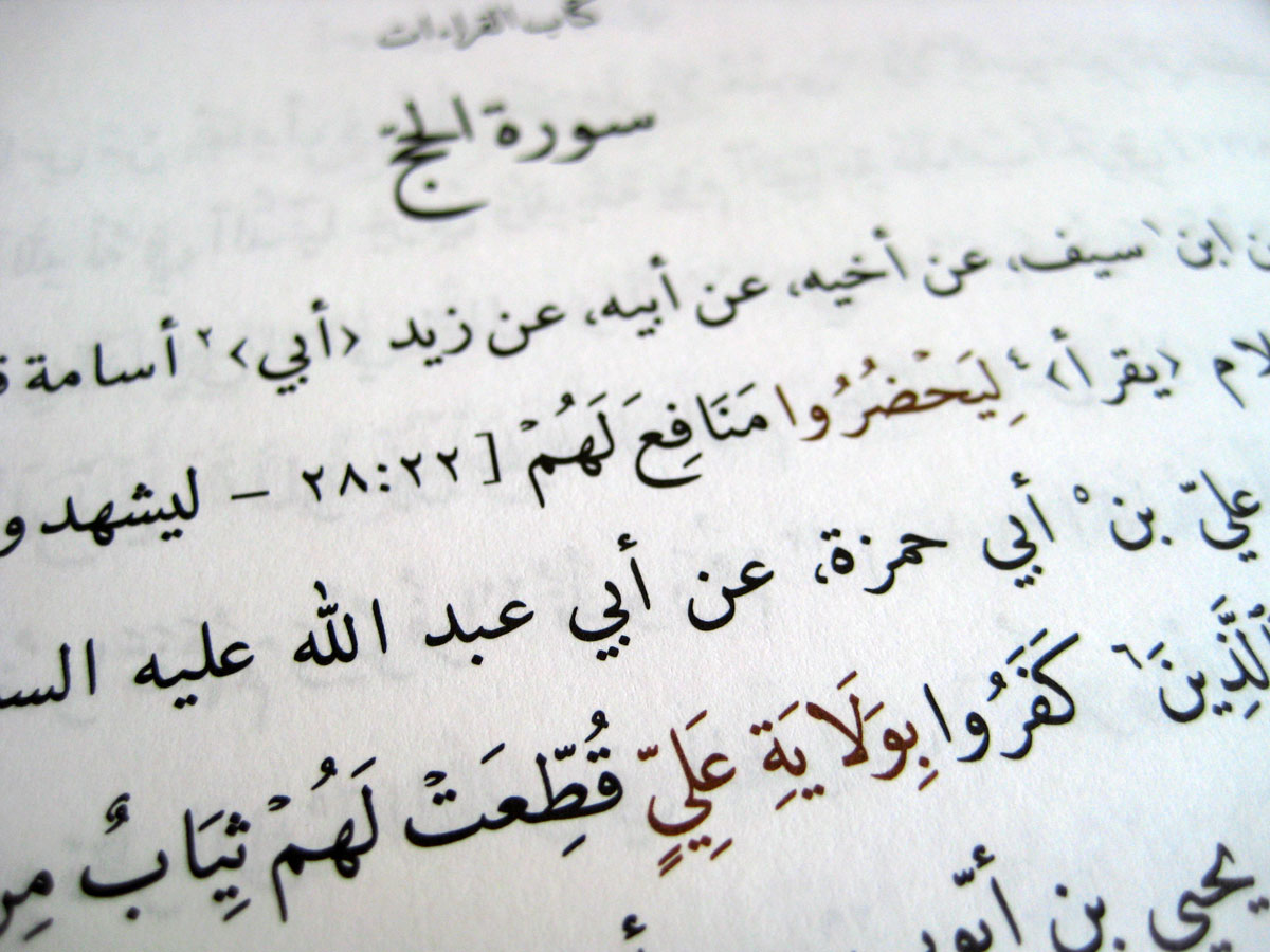
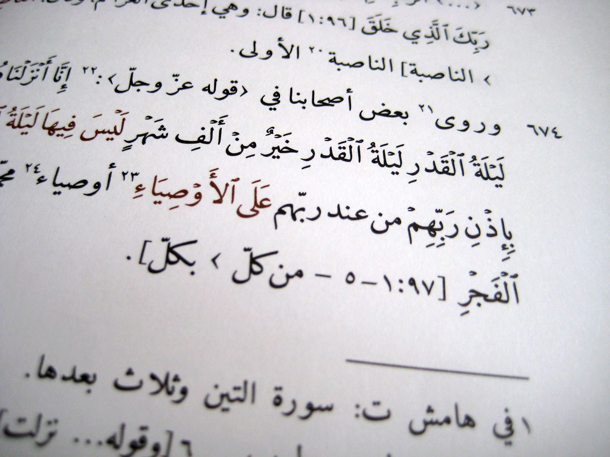
The text contains multiple levels of hierarchy: running titles, Sura titles, commentary, Quranic quotations, and a full apparatus criticus to describe the manuscript sources. This complexity, in combination with the intricacies of full Quran orthography went beyond the capacity of conventional Arabic typesetting tools. In our design, we opted for DecoType’s Emiri typeface for the body and footnotes and used their Tasmeem Naskh for titles and running titles.
Our partners at Brill showed their commitment to the highest possible quality of Arabic text production by allowing us to define a second colour for text differentiation. A practice well known from manuscript evidence but hardly used in contemporary typography because of the increased costs. And the care did not go unnoticed as a glowing review noted that the volume was ‘imprimée avec tous les soins qu’une grande maison d’édition peut apporter’. J. Dean in Revue D’Histoire et de Philosophie Religieuses 2011, 91.1, p. 104.
After the successful typesetting of Revelation and Falsification, we had established a foundation to build upon in another publication: Samer Akkach’s 2010 Letters of a Sufi Scholar. The Correspondence of ‘Abd al-Ghani al-Nabulusi (1641-1731). Yet, the different nature of the text required also significant reconsiderations. While the former volume contained a theological treatise, the collection of personal letters suggested a different approach, reflected in our choice of body typeface: the flamboyant Tasmeem Naskh instead of the more sober Emiri.
In addition to the change of body typeface, we introduced for the first time the new Tasmeem Nastaliq, also developed by DecoType. In this volume we gave it a three-fold role. Most prominently, the Nastaliq features for headers, indicating individual letters by ‘Abd al-Ghani al-Nabulusi. Moreover, we re-introduced the Nastaliq as a secondary companion typeface to distinguish different text categories, similar to the role the Italic plays in Latin-script typography (which lead Thomas Milo to the pun “Naskh-italiq”). This practice, known from the heritage of manual text production had vanished from contemporary Arabic typography.
And as we did not leave any details up to chance, I designed a set of Arabic Indic superior figures for the technical apparatus. In contrast to digitally scaled superior figures, the ones we conceived for Naskh are optically adjusted to match the typeface in size and blackness.