‘Portraitscapes of War’
Typography
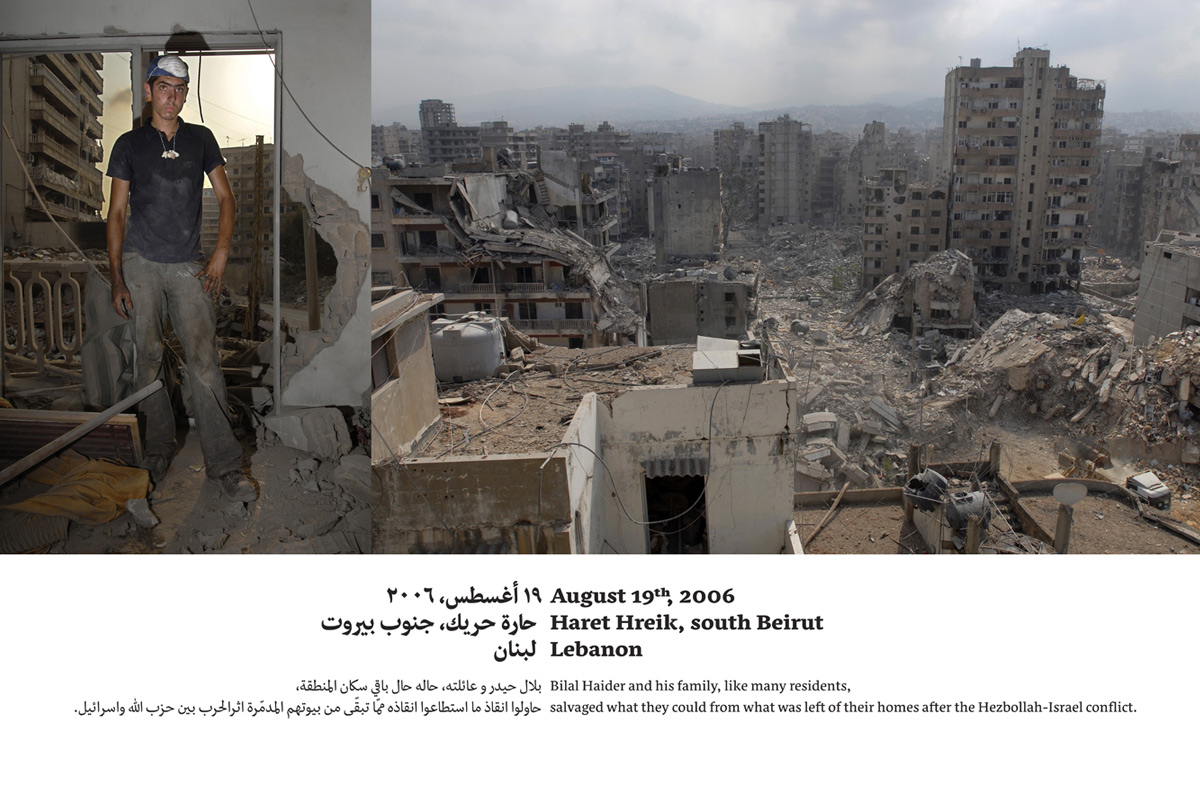
Typography for photography exhibitions. Bilingual panels accompanying series of photographs taken after the 2006 July war in Lebanon.
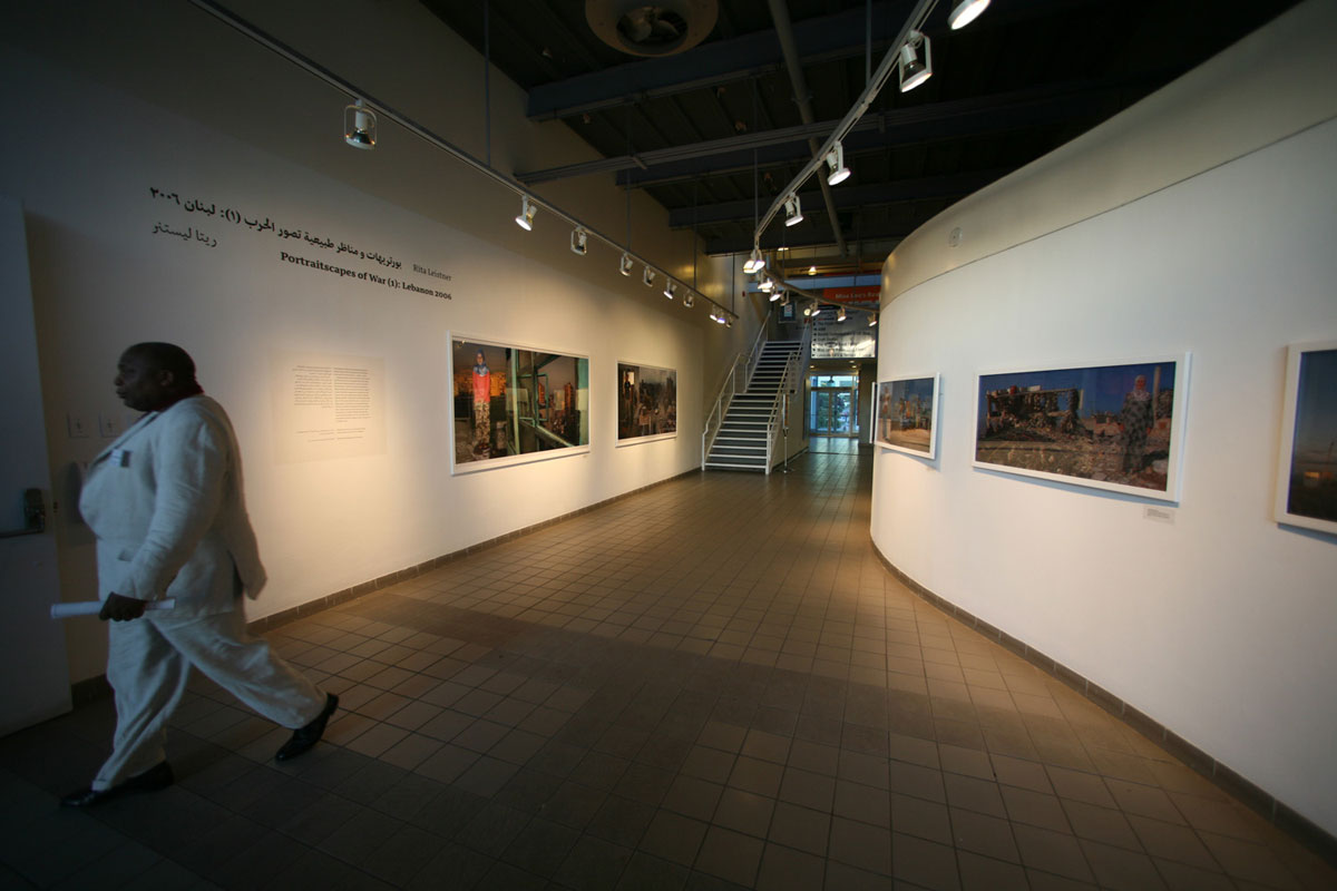
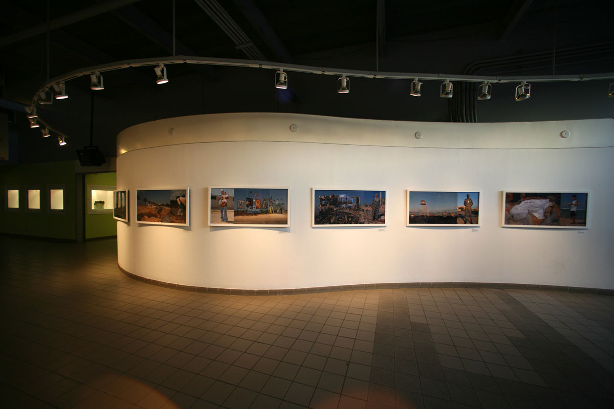
During my stay in Syria in 2007 I had the pleasure of meeting photojournalist Rita Leistner. During our conversations we discovered an overlap in our work and interests, and Rita suggested that I should typeset the signage for two exhibitions of her project ‘Portraitscapes of War’, a series of photographs taken during and after the 2006 July war in Lebanon.
In this project, Rita Leistner converges people and their immediate environment in the face of destruction and war. She uses the concept of the diptych to juxtapose individuals and their destroyed livelihoods, creating a powerful humanistic image. As she notes, too often these people ‘become so-called collateral damage. It is all too easy to forget that, like us, they are just ordinary people, but unlike those of us blessed with peace at home, they inhabit extraordinarily unfortunate lands.’
It is important for Rita to note that the fact of showing the face of the war in Lebanon does not mean that this perspective is exclusive to this country. Rather, she notes that she ‘could just as well have made these kinds of images in Israel, or Chechnya, or Sri Lanka, or Iraq.’ Rita therefore considers this project the first part of an on-going body of work.
The photographs on this page show the harbourfront centre in Toronto and my modest contribution – typesetting of the panels and the short accompanying stories. I used Nassim for this task and kept the design as low profile as possible. For more details about Rita’s impressive body of work, please refer to her website.
All photographs courtesy of Rita Leistner.