BBC World Service
Type
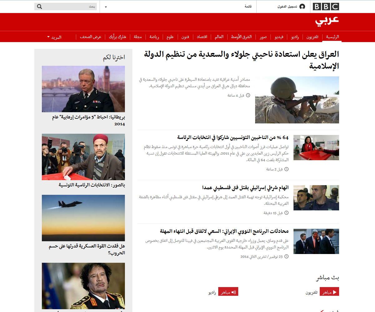
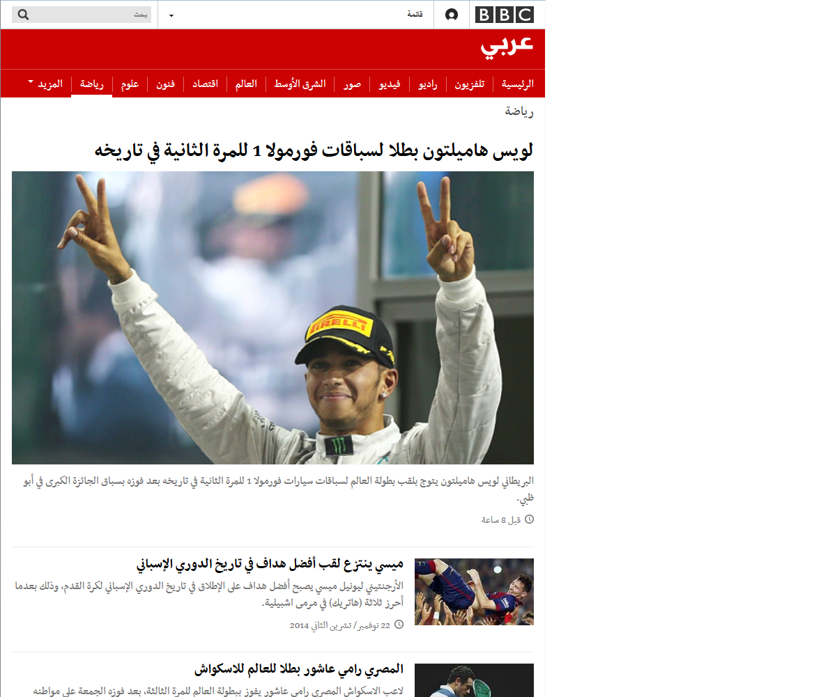
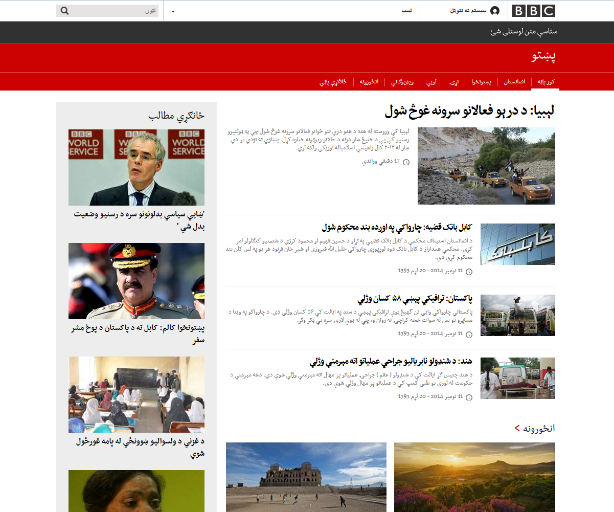
With its adoption by the BBC World Service in 2011, Nassim became the first Arabic webfont used on a major website.
When in 2010 the BBC World Service initiated a major redesign of its websites, the design team around Senior Creative Director Kutlu Canlioglu approached me to test my Nassim. The service had commissioned Neville Brody and his Research Studios to devise a new visual language in which type featured prominently, and now Kutlu and lead designer Nour Saab wanted to test Nassim against other typeface for this task on the Arabic-script sites. Their requirements were the following:
‘Our primary criteria in our search for a font for the sites that use Arabic script were:
– readability at body copy sizes
– a good presence at headline sizes to achieve the typographic hierarchy set out in GEL
– a contemporary, fresh aesthetics, again, in fitting with GEL’s philosophy
– and most importantly, to constitute a good base to customise for the different languages. (As we all discovered, this was much more difficult for many reasons, mostly for cultural reasons rather than typographic ones)’
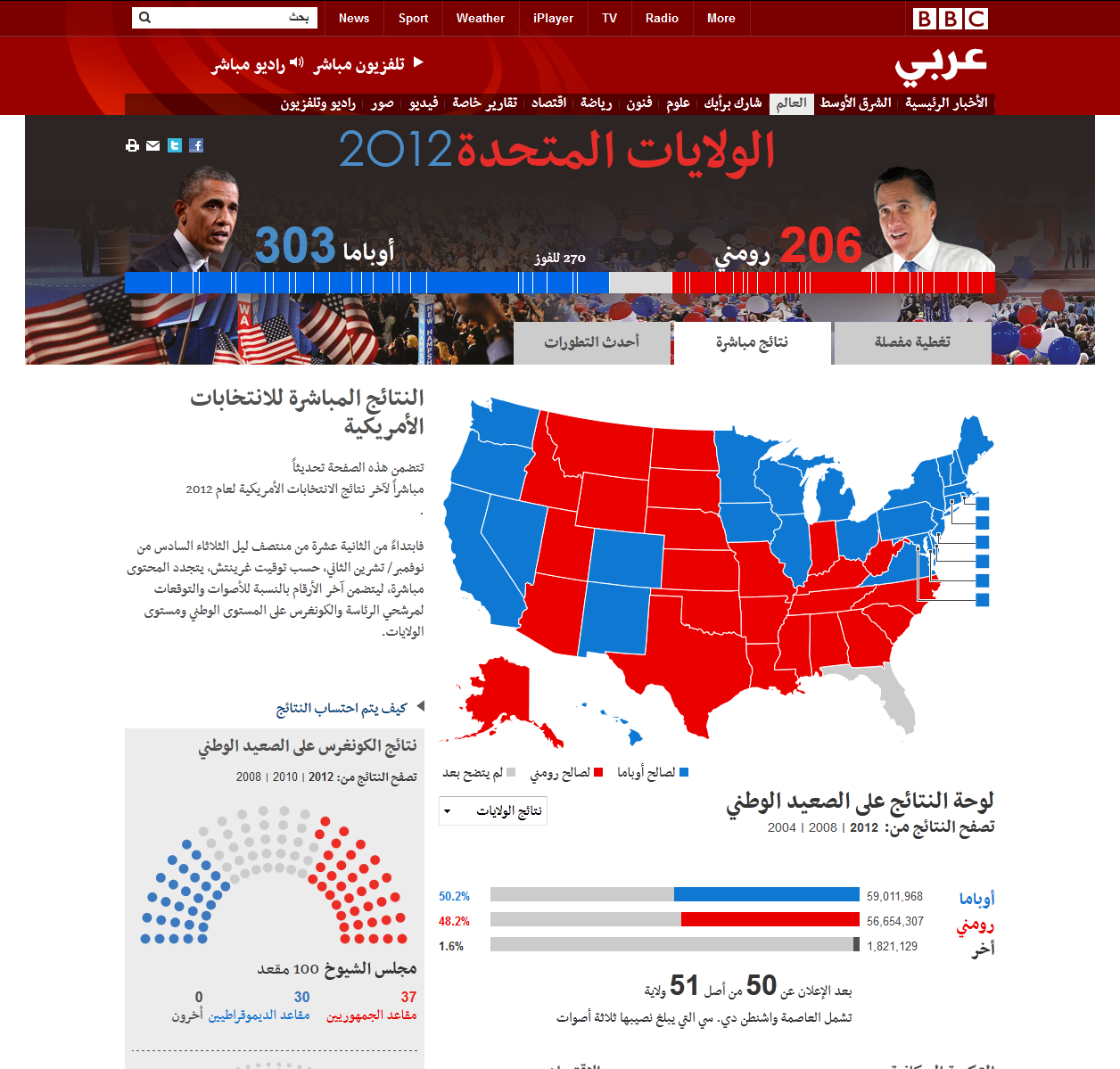
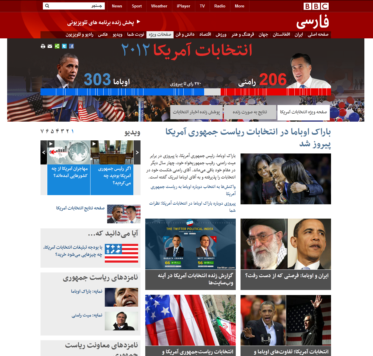
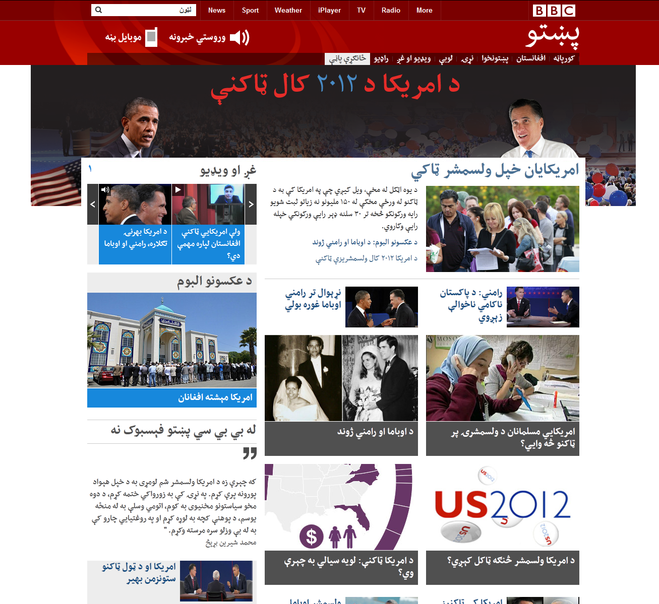
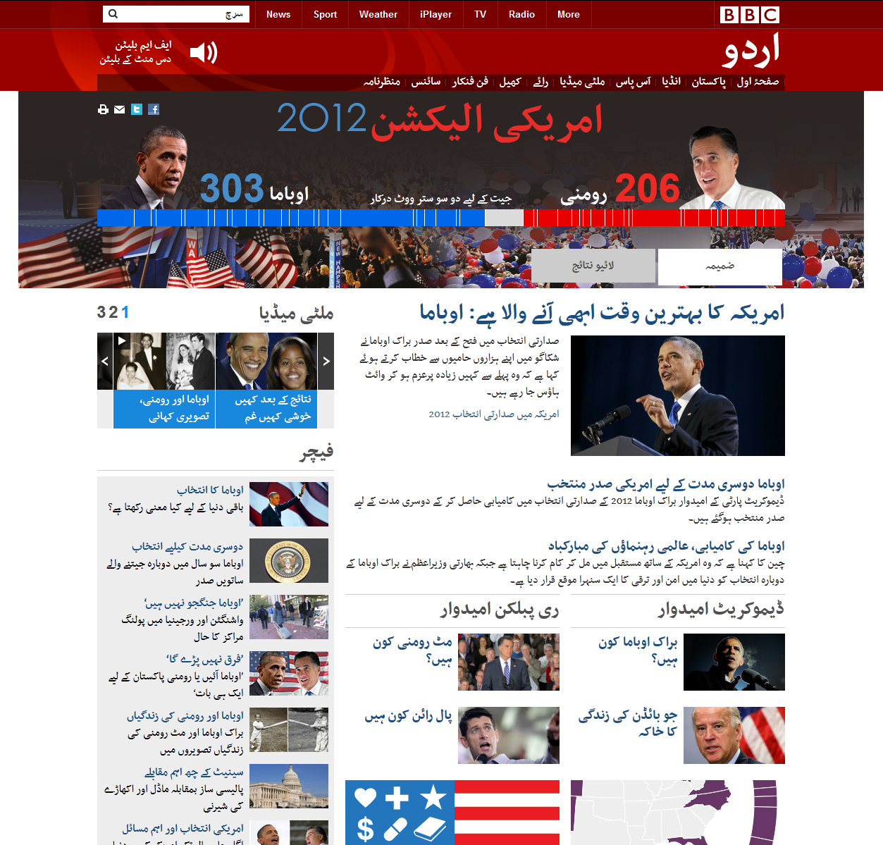
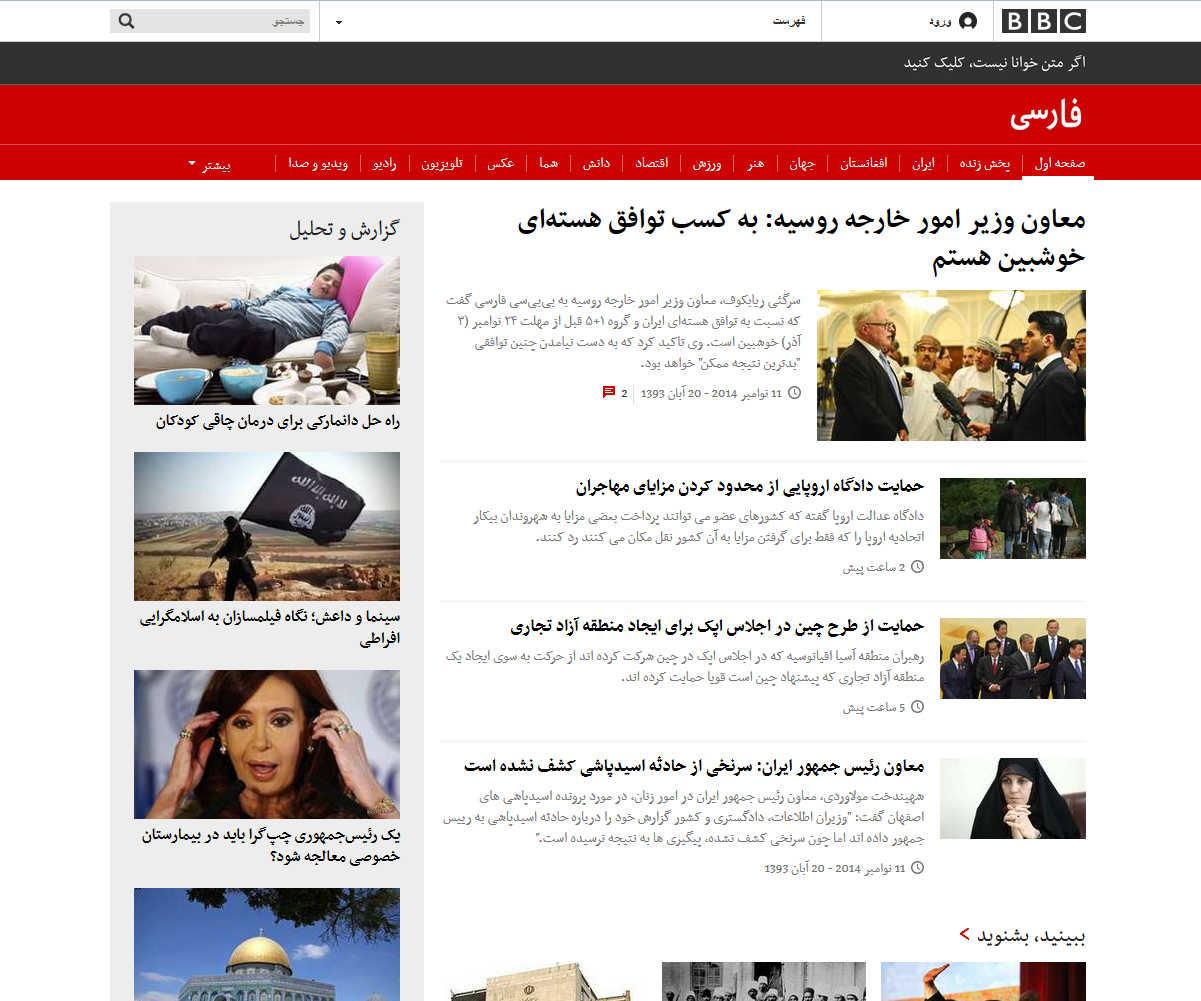
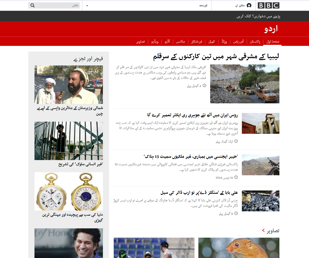
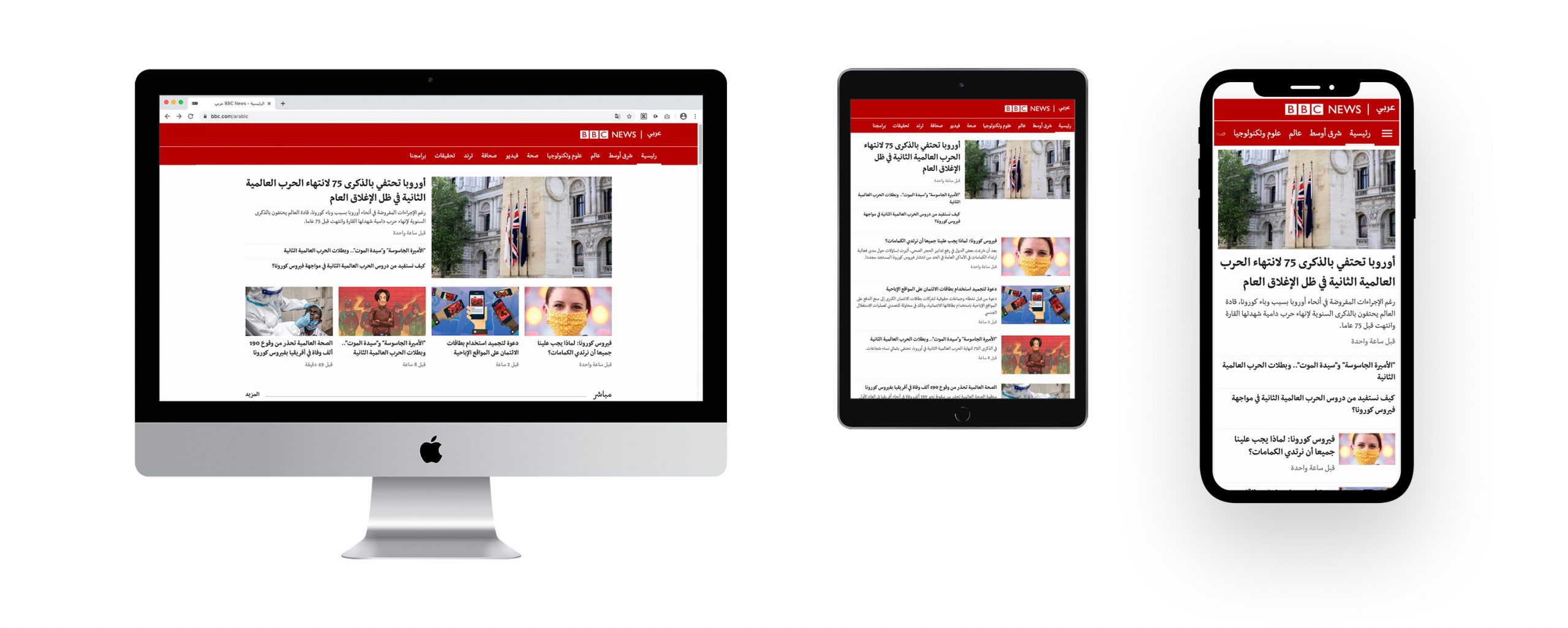
After extensive testing in its new, highly structured and thoroughly detailed website design, the team chose Nassim as the best match for the task. The typeface thus received a ground-breaking role, featuring in one of the first and biggest sites to use Arabic-script webfonts. Indeed, not only was Nassim to be used for Arabic, but for all Arabic-script sites in Pashto, Persian and Urdu languages. It was an exciting development for Arabic typography in general, and for Nassim in particular, pioneering the way on the Internet and facilitating what has long been thought impossible to achieve: distinguished Arabic-script web typography.
To help bring about this new visual style, I was approached to customise Nassim, requiring significant work and close collaboration with the BBC World Service’s designers and editors. The BBC World Service has a number of dedicated language sites and I provided customised versions to accommodate the style and specificities deemed most appropriate for the respective language. The challenge in this endeavour was to customise Nassim in a way that corresponded with cultural stylistic preferences and yet maintain the design distinctiveness for which Nassim has been prized. In addition to these stylistic changes, some letters were modified to accommodate for compact headline setting and on-screen legibility.
The resulting BBC Nassim versions stay true to the qualities of the original design, whilst toning down some idiosyncrasies and giving each language a specific tailor-made look. A technical challenge was to translate this new look to the final browser rendering of the font, a process to reduce the distortion of letterforms (blurriness, uneven edges, visible pixels) when they are displayed on screens with low resolution.
A process called “TrueType hinting” was employed to retain the original letter shapes. I am grateful to my colleague Thomas Grace, for his task was not enviable. It could be compared to drawing a beautiful and complex Arabic letter shape with subtle curves and details on the tiles of your bathroom. I am quite thrilled about the effect we were able to achieve: solid and clear letterforms in small sizes and well rendered, crisp and unique Arabic type in headlines.
Further technical work and testing had to be done for Nassim to be displayed in web browsers – webfonts were new, but Arabic webfonts were pretty much unheard of until then. Browser and cross-platform compatibility for anything more complex than ASCII proved to be still problematic and details of the technical process and some of the challenges are described on my blog.
In the BBC’s latest redesign in 2014, Nassim webfonts are still used throughout their Arabic-script news sites.