HUP Murty Classical Library of India
Typography
Multiscript typography for classical Indian literature in bilingual Harvard University Press series
“The shaping of India’s future depends on understanding its past, and the Murty Classical Library of India deserves acclaim for making great works from the past widely available.”
Amartya Sen
The Murty Classical Library of India is an endeavour of unusual scope and ambition. Its stated goal is to publish more than 500 books of ancient Indian literature by 2114, eclipsing the life-spans of all the people involved in its inception – a humbling perspective. Upon publication of the first five volumes in January 2015, the MCLI has received much applause and attention for its novel and bold approach, excellently summarised here.
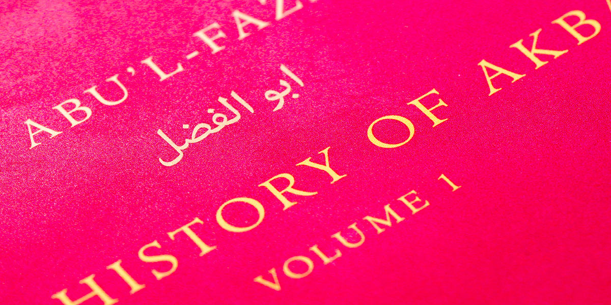
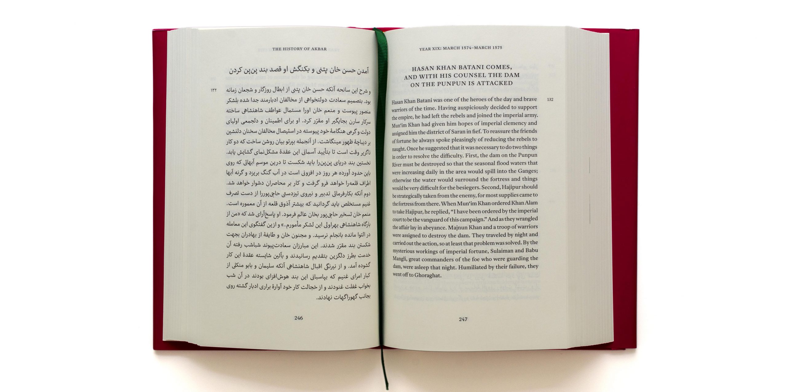
Conceived by Rohan Murty, son of the Infosys co-founder Narayana Murthy (the two men spell their surnames differently) whose family donated 5.2 million dollars for the project, the series takes inspiration from Harvard’s Loeb Classical Library. It seeks to revive Indian classical literature and make it as widely available and accessible as possible. To this end, it presents texts from the vast and diverse literary cultures of India in bilingual editions. The original, composed in one of the many scripts employed throughout the subcontinent, is accompanied by a contemporary English translation on facing pages.
The concept and design for this complex series was done by Rathna Ramanathan, who sought to embrace the idea of “unity in diversity”. Rather than forcing the vastly diverse scripts and languages – from Assamese to Urdu, from Sanskrit to Persian, from Malayalam to Telugu – into one rigid design, she devised a flexible grid inspired by polyphonic music. Through flexibility of column widths, interlinear space and type size, the series design provides for the starkly differing structures of texts encompassing prose, poetry and drama, and allows to arrange original text and translation to their best internal logic while providing a smooth bilingual reading experience.
Indeed, mirroring the substance of the editorial task, HUP went to great lengths to ascertain that the appearance of the series would match the content. Parallel to the book design by Rathna, a range of new Indian types were specially commissioned from Fiona Ross and John Hudson of Tiro Typeworks. The resulting Murty Hindi, Murty Gurmukhi and Murty Telugu types are not only used to great effect in the this series, but are even made available, free of charge, upon publication of the first book in which each appears, actively contributing to improve Indian typography.
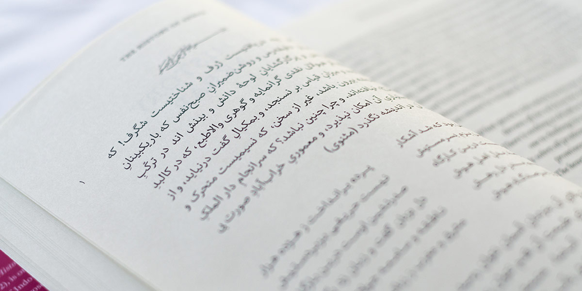
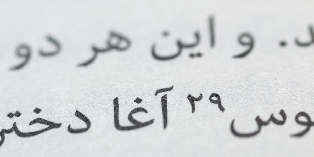
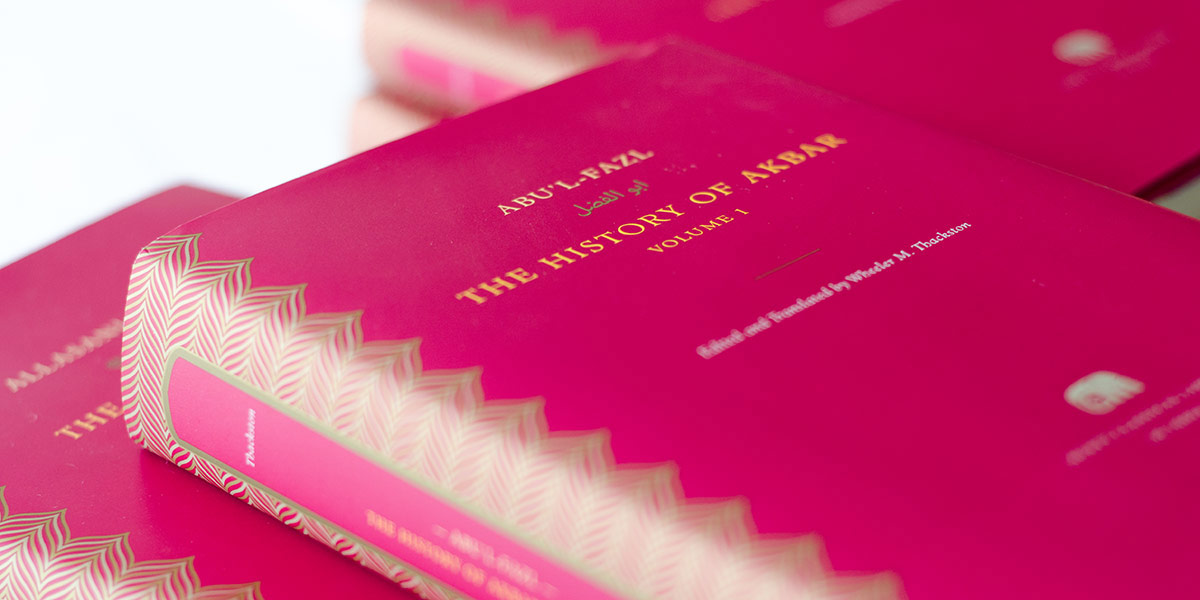
In this manifold and enormous endeavour, my own contribution was relatively modest, yet no less fulfilling. I was approached by the design team to contribute to the series by specifying the typography for the Arabic script texts, and typesetting the first volumes in Persian, Urdu and Sindhi. After a number of typefaces were considered for this, the design team and editorial board suggested that my Nassim be used for the first book in the Arabic script – the The History of Akbar in Persian language. Tests confirmed that Nassim sat very comfortably with the Latin type – Henrik Kubel’s Antwerp – and worked well for the Persian in Rathna’s layout, but I felt it needed some work for the task.
Thus, I added typographic features to make Nassim more suitable for book typography. This included Arabic superior figures for the note references, which despite their obvious usefulness are rarely, if ever, found in contemporary typefaces. Moreover, I decided to bring in the most successful elements from Nassim’s Tasmeem version, and expand on them. Alternating teeth characters, contextual and stylistic alternates, as well as swash variants found their way into the updated version, making Nassim well equipped for the kinds of text the Murty Library presents. Therefore, it was with some regret that the editorial board rejected my proposed use of swash alternates for justification of poetry, making me resort to conventional Kashida justification.
Beyond the typographic details, the books themselves are beautiful objects. Their dimensions hit a sweet spot, balancing elegance and compact dimensions, making them sit comfortably in one’s hands. Although the dust jacket is printed on the kind of odious rubberised paper that has recently inundated book shelves, the interior is nicely printed on smooth, off-white paper making it a pleasure to leaf-through the pages. Finally, the binding is outstanding – especially since this has become so lamentably rare. No matter where you open the book of a few hundred pages, it will stay flat open in your hands, contributing decisively to the pleasant experience of handling an MCLI volume.