Lammerhuber
Type
A face for Europe’s best photo book publisher 2013.
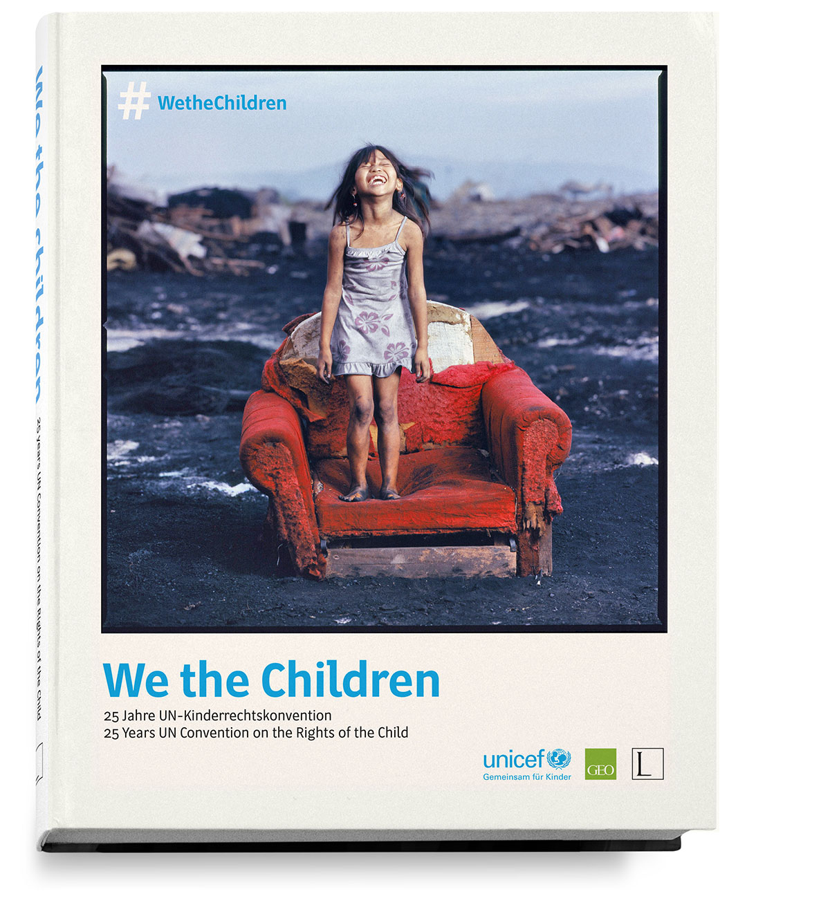
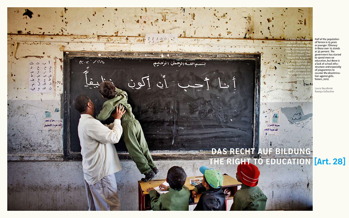
Edition Lammerhuber is an Austrian photography publishing house; and they are serious about their books. Founded as recently as 2008, Edition Lammerhuber has established itself among the top tier of photographic publishing houses, earning numerous prestigious awards for its books. When selected as Europe’s best photo book publisher 2013, the jury noted ‘Outstanding photographic quality, the fusion of creative ideas with technically perfect realization and the thematic breadth of the books’ among the reasons for awarding the prize. Indeed, the production quality of their books struck me as second to none when I first met the publishers Silvia and Lois Lammerhuber. It is fitting that now Edition Lammerhuber has become the first Austrian publishing house to have commissioned its own bespoke typeface.
In mid-2013 I was contacted by my old-friend and former teacher Martin Tiefenthaler, enquiring whether I would be interested in a project he was working on. In a consulting role for Edition Lammerhuber, Martin had been asked whether he could recommend someone to design a bespoke typeface for the publisher and kindly thought of me. While initially hesitant to take on the job – I was in the process of finishing my PhD at Reading – it was too interesting a project to refuse. Martin, as their typographic consultant, would help in developing the brief and provide input on the direction, and photography has been a passion of mine for many years.
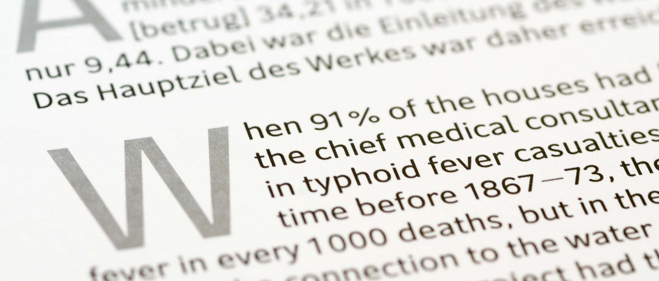
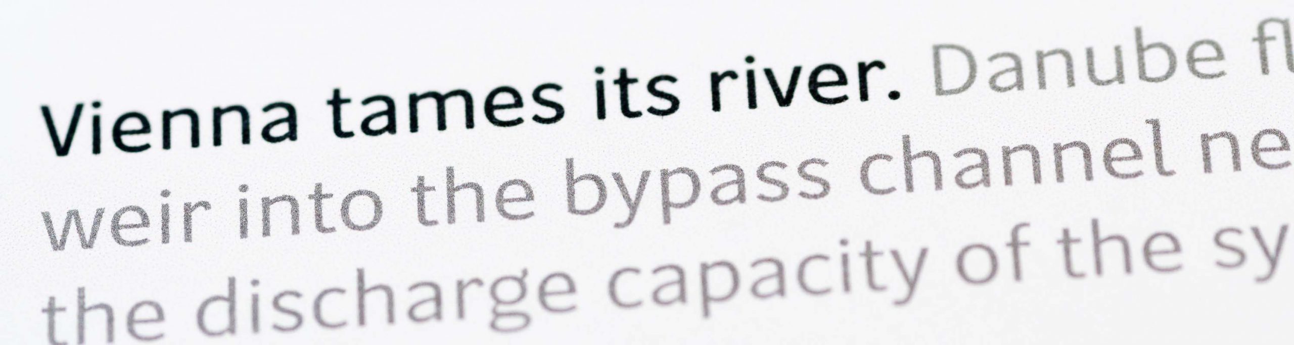
Thus, I began to make preliminary sketches and exchanged with Martin about potential design directions. As he observed, justified setting was bound to arise in photo books, and from early on we considered options to handle this well. The type had to replace FF Din, a favourite with many photographers, and should have the typical qualities commonly associated with geometric sans serifs: neutrality, clarity and versatility. Martin and I, however, aspired for it to be more text-friendly. Edition Lammerhuber publishes primarily documentary photography, and we wanted this to influence the voice of the design, a consideration that lead Martin to suggest considering the American Grotesques with their news heritage.
With these various aspects in mind, I began to make some sketches and to develop a few core letters – Reading’s (in)famous ‘adhesion’ – as a proof of concept. At this point, the Lammerhubers and I had our first meeting for which the two flew in to London. Ample proof, if any was needed, of their commitment to their work. The description of their ideas of book making and their wishes for a typeface thus met with my explanations of the reasoning behind the concept, in a conversation that quickly cemented our collaboration.
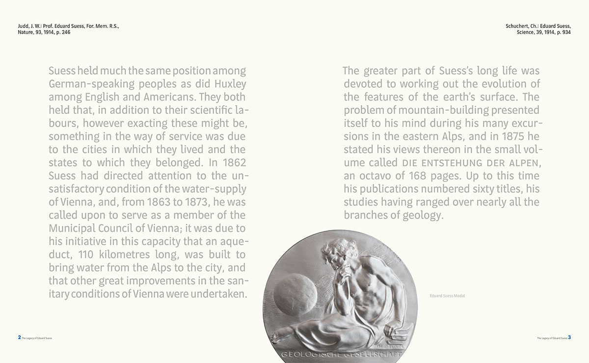
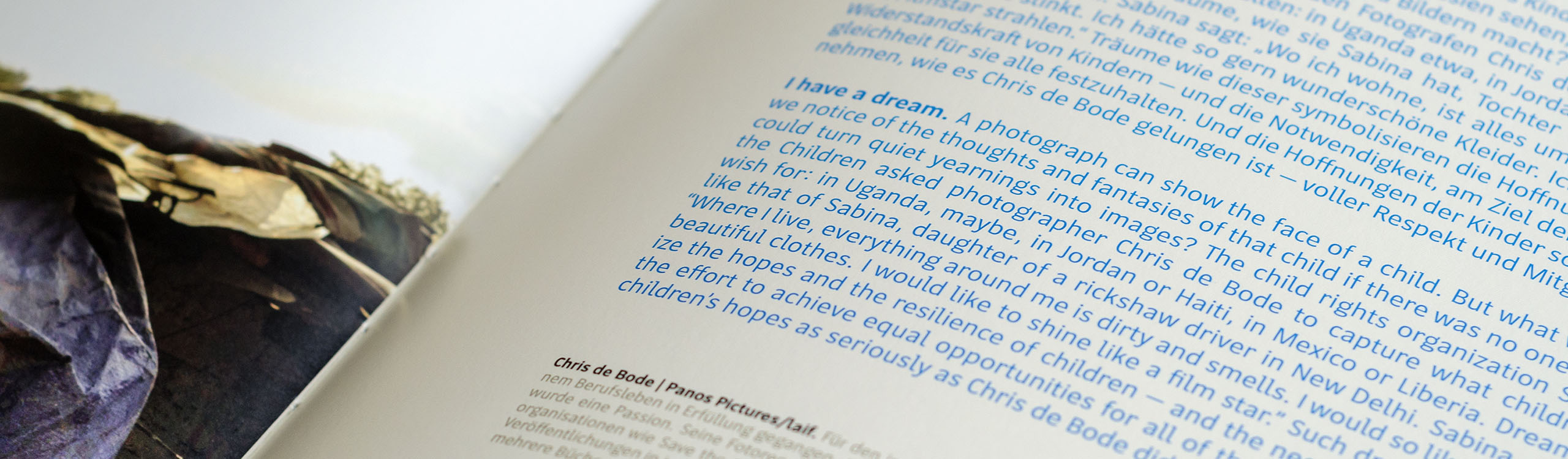
Over the next few months I developed the typeface further, with a special perk from working with a quality-driven publisher: my suggestion to run offset tests on their paper in order to get the right colour for the regular weight was done early on in the process. For the first book which was to use the new type, Gerd Ludwig’s The Long Shadow of Chernobyl, (see here for a review on the Guardian) I completed a range of upright weights with a sizable characterset, and an Italic companion was added soon after. But whereas the brief had entailed a classical set of four styles, by the following publication, The Face of the Earth, an unexpected issue arose. Here, a new high-resolution halftoning process was used for superb photo reproduction; however, the substantial dot gain made the black type look distinctly heavier than planned. Indeed, the increased amount of ink even resulted in the type bleeding around the edges. Lois wanted to have a light weight to address this, and we agreed to expand the typeface’s weights.
But rather than just adding a light weight, it struck me that a range of finely graded weights would be a more useful tool for the kind of text treatment Lammerhuber photo books regularly employ. For this task I was able to enlist Sandrine Nugue, who did an excellent job helping me with the extension of the design to the light range.
With the family grown to some 10 weights, I asked Lois for another offset print of a more comprehensive specimen, which was quickly implemented. Based on the first few books and this latest test, I was able to fine-tune design details, in what was one of the best type design processes I have had so far.
Photographs of books and spreads courtesy of Edition Lammerhuber.