An invitation from the New York University Abu Dhabi (NYUAD) to give a talk and run a short workshop provided me with the opportunity to visit the capital of the United Arab Emirates over the last couple of days. Visiting Associate Professor Goffredo Puccetti runs a brand new course on visual communication in this branch campus and asked me to come over to talk to his students about Arabic typography.
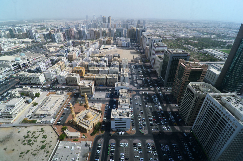
Having taught previously at the VCUQ in neighbouring Doha, and visited Dubai for the 2006 Kitabat conference, I was familiar with the region but eager to see how Abu Dhabi differed, and happy to give a hand in teaching Arabic typography. For although the emirates are among the centres of economic development and their iconic architectural and other projects are much discussed phenomena, the level of typography and graphic design leaves room for improvements.
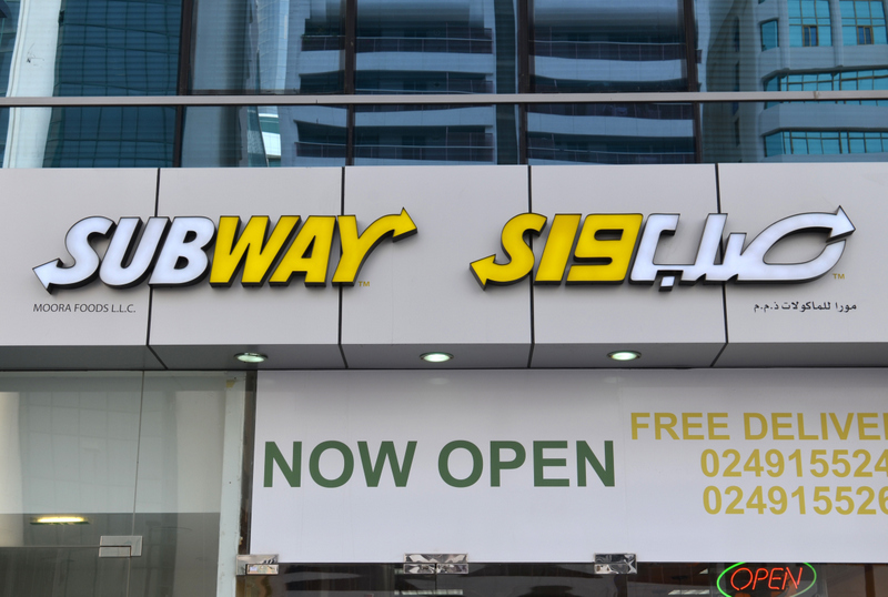
Without indulging in a detailed list of observations, the general shortcomings of typographic/graphic design seem to be a lack of critical evaluation and a reliance on existing typefaces and their use in what often appear to be unimaginative imitations of Western design language. The justified wish for modernity and contemporary looks strike me as overarching desires, whilst neither enough time nor resources are devoted to their development. Critical evaluation of design solutions, a prerequisite for an amelioration of function and style are not evident from most brand, editorial, signage and advertisement design. Abu Dhabi, like other places in the region, is also a haven for logo adaptations that fail to convince fully.
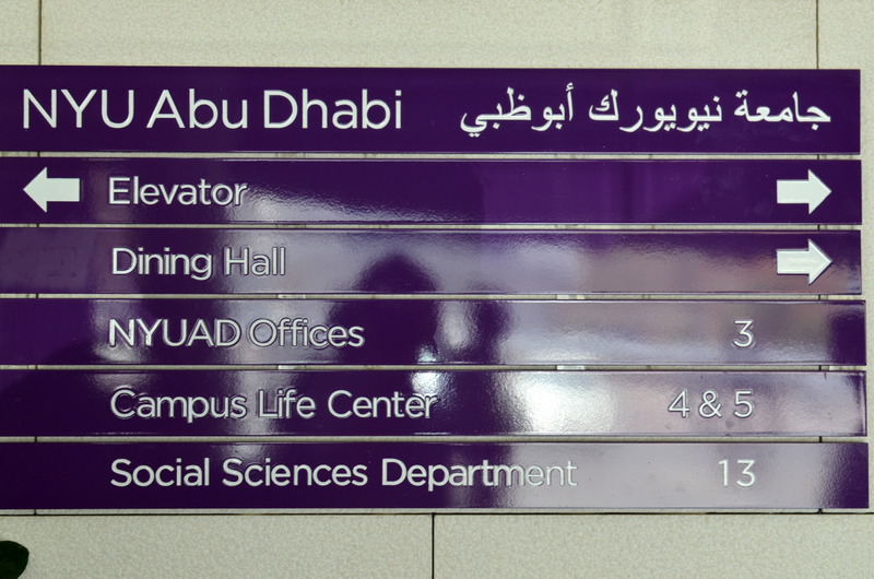
Overall it appears that whatever has an air of novelty is considered good, unfortunately often to the detriment of substance and quality. The visual communication course at NYUAD is an initiative to steer against this, and aspires to raise awareness by providing design education in situ. The lecture I gave to students and faculty thus attempted to summarise aspects of the development of Arabic typography, explaining the circumstances which lead to design decisions, and pointing out where opportunities were missed for revaluation of existing solutions. In what appeared to be an eye-opener for many in the audience, I demonstrated how too many current typefaces are based on assumptions and an approach to design that are outdated and marked by a reluctance to revisit the established. In the following discussion the topic of discrepancy in expectation of design standards between Latin and Arabic components of identities was raised. It had come as a surprise to me to discover that the campus’ identity, designed by none other than Pentagram, lacked any Arabic definitions, and that HFJ’s Gotham had to sit besides the mis-aligned, default Arabic of Arial. I was assured by staff that this was going to be addressed at some point.
In the following workshop, attended only by the small group of students registered in the course, we discussed issues of existing bi-lingual logos and established criteria for their assessment. In 4 hours – unfortunately too short an amount of time – the students presented their findings of issues in existing logos (one student appropriately chose the identity of the city of Abu Dhabi) and we discussed approaches to a more reflective way of designing identities that covered both scripts. Although I would not expect any sudden changes to the design practice, courses like the one at NYUAD are bound to contribute to a gradual improvement of the field and it will be interesting to see how things have changed upon my next visit to this rapidly transforming area.
In addition to my teaching contribution, this visit gave me the opportunity to meet staff involved in an (unrelated) project with the NYU Press, about which I shall post soon-ish. See the NYUP Library of Arabic Literature.