NYUP Library of Arabic Literature
Typography
Book series design of Classical Arabic Literature. ‘[It] will do for pre-modern Arabic texts what the famous Loeb Library has done for the Classics.’

‘Geert Jan van Gelder has strung for us an attractive set of pearls – well selected, handsomely presented, readably translated, and helpfully annotated to guide the reading public gently into the world of a very bibliophilic civilization.’
Times Literary Supplement
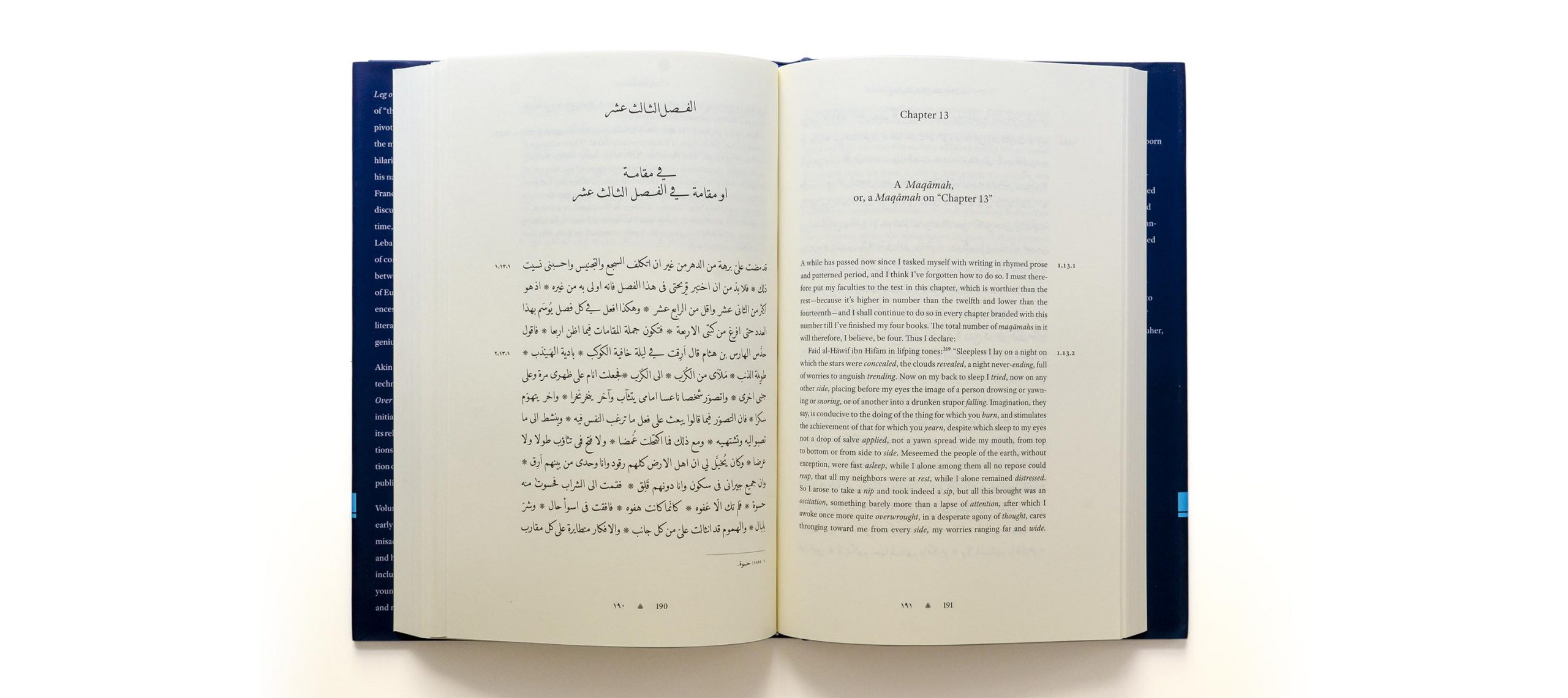
In autumn 2011, Thomas Milo of DecoType approached me with a book design project which followed-up on our previous collaboration for Brill. The New York University Press was planning a book series on classical Arabic literature, and sought our help for its design. The series’ aspiration was daunting: ‘the first comprehensive library of this literature in English, the Library of Arabic Literature aims to make the treasures of this world literature accessible to scholars, students, and general readers.’ It was a fabulous project to work on, and one in which our expertise could make a decisive difference in making sure that these key works were presented in the best possible way. Eagerly we set out with the planning of the series.
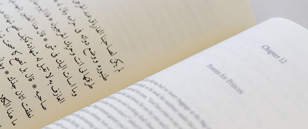
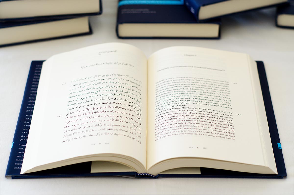
We began by trialling page layouts of two different trim sizes, seeking the best balance of format, text area and resulting word length. Initial tests based on a sample of texts found that a 6 × 9 inch format was required to avoid clunky volumes, as long texts were planned to feature in the series. While I initially aimed for a baseline grid in which every other Arabic line would align with an English line on the recto, this consideration was eventually abandoned to provide the ideal interlinear space for each script on its own terms. Stylistically, a series of classical literature with scholarly translations called for a suitable typographic dress, and our suggestion of DecoType’s Tasmeem Naskh was embraced by the editorial board. For the English translations we opted for the recently released Adobe Text Pro, an elegant yet unassuming typeface which featured the required character set.
As Thomas was swamped with work at the time, the series design ended up as my task, with Thomas providing important support for the Arabic parts. In a kind of mission-creep, the elements which we were involved in kept increasing: the series’ logo and the jacket design also called for input to achieve a culturally sound design, and the Adobe Text fonts had to be updated to include a missing transliteration character – which our friends at Adobe Type kindly did for us. Furthermore, I expanded on the additional Naskh features I did for the Brill books and designed semibold Arabic numerals for the paragraph numbers in the margins.
By early 2012 I was able to provide the series design specification to NYUP and hand over to the typesetter Stuart Brown, who had been charged with implementing the individual volumes. In autumn that year, the first books were released, to much to much praise from diverse quarters. Indeed, Stuart did a great job in implementing my series specification, expanding it where necessary and, crucially, typesetting the often complex text configurations. Especially the setting of the verse couplets, a particularly demanding element of Arabic script composition, is exemplary in taking full advantage of DecoType’s Naskh typeface to produce possibly the best example of such setting currently available. A more poetic account of Stuart’s work can be read on his blog.
As the Times Literary Supplement exclaimed, the Library of Arabic Literature is ‘a remarkable project of editing, translating and publishing that will do for pre-modern Arabic texts what the famous Loeb Library has done for the Classics’, and I am humbled and thrilled to have designed the series. Indeed, as Michael Cooperson, who translated a text by Ibn al-Jawzī for the series noted on the LAL blog, the ‘marvelous type and text design, bring you closer to the feeling of reading a manuscript’; and while his attribution isn’t quite accurate, I would agree that Thomas Milo’s type design, Stuart’s typesetting, and my text design work very well together.


