Last month, on February 7, the latest group of ESAD Amiens post-diplôme students graduated from their 18-month exploration of type design. The group had started their course in October 2011, giving them a few months overlap with the previous graduation, a valuable opportunity for some experience and skill exchange. The course, run in its current setup only since 2009/10 may still qualify as ‘young’, but already developed a profile in France. Since 2012 the post-diplôme’s crew was strengthened by Jean-Baptiste Levée, adding a young and internationally renowned type designer to its team. Its graduates started to get noticed with Damien Colot’s Mingus receiving the Milosz award in 2011. In the most recent instance, I am very pleased to note that former ESAD grad Alisa Nowak’s Eskapade has just been selected by typographica as one of the best designs of 2012, with a well written (though in some details slightly unfortunately put) review by Matthew Butterick.
For the ‘soutenance’ my fellow PhD researcher and type designer Alice Savoie, the former Mergenthaler-Linotype employee and Frutiger collaborator Hans-Jürg Hunziker, and the current director of the newly re-launched ANRT, Thomas Huot-Marchand, were invited to form the jury. For approximately one hour each, the research students Thomas Bouville (FR), Elisa Manente (IT), Sandrine Nugue (FR) and Christina Somorjai (BE) presented their work and replied to the questions of the jury before proceeding to opening the exhibition of their typeface designs.


Within the general concept of a research-led new typeface creation, the four graduates shaped their project in quite distinct ways. Thomas investigated the theme of the modern in typeface design, developing the Kelvin family containing a high-contrast Didone in combination with a monolinear geometric Sans, insisting not to build both on the same skeleton

Elisa’s project which resulted in her Ambra design, underwent a few twists and turns to eventually tackle the timeless question of continuous reading. Her explorations led to the beginning of a text typeface with historical influences.

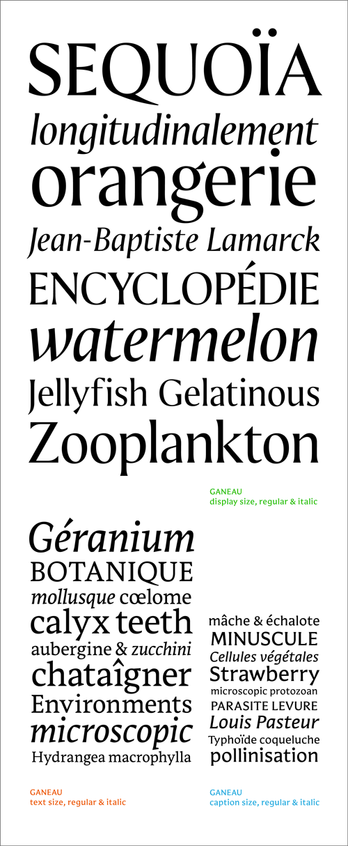
Sandrine developed a typeface family of stylistically related, though not identical, optical sizes. The six fonts of her Ganeau thus combine an Incised style for the caption and display sizes, and a text size featuring pronounced triangular serifs. How well the optical sizes work can be judged from this high-res scan of an offset printed specimen (1.6mb).

Christina explored the Arabic script, and the topical question of multi-script and multilingual typography in her ‘Rajah’ typeface, combining a flowy interpretation of the Naskh style with a friendly-looking Roman (images and specimen to be added once supplied).


The projects’ future remains to be seen, but I wouldn’t be surprised to see one or the other make its way into a published typeface family. Rumours have it that some former graduates’ typefaces are due to be released within the coming year or so.
Here for me remains only to wish them all the best and good luck for their future endeavours, be they in type or other domains!