In June the new Skylink (not to be confused with Skyfall or Skynet) terminal of the Vienna International Airport opened its doors and gates to the public. Planning started in the late 1990s and the construction of the extension was awarded to the architecture offices Itten-Brechbühl from Switzerland and the Vienna branch of Baumschlager-Eberle. Due to be finished in 2008, the Skylink made the news mainly with poor planning, repeated delays and skyrocketing costs. Planned to be opened in 2008, the terminal’s inauguration kept being postponed, and the estimated costs of 400 million Euros were exceeded substantially. By the time Skylink opened this summer, the costs had soared to over 800 million Euros and the project was called a fiasco.
I hadn’t followed these developments much until this June, when I arrived in Vienna at the new terminal. Not expecting anything new, I walked through the new arrival sections with a sense of novelty, and alas, confusion. I was in a rush to get out as I had to attend to personal matters and promptly was mislead down a corridor that turned out to be an unnecessary detour. Not having paid much attention, I was quick to blame myself and carried on without giving it more thought. Luckily only three weeks later by the invitation of Design Austria I returned to Vienna, this time having my camera ready and planning to have a good look at Skylink and the wayshowing it used.
I am neither information designer nor architect, but frequent traveller and keen observer, and here I felt at once that things did not work as I knew them from airports around the world. Something was odd. Corridors seemed excessively narrow, surprisingly so for a brand-new airport, and distances to cover were substantially longer than previously the case; tellingly, there was no bathroom to be found for a long distance from the gate. But for me most astounding was the wayshowing system.

Conceived by internationally renowned Paris-based studio Intégral Ruedi-Baur, one expects solutions to the design issues of a 21st century airport signage system that are of the highest standards. Things that work and look good at the same time – the basic challenge of design, where design stands for functional and aesthetically pleasing solutions to practical problems.
At the Vienna airport such a system had been in place (see for example here). It wasn’t very ambitious in terms of aesthetics, but it certainly did the job of telling you where to find what. Unambiguous and very prominent through the use of an intense yellow, information could not be overlooked. Indubitably, there was room for improvements and a slight brushing up of style, including a revaluation of the use of Helvetica, but overall more things worked than didn’t. However in the new wayshowing, conceived for Skylink but extended to cover the entire airport, everything of the old system was scrapped and a new approach developed from scratch.
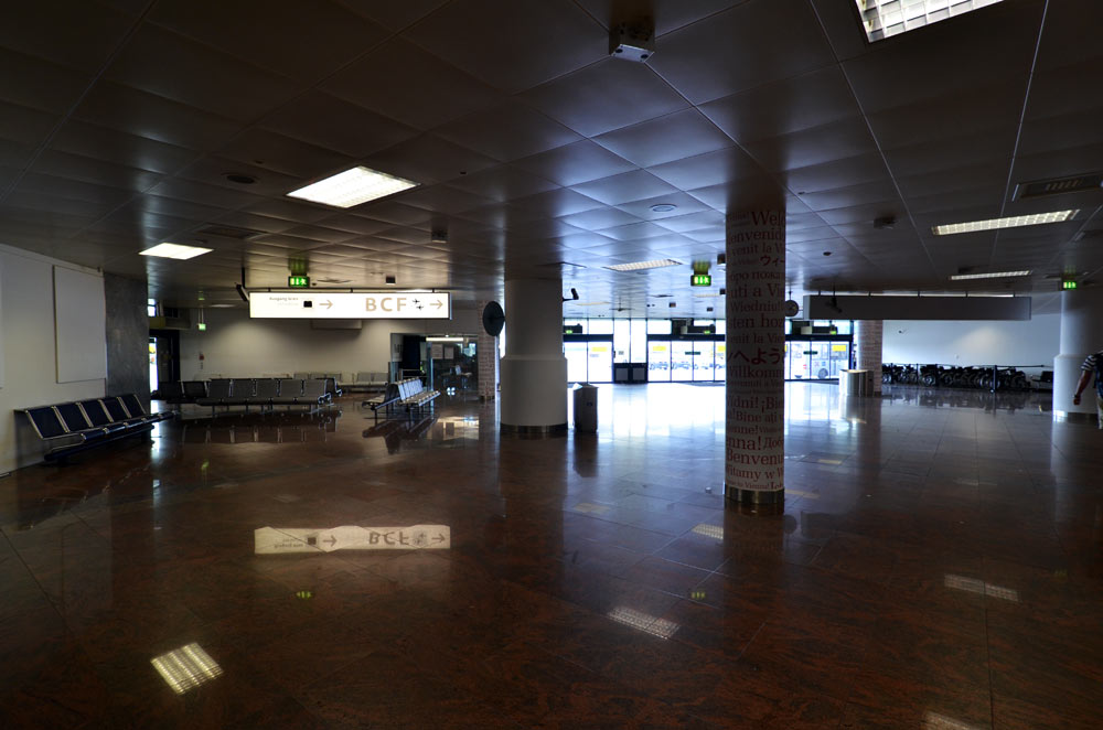
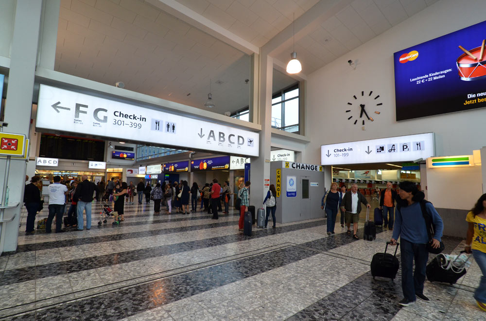
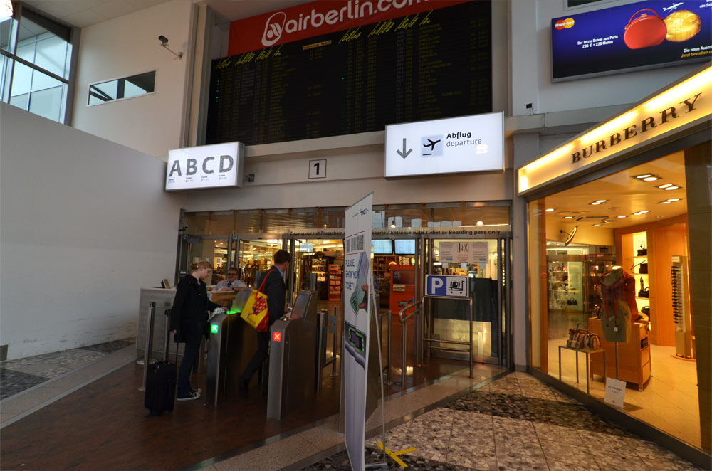
The new signs, both back-lit and illuminated are placed on a white background with black type on it. For the new signage a custom version of Peter Biľak’s Fedra Sans was used throughout. But upon closer inspection, one realises that the type of all large letters isn’t actually black, but rasterized with a curious stroke pattern. What added benefit for clarity and/or legibility this is supposed to add remains open to speculation.

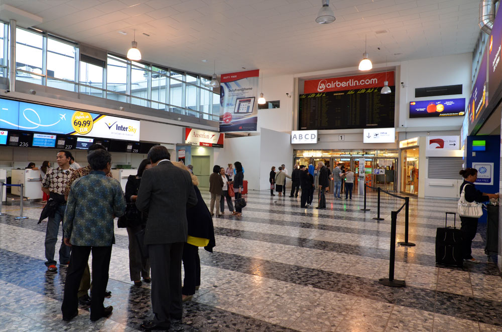
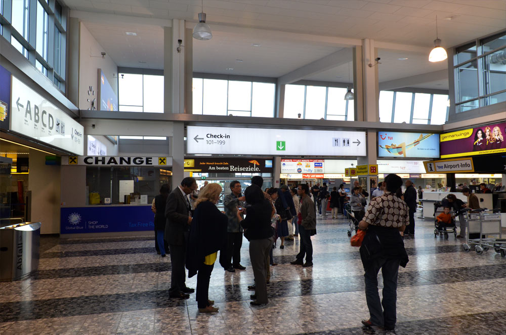
But even more irritating is the colour choice. The white signs appear to be designed to blend into their surroundings, in effect camouflaging the essential information one looks out for. The signs are lost against the white walls and ceilings that surround them, and fall into complete oblivion besides the bright, shouting advertisements they often have to compete against. The disguise is at its most startling when seen with the ceiling lights and windows, where the back-lit white information signs attain virtually the same colour and brightness values.
In addition to these fundamental issues, decisions on the micro level do not seem to be informed by function but by fancy, a characteristic that extends to the overall impression of the system. The pictograms are curiously blurred at the edges, use faded pastel colours and appear to employ a deliberate off-set of elements. Tragically, whilst clearly none of this contributes to improved functionality, it doesn’t even look good. Also the configuration of the individual signs and the information they display is just not quite right, as the surrounding space of type and pictograms is dull and not used to any favourable effect. Borders are either too tight or too big,with the surrounding white appearing as emptiness, rather than an actively used negative space.

The list of problems could go on further, including the much-hyped arrival display wall with illuminated LED characters that doesn’t work because the glass reflects so badly (see here) and the dark, illegible displays over the baggage belts.
Having observed all these issues, I couldn’t help but think it might be just my designer eyes that turned all picky and exaggerate the actual impact on the daily life of passengers. However, doing a quick online research, I soon discovered that this wasn’t the case. Indeed, the problems were much more severe for those whose eyesight is impaired. In a shattering verdict, the two Austrian associations for the visually impaired, the Hilfsgemeinschaft der Blinden und Sehschwachen Österreichs and the Österreichische Arbeitsgemeinschaft für Rehabilitation declared that about everything that could have gone wrong, did go wrong, and that the design of the new signage of the Vienna International Airport amounted to discrimination against the visually impaired. Indeed, the vice-chairman of the association, Dr. Elmar Fürst, who is researching the mobility of people with visual deficiencies at the University of Vienna, came to very similar conclusions as I described above.
And it must be said that these conclusions are frustrating. One of the most high-profile public development projects in recent years thus not only fails to deliver, despite the bloated budget and the hiring of big name designers, but conveys that “apparently design was valued more than functionality”.* Austria, where design consciousness has yet to develop widely, was served the exact opposite of the much praised ideals of our field. Rather than solving a problem – the incessantly repeated claim of our profession – in a big waste of money a dysfunctional system that suggests design is all about catchy effects was developed; already today the Vienna airport authority admits that more money needs to be spent to address the deficiencies of the signage. If anything this should serve as a reminder that the well executed craft is not as much about flashyness, but about appropriateness, precision and informed choices.
* “Offenbar wurde auch mehr Wert auf Design als auf Funktionalität gelegt”, from this article, retrieved 31 August 2012. Translation by the author.
Prologue
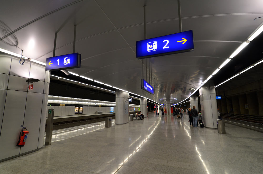
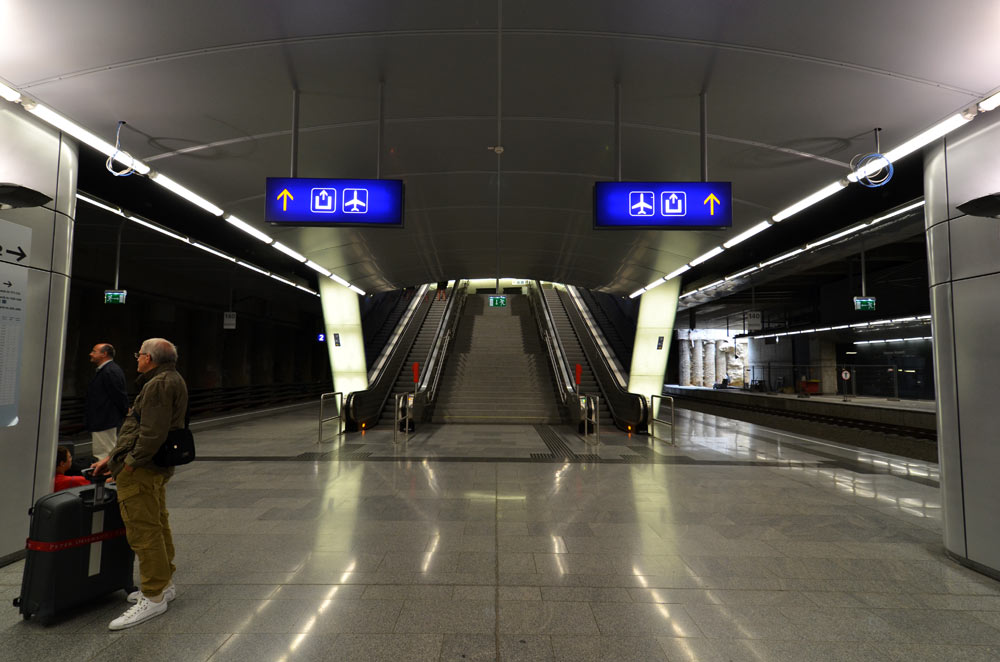
Continuing to the regular train station of the ÖBB (not the useless CAT) under the airport makes the difference between a successful and a dysfunctional wayshowing system ever more obvious. Here clarity and functionality clearly drive the system, and proven solutions are refined, updated and implemented in a way that pleases the eye without imposing its deliberate novelty. Frutiger Next, in white on dark blue backgrounds, with sharp, orange-coloured arrows may not be the newest of ‘ideas’, but it works like a charm. Incidentally, the authors of this signage system are hard to find and it takes me some looking around to discover that it was conceived by the Austrian-born industrial designer and emeritus professor at Hannover, Herbert Lindinger. The former HfG Ulm teacher developed this detailed signage scheme in collaboration with architect Alfred Ritter in the early 2000s. It is successfully implemented throughout most of Austria and in 2004 it received the iF communication award.
