Over the last months, three new publications arrived at my doorstep: the two annuals 365 Typo and the Year Book of Type 2, and the journal ‘LetterSeed’. While the two former books feature my Lammerhuber typeface for the Austrian photography publishing house, in ‘LetterSeed’ I was invited to write a paragraph about my multilingual typefaces published by the Rosetta typefoundry. The annuals probably don’t need introduction, notably the first edition of the 365 Typo book.
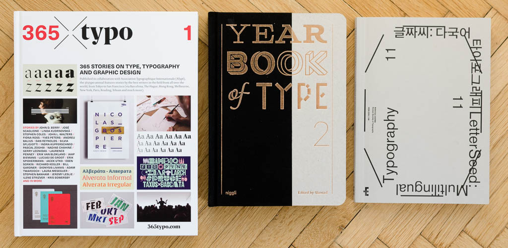
The brainchild of the former Typo magazine editor Linda Kudrnovská, published by the French étapes:editions, has been received with much acclaim. It is a milestone publication in scope and, as John Berry notes in his preface, ‘represents a new level of self-awareness in the typographic community.’ The 365 stories touch on all aspects of type and typographic design in 2015, and are testimony to an incredible editorial and managerial effort by the people behind the publication. It is a fantastic snapshot of this moment, documenting the variety of contributions and the high quality of work that sets the standards today. With a global perspective, and giving room for stories big and small, 365 Typo provides a representative and inclusive look at the world of type. Given the high standards and aspiration of the publication, it was, however, a disappointment to find that the printer messed-up one signature (at least in my copy). Among the contributions affected was unfortunately also Dr Fiona Ross’ account of the Murty Library, making this story entirely unreadable.
The Year Book of Type, created by the editorial team of the German magazine Slanted and published by the Swiss house Niggli, is similarly well known and loved in its second edition. As 365Typo, it is a heavy, hard-bound coffee-table book, with a cover featuring nice special finishing effects, emphasising the continued value and importance of print. In addition to the catalogue which presents select typefaces of 2014/15, a handful of in-depth articles add substance to the Year Book. The focus of the publication is on new type design, and the level of quality now commonly attained in both execution and concept is nothing short of impressive. With good standardised samples in a range of sizes and mock-up applications facing the specimen-setting provided by the designers, the Year Book does an excellent job in illustrating the state of the craft. The additional articles introduce the two type design courses at the ANRT in Nancy and the ZHdK in Zürich, an update on the new features of Glyphs 2 and two essays by Jakob Runge and Ole Schäfer – a bit random, but still a good addition of content.
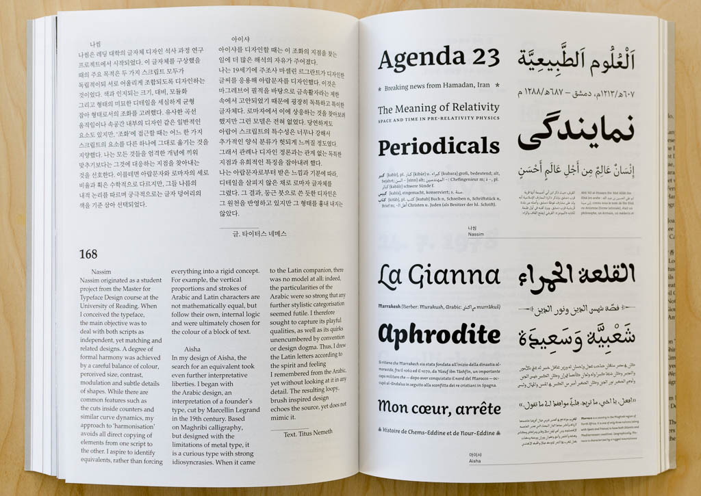
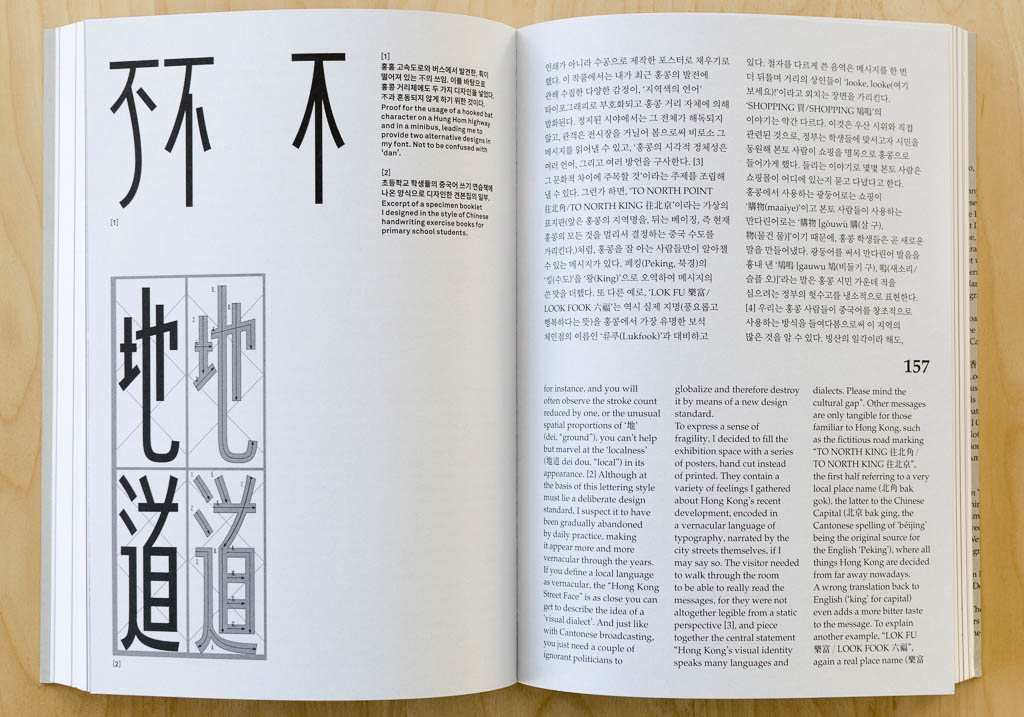
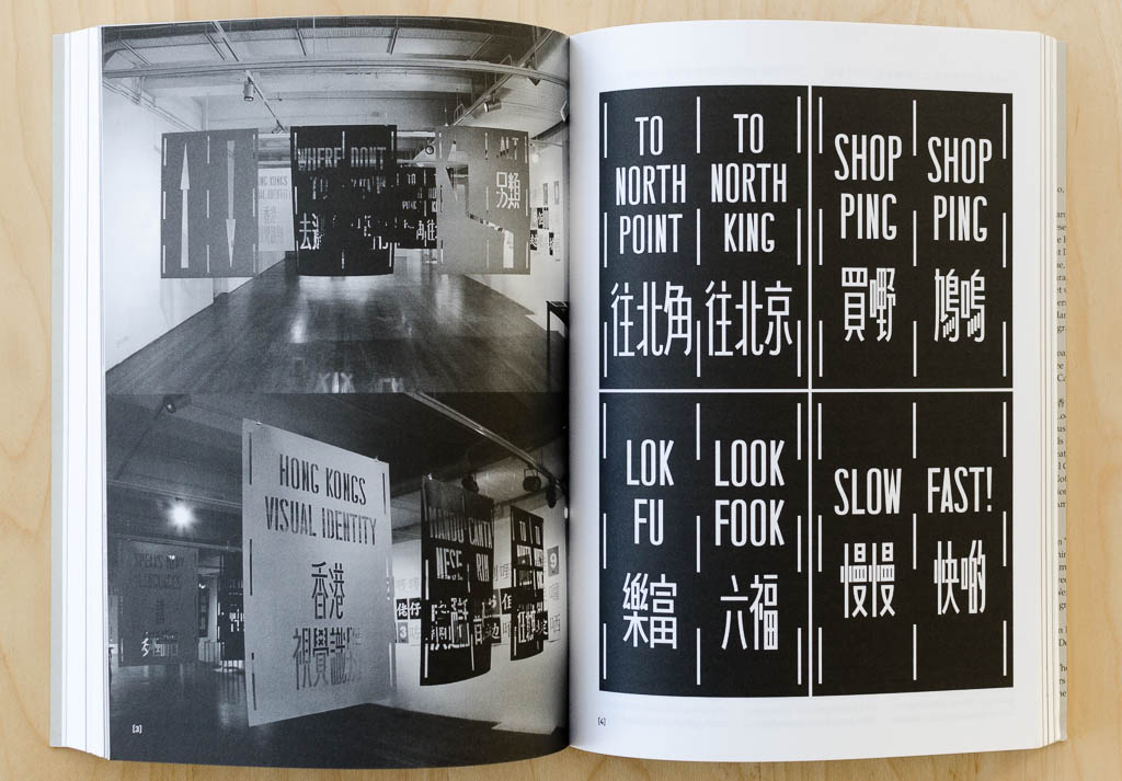
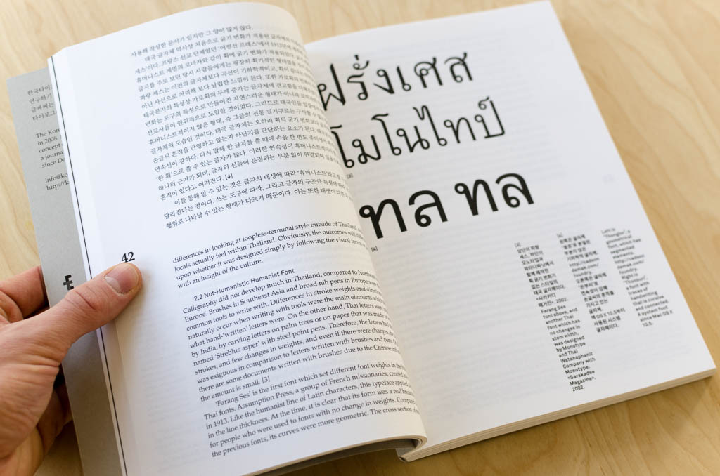
The third publication is not as prominently discussed as either of the annuals. LetterSeed is the journal of the Korean Society of Typography, and issue 1 of volume 7 was published this June, and wholly dedicated to ‘Multilingual Typography’. A nice octavo-sized book, soft-bound with an uncoated grey cover stock, the appearance is pleasantly understated. Over 275 pages, the journal is consistently bi-lingual Hangeul and English, and features a range of contributions that engage with the topic of multilingual typography. With substantial papers on issues of multi-script type design and typography, interviews of designers and the presentation of case studies, LetterSeed provides an ambitious and multi-faceted take on a design publication. It aspires to a scientific attitude (maybe overdoing it a little when providing the dates of receipt, review and acceptance of submitted papers) in typographic discourse, assembles truly global voices on the subject and presents them in a readable, no-nonsense package. LetterSeed is thus a journal any national typographic society could be proud of, and deserves a wider public.