Tafsīr al-ʿAyyāshī
Typography
Bi-lingual scholarly edition of a Qurʾān commentary
The Al-Mahdi Institute in Birmingham, UK, considers itself an open platform for critical Muslim scholarship. Its dedicated publishing house, the Al-Mahdi Press, aspires to disseminate research of the highest standard and show the rich cultural, social, and intellectual history of Shia Muslims. With this programme, Al-Mahdi intends to become the leading publisher of academic studies on Shiʿism in the western hemisphere, and to achieve this goal Al-Mahdi approached me to help them produce an edition of the Tafsīr al-ʿAyyāshī as a flagship publication that demonstrates its standing in the field.
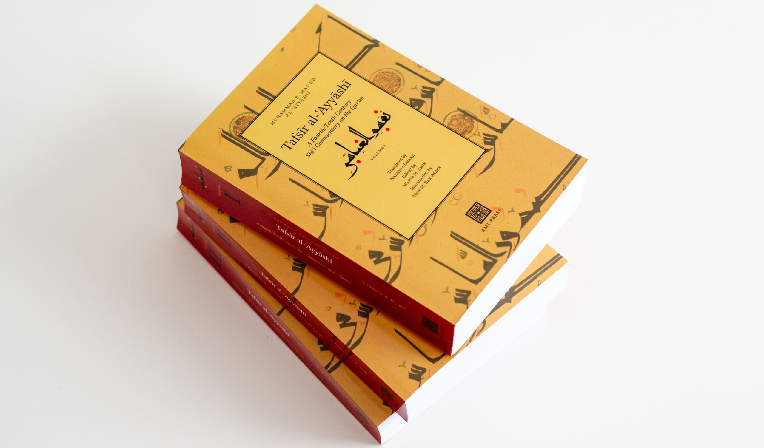
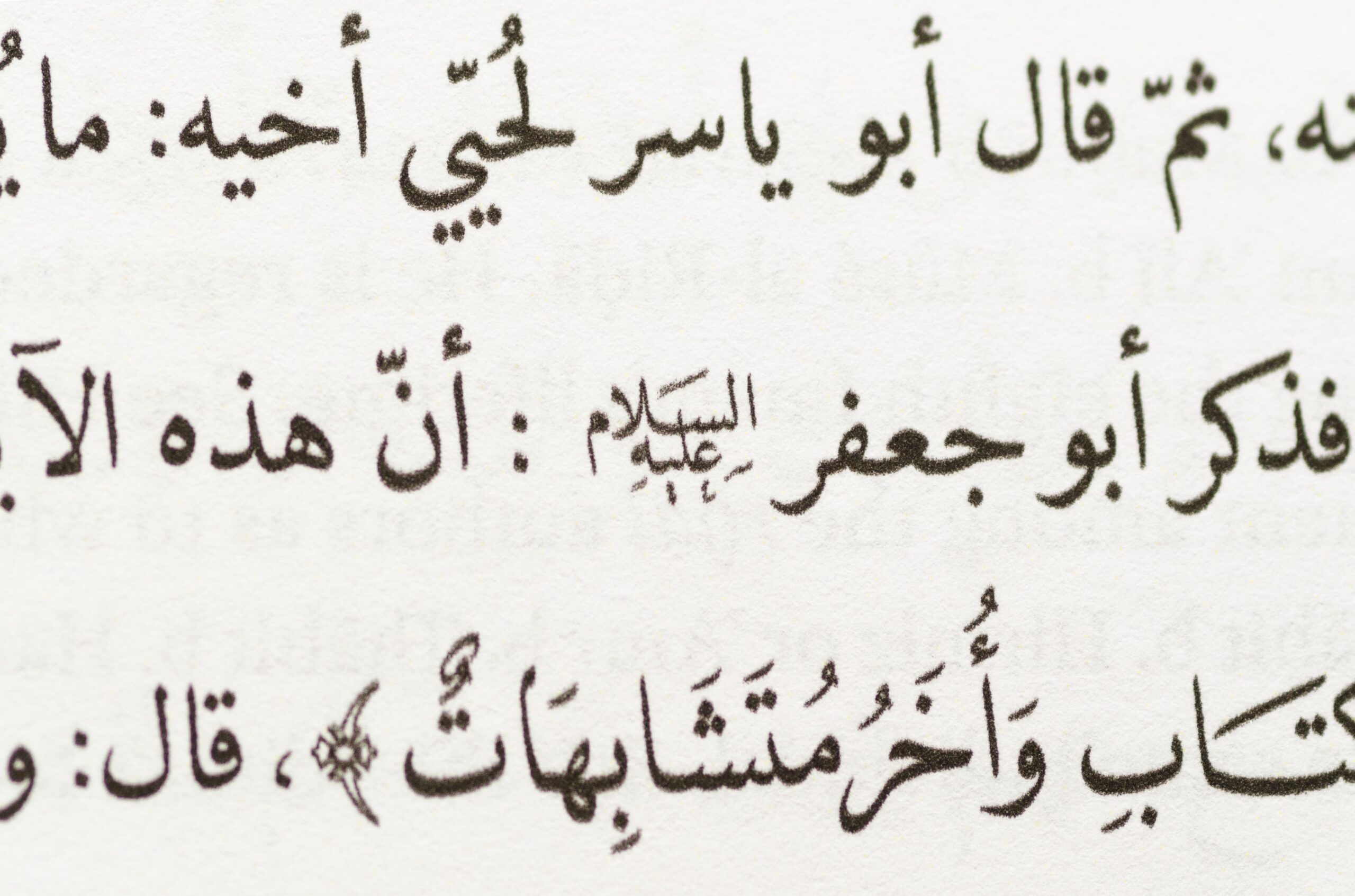
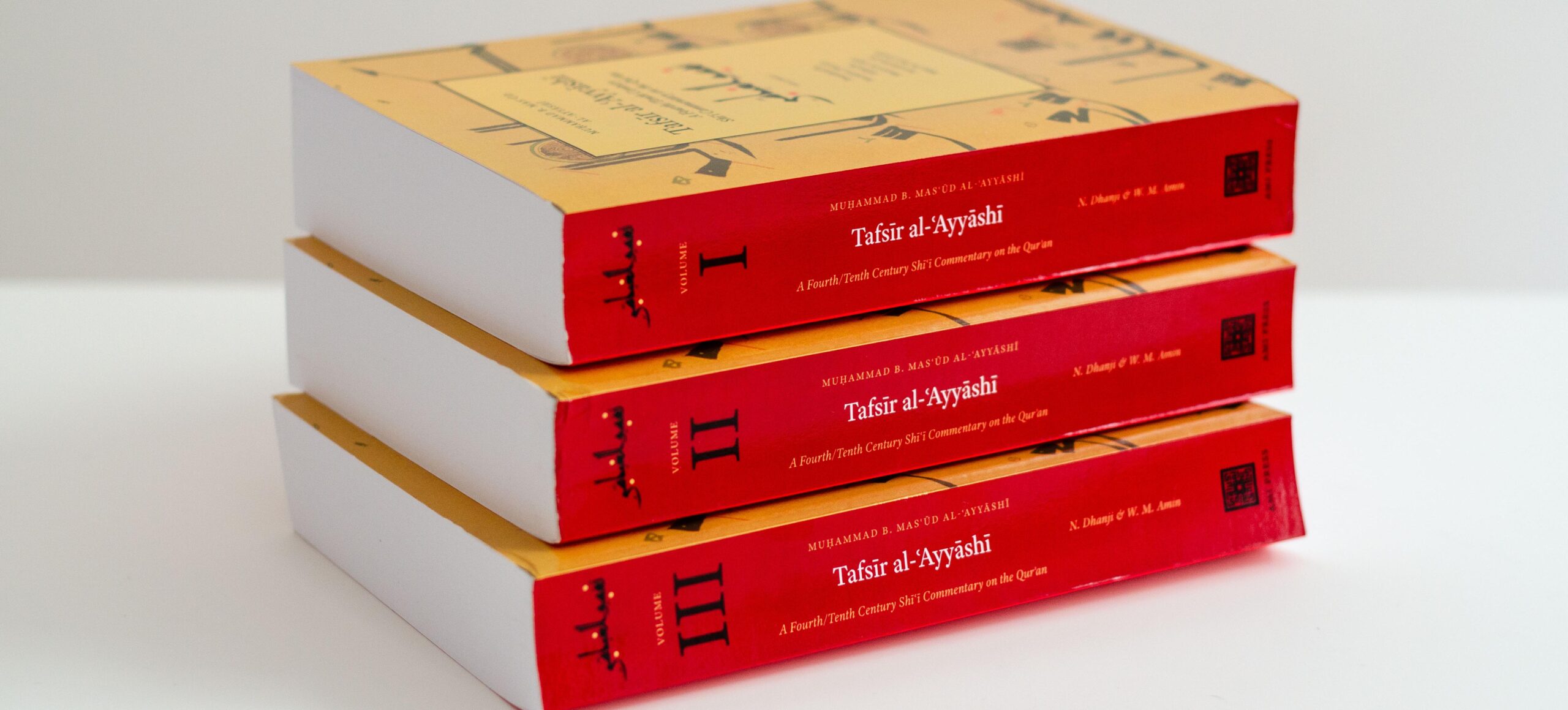
The text is an Imāmī Shīʿī Qurʾān exegesis written by Abū al-Naḍr Muḥammad b. Masʿūd al-ʿAyyāshī al-Sulamī al-Samarqandī, better known as al-ʿAyyāshī (العيّاشي d. 320 AH / 932 CE). The Al-Mahdi edition of the Tafsīr al-ʿAyyāshī is the first complete translation of the work, presented as a bi-lingual critical edition in Arabic and English.
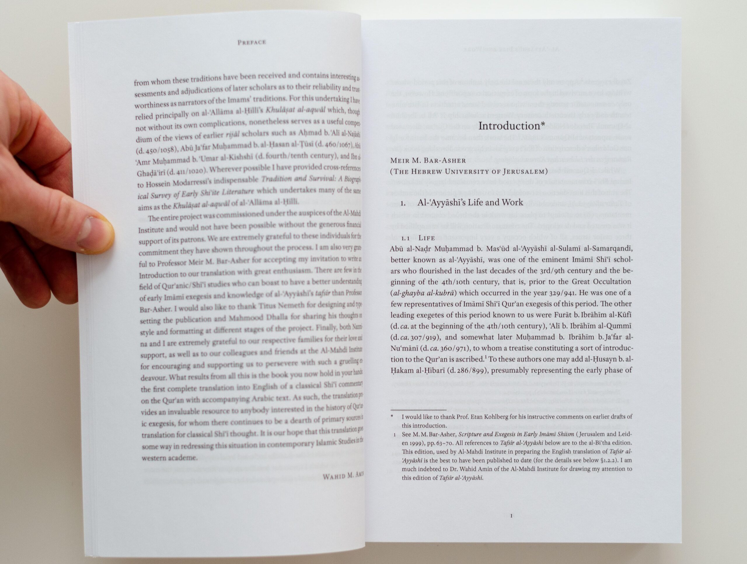
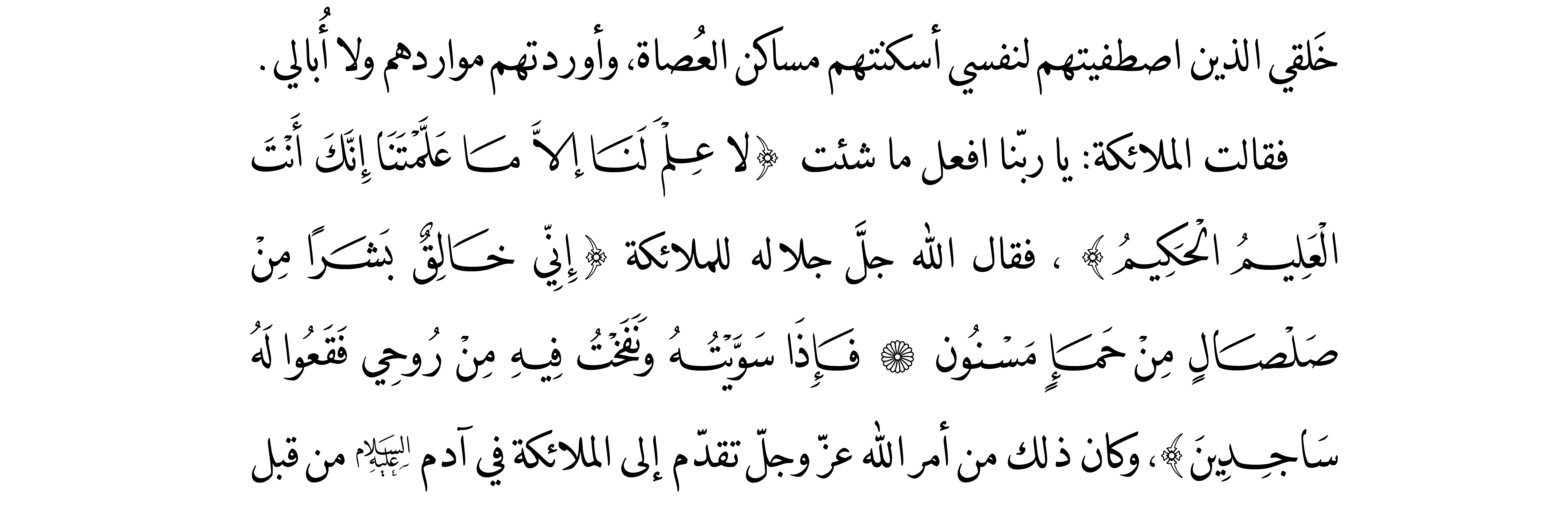
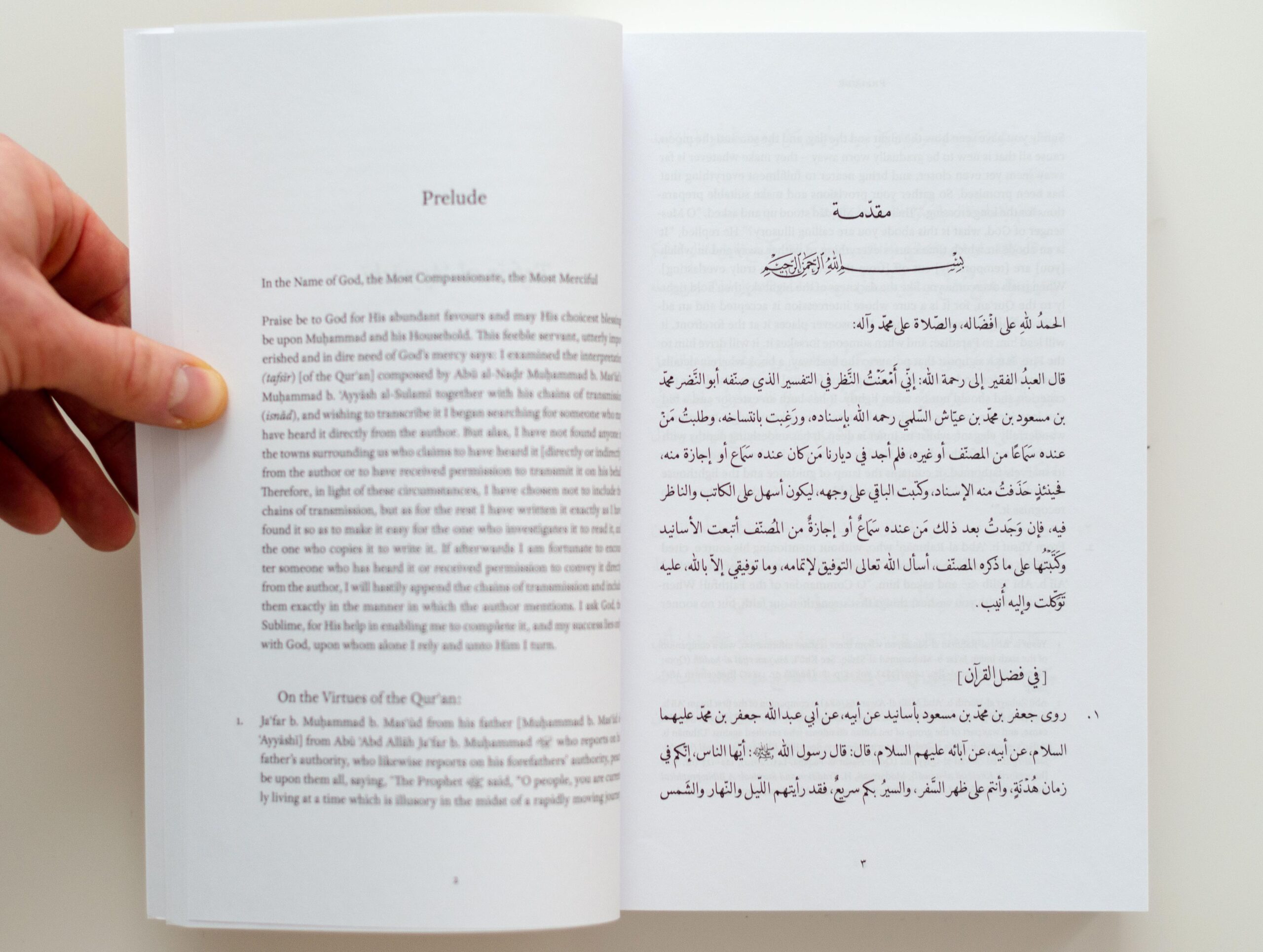
Building on my experience with similar cases of complex text typography, which included annotations in both languages, marginal numbers, cross-references, multiple indices etc., I employed DecoType’s Tasmeem for the Arabic parts and complemented it with Adobe Text for English texts. To distinguish between text categories of the Arabic, I employed the typeface Emiri for the main body and used Tasmeem’s Naskh to highlight textual differences. Taking advantage of elongations, stylistic variants, and swashes, the various text categories could be subtly emphasised. Furthermore, the text required special honorific signs that were not included in the fonts. For the sake of textual integrity and a consistent look, I resorted to drawing the missing signs in a in a way that echoes the style of the main typefaces and blends seamlessly into the overall appearance.
For the cover artwork, I sought visual references and aesthetics that matched the origin of the text – tenth century Iraq. As a center piece of the cover I made a piece of custom lettering in a calligraphic style that approximated era and region, a variation of kūfī that was popular in Iraq and Iran from the tenth to the thirteenth centuries. Whilst I proposed to complement it by purely abstract, geometric patterns from that time and place, the publisher insisted on a large background image, which was chosen not match the lettering style.
I was assisted in the typesetting and correction work by Doris Lang, which is gratefully acknowledged.