Frédéric Malle perfumes
Logo
Calligraphic wordmarks for exclusive fragrances

The Éditions de Parfums Frédéric Malle is no ordinary perfume label. The company, established in 2000, seeks to put their product – perfume – at the centre of their attention, in what it describes as ‘a simple “back to basics” ideology’. The inventors of perfumes – which are described as ‘the world’s greatest noses’ by the company – are given complete freedom in their creations and are all individually credited, making the company something akin to a publisher. A publisher of (distinctly upmarket, I hasten to add) fragrances which follow only one requirement: to “eliminate all that is superfluous or merely decorative”.
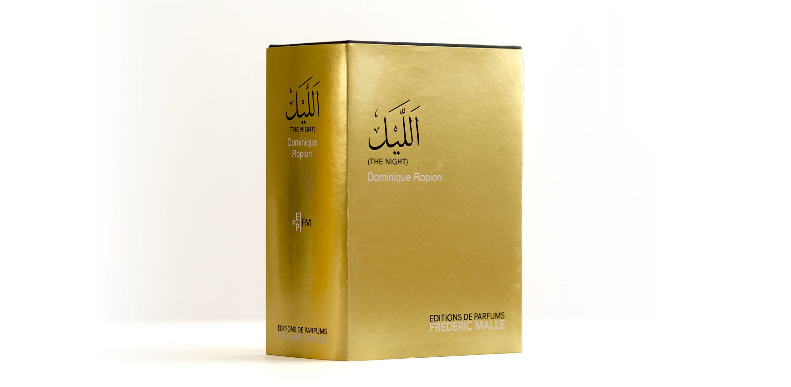
In April 2014, Éditions de Parfums contacted me to give them a hand in their upcoming entry into the Middle Eastern market. Dominique Ropion, one of its select noses, was creating a new and distinctly ‘Oriental’ scent, featuring a large proportion of Agarwood in its composition. The fragrance was to be called ‘The Night’ and Éditions de Parfums asked me to provide fitting rendering of the name in Arabic.
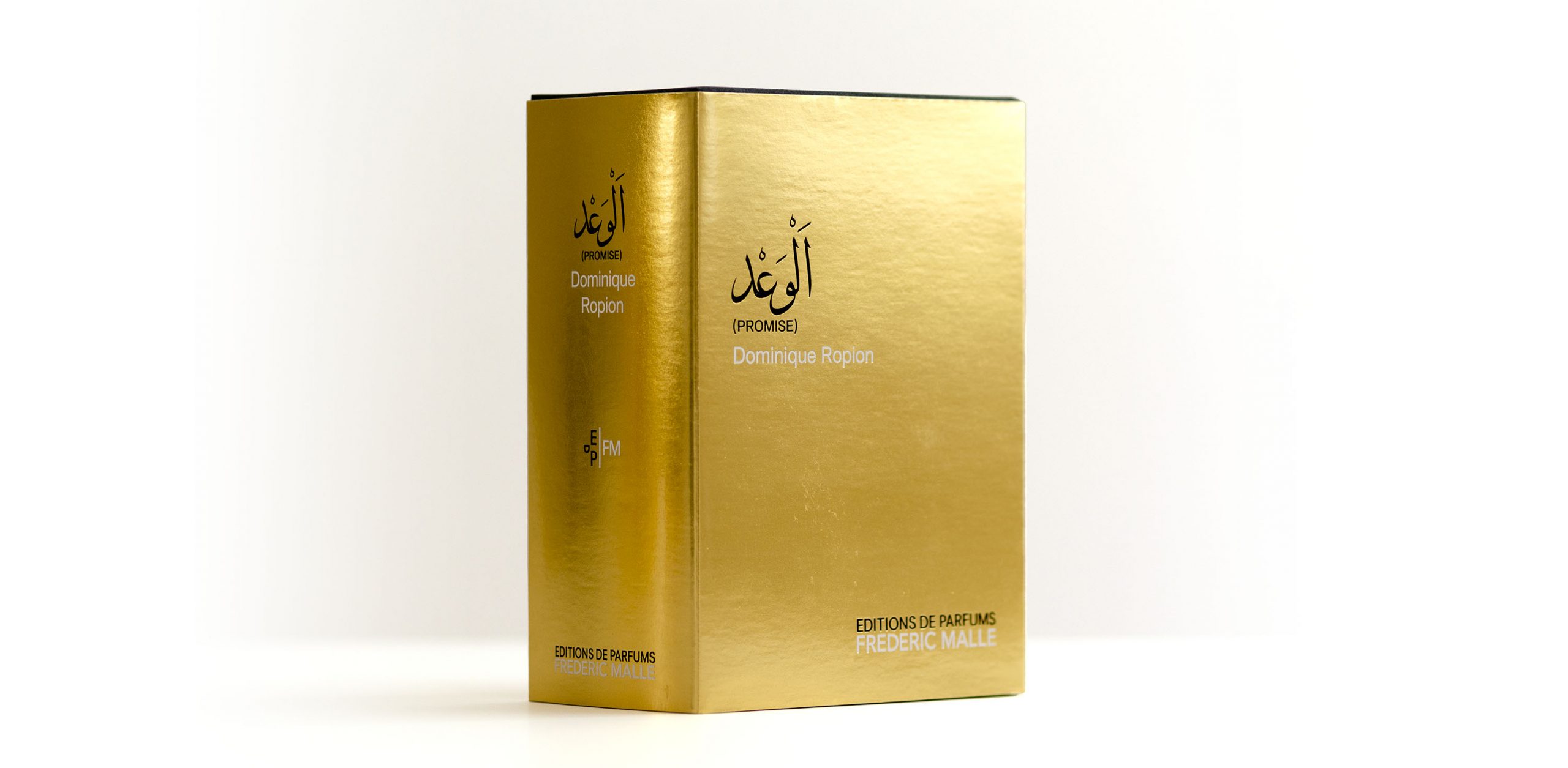
Given the product and its intended audience, I chose to base my lettering on the Thuluth calligraphic style, the elegant and decorative hand commonly used for large and ornamental applications. Its subtle details allowed for refinement, while its clarity and familiarity seemed an ideal match to the reduced language of Éditions de Parfums. Here, I had the pleasure to develop the lettering with ink on paper before moving to the digitisation, a welcome break from the numerical everyday routine.
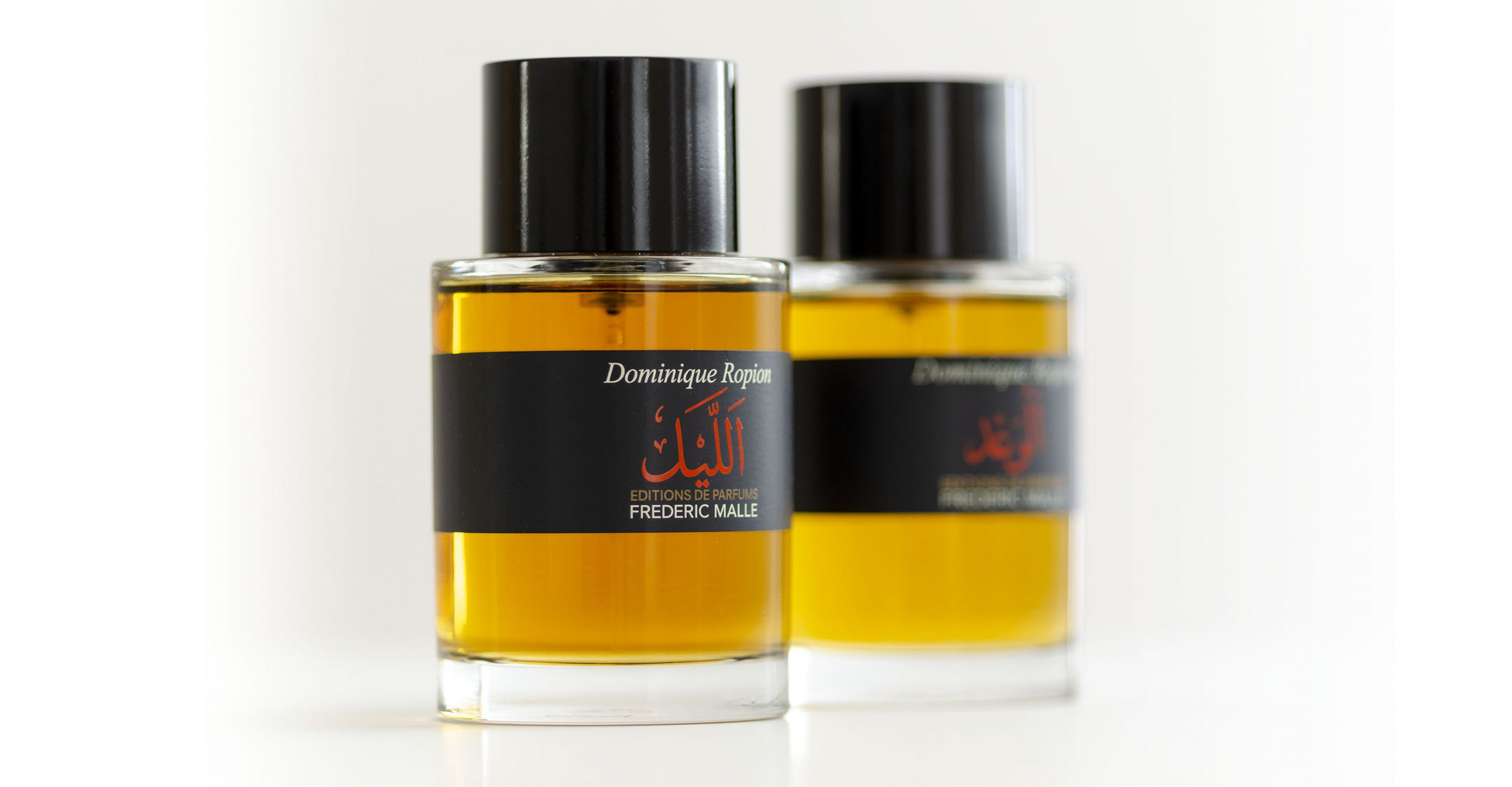
The final implementation was done in house by Éditions de Parfums, creating a grandiose golden packaging which suits the aspired exclusivity and works well with the Thuluth logo, as well as a flacon in which the calligraphic lettering nicely contrasts with the modernist aesthetics of the existing brand.
Photograph of flacon courtesy of Nouvelles Éditions de Parfums.


