This article was first published in Digital Fonts and Reading, 150–172, edited by Mary C. Dyson and Ching Y. Suen, Series on Language Processing, Pattern Recognition, and Intelligent Systems, vol. 1, (Singapore: World Scientific, 2016).
Introduction
In 1993 Charles Bigelow and Kris Holmes published ‘The design of a Unicode font’ [1993], an account of the development of the Lucida Sans Unicode typeface. Based on the older Lucida Sans design, the suffix ‘Unicode’ identified concept and aspiration of the new typeface, both rooted in the historical circumstances of its development.
With the maturing of personal computers in the early 1990s, the need for standards compliance and cross-platform compatibility became increasingly apparent, and the Unicode Standard was conceived as the universal encoding scheme that should facilitate seamless international document exchange.[1] Developed by leading technology companies in the USA, it was only concerned with the encoding of characters; its definitions deliberately eschewed questions of appearance and – at least in principle – made no assumptions about the form of text thus encoded. But as Unicode aspired to provide an encoding standard for all languages of the world, it raised novel questions about typographic design. Although fonts could now technically contain characters for scripts as diverse as Arabic and Thai, there had hardly been any consideration about the aesthetic, cultural and practical implications of such border-crossing typefaces. Whereas commercially successful Latin typefaces had been extended to Cyrillic and Greek, barely any designs ventured beyond the relative familiarity (and similarity) of these European scripts.
Against this background, and commissioned by Microsoft as a demonstration of the new technology, Bigelow and Holmes conceived Lucida Sans Unicode. Its express purpose was ‘to provide a standardized set of glyphs that could be used as a default core font for different operating systems and languages’ [Bigelow and Holmes, 1993, 291] in one, visually unified design. Bigelow and Holmes thus coined the term, and to a large extent also the concept of ‘harmonised design’.[2] As the type’s reference to Unicode implied, the aspiration for this design approach went well beyond the familiar realm of European scripts. When the first version of Lucida Sans Unicode was released in 1993, it contained Latin, Cyrillic, Greek and Hebrew characters, and the designers planned the addition of Arabic, Armenian, Devanagari and other Indian scripts.
With the advent of the World Wide Web in the mid-1990s, internationalisation of computing and document exchange rapidly rose to unprecedented importance, and so did typefaces which included characters for multiple scripts, often in one ‘harmonised design’. To be sure, not all, and likely a minority of such types would have consciously followed Lucida Sans Unicode as model, or the design principles articulated by Bigelow and Holmes.[3] Nonetheless, as the first of its kind, accompanied by a substantial descriptive text, Lucida Sans Unicode marks an historic milestone.
Twenty years on, this article proposes to revisit the notions first articulated by Bigelow and Holmes in the light of applied multi-script typography. In order to arrive at more general observations, most examples shown here predate the concept of harmonisation, providing a historically longer, and technologically more diverse perspective. Indeed, this perspective is part of the argument, which identifies connections between typographic technology and harmonised design. In line with this perspective is the emphasis on applied typography, rather than type design, as the argument is less about how type designers have addressed harmonisation, than where and whether harmonisation is a useful approach. In conclusion, the paper briefly reviews some aspects of design practices which evolved in the wake of Lucida Sans Unicode.
1.1 What is harmonisation in type design?
When Bigelow and Holmes began their Lucida Sans Unicode project, a unified design approach to a typeface covering multiple scripts was a novel proposition. Neither the conceptual, nor the practical implications and limits had been explored, and the two designers saw the project as a test bed for the concept of harmonisation. In their words, the idea meant ‘that the basic weights and alignments of disparate alphabets are regularized and tuned to work together, so that their inessential differences are minimized, but their essential, meaningful differences preserved.’ [Bigelow & Holmes, 1993, 292][4] According to Bigelow and Holmes, through this approach ‘the “noise” of insignificant design artefacts and historical accidents is filtered out, leaving the “signal” of significant character features amplified in comparison.’ Thus, it was assumed that the principle of harmonisation could benefit the transmission of information, or in other words improve legibility. Furthermore, practical and aesthetic considerations were advanced in favour of harmonisation: ‘Within a harmonized font, when text changes from Latin to Cyrillic, or from Greek to Hebrew, or when mathematical expressions or other symbols are introduced into text, the visual size, weight, and rhythm of the characters should not appear to change, should not jar or distract the reader, but the basic character shapes should nevertheless be distinctive and immediately recognizable.’
The case for harmonisation as seen by Bigelow and Holmes can therefore be divided into two parts: (1) the amplification of the ‘signal’ for improved legibility, and (2) the regularisation for aesthetic and practical reasons. The first part of the argument relies on the concept of ‘signal’ and ‘noise’, yet lacks further evidence or justification of the assumed advantages. Indeed, Bigelow and Holmes are conscious of the potential drawbacks in this approach, for ‘if [harmonisation] erases distinctive differences between scripts, it increases the possibility of confusion. In this view, the attempt to filter out unwanted noise may instead remove significant portions of the signal and distort what remains, thus decreasing the signal and adding noise.’ In other words, if signals which are different and ought to be different are rendered similarly, their distinctiveness becomes blurred. Indeed, one needs to look no further than to highly modular (and thus regular) typefaces such as ITC Avant Garde, to appreciate that generally speaking, more uniformity reduces, rather than improves the transmission of information. It follows, that the ‘signal’ and ‘noise’ argument does not provide a convincing rationale by itself, leaving the case for harmonisation primarily down to aesthetic and practical reasons.
Although the relevance of such considerations is undeniable for typography, perhaps the scientific semblance of the argument for harmonisation appears somewhat lessened from this perspective. If regularity, then, is at the heart of the argument, the concept is firmly embedded in typographic practice, and it may be useful to consider it within a wider historical frame. For as Robin Kinross points out, the visions of ‘universal’ types have ‘cropped up repeatedly, encouraged by the standardization that is inherent in printing.’ [Kinross, 2002a, 233]
1.2 Harmonisation as an extension of modernism
Regular, systematic and therefore rational approaches to typography and the making of type have a long history. Kinross’s Modern typography [2004], perhaps the most comprehensive discussion of the subject, traces the origins of rational and regulating approaches to typography back to the turn from the seventeenth to the eighteenth century and the making of the ‘romain du roi’ type. It was conceived at the drawing board, a feature which made James Mosley observe that it ‘can be claimed to mark the beginning of the concept of “type design”, a process in which the form of the alphabet for a printing type is determined independently of its means of production.’ [1997, 5] This approach to the making of type received much mockery from practitioners for its unworldly attitude, most clearly apparent in overly regularised letterforms and the improbable demands of precision from the punchcutter.[5]
Whereas the ‘romain du roi’ may be seen as an early precursor, notions of rationally planned type became a recurring theme only in the twentieth century. As Kinross reminds us [2002a], related concepts of ‘universal’ aspirations can be traced from the emergence of an articulate modernity in the 1920s and 30s, to the late 1960s, up to the beginnings of digital typography, often with explicit references to technological progress. Herbert Bayer’s alphabet for the Bauhaus (1926) and Jan Tschichold’s letterforms for Walter Porstmann’s new orthography (1930) were but the most radical instances of an approach to type design which was based on, and derived legitimacy from its rational, constructed and systematic principles. During the same era, one also finds the first successful application of similar, albeit tamed, ideas to a commercially viable type in Paul Renner’s Futura (1927). After the rupture of the Second World War, Adrian Frutiger’s milestone Univers (1954) stands out as perhaps the most convincing combination of aspirations to regularity, systematic planning, and conventional letterforms.[6] As is apparent from this incomplete listing, a history of rational approaches to type design would go well beyond the scope of this paper.[7] Yet even a superficial glance at the more recent history shows how resilient and ultimately successful notions of rational planning and systematisation in type design have become. From Frutiger’s Univers to Otl Eicher’s Rotis (1988), Lucas de Groot’s Thesis (1994) and Peter Biľak’s Greta Sans (2012), to name but a few widely celebrated examples, the elements which are considered part of a typeface (family) have been expanding in unprecedented ways and gave birth to what may be called type ‘systems’. Indeed, the trend of type-system-design, which assembles ever-more historically unrelated styles under an umbrella name and concept, may be seen as one of the defining characteristics of current practice.
Arguably, from this perspective Bigelow and Holmes’s notion of harmonised design, relating to the regularised treatment of different scripts, may be seen as part of a wider phenomenon. If the rationally planned, systematically organised and stylistically regularised design of type is a defining feature of contemporary practice, the extension of this trend to non-Latin scripts was bound to arise with increasing internationalisation. Indeed, for designers with western background and/or education, the reasoning for harmonisation would be compelling. It strikes a chord with an audience which has been accustomed and trained to think in grids and design systems, which has embraced typefaces for their perceived ‘universal’ and allegedly ‘neutral’ qualities, and which, by and large, has been anchored deeply in Latin-centric typography.
With the benefit of the historical perspective, it even appears as if the case for harmonisation was perceived as self-evident, for little justification was provided in its favour. Bigelow and Holmes’s summary that ‘harmonization seems like a desirable goal’ [1993, 292] may be applicable in the specific context of the Lucida Sans Unicode project, but calls for further scrutiny if taken as a more general design principle. In order to better identify the reasons for the apparent need of harmonised design, it may be useful to consider different typographic scenarios and query the applicability of the notions proposed by Bigelow and Holmes.
1.3 Where do we need harmonised type?
For the purpose of this discussion, one can distinguish two broad categories of multilingual texts in which two or more different scripts are likely to appear together. In the first category, the bulk of the text is written in one script and the other script(s) only appears in a complementary role, as in the archetypal case of the bilingual dictionary. Other examples of this category, which for the present discussion are called ‘mixed settings’, can be found in related kinds of documents such as those created for language training, linguistic analysis and generally scholarly texts.
The second suggested category, despite its acknowledged breadth, assembles all forms of parallel translations in which, at least in principle, all languages and scripts should be of equal standing and relevance. From literary texts to public signage, instruction manuals, package inserts and government forms, a range of vastly different kinds of texts fall into this definition; and notwithstanding their diversity, it is fair to assume that where texts have been translated and are presented together, the readers of all languages are considered as being equally important. Thus, it should follow that the presentation of their respective languages in type is also given equal importance.
1.3.1 Mixed settings
It is easy to think of practical constraints of documents with mixed settings which can be eased by harmonised type. Especially in cases where economical setting is at a premium such as dictionaries, more regularisation facilitates space efficient typography. Indeed, the different use of Cartesian space by different scripts appears as one of the most challenging factors in all kinds of multi-script settings.
The letterforms of Arabic, for example, have distinctive features which are distributed over the entire y-axis, making any regularised horizontal alignments difficult. As letters fuse with other letters according to their context, the positions of distinctive features frequently change. Moreover, a broader range of proportions is typical of the Arabic script, with some letterforms being tall and narrow, others flat and wide; critically, not only the proportions are diverse, but also the respective sizes and it is not uncommon for one letterform to appear many times as big as another. As a result, the Arabic alphabet is often described (at least by western observers) as appearing smaller than its Latin counterpart, for if the biggest Arabic letters are equalised with the biggest Latin letters, the small Arabic letterforms are diminishing. So where both scripts appear in the same line of text, obvious practical problems arise for the typographer: if one uses an Arabic body size equal to the Latin, it looks small; but if a larger body is chosen so that the Arabic appears similar in size, alignment and setting of the matter are more complicated.
Here, one is reminded of Anthony Froshaug’s dictum that ‘typography is a grid’ [2000b], which concisely (albeit unwittingly) summarises both, the primary difficulty of multi-script composition, and the fundamental Latin bias of typography. For as the reader would have gauged by now, the principal reaction to the conundrum of diverse uses of vertical space has rarely been to treat every script according to its own characteristics. More common is the attempt to standardise the proportions in a way more akin to those of the Latin script – as indeed proposed by harmonised design. Thus, letterforms, irrespective of their size and proportions (not to mention the script’s morphographic rules which define how letters are assembled in words and sentences), are modified according to the basic module of the typographic grid: a rectangle whose regular height allows the assembly of letters into lines and paragraphs. The advantages of such an approach for the typographer (or historically the compositor) are readily apparent, and establish the link to the precursors of harmonisation. Standardised type sizes – think of the ‘romain du roi’ – with regularised faces enable the mixing of different scripts with insouciance, and therefore greatly facilitate composition while economising space. In this perspective, the case for harmonisation appears as one strongly informed by practical constraints and needs.[8]
Despite the argument’s apparent seductive power, a review of actual practice reveals that the regularity and uniformity it aspires to has not always and everywhere been equally coveted.[9]
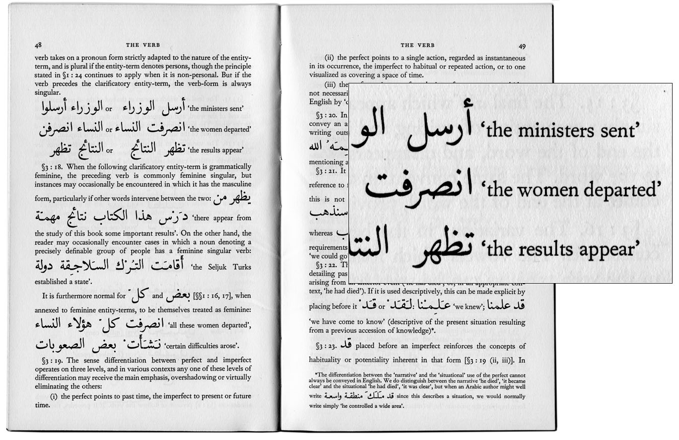
A striking example for a different approach can be found in A.F.L. Beeston’s Written Arabic (figure 1), a concise language teaching booklet published in 1968 by Cambridge University Press, and printed by Stephen Austin and Sons in Hertford, UK. Here, a clear typographic editorial voice is apparent, prioritising function and pedagogic usefulness in an uncompromising way. The Arabic type follows conventional proportions and styling, suitably so for a document aimed at beginners who are likely to be most familiar with handwritten letterforms. The large size used for the script tables at the beginning of the text facilitates easy recognition of letters and deciphering of words, and demonstrates with great clarity the joining of letters. Yet the emphasis on the usability for the reader is most apparent in the main text. The interspersed Arabic words are set in a size of unapologetic irreverence for the Latin type, boldly emphasising convenience for the reader (a novice language learner), over abstract design aspirations. Half-way through the booklet the size of the Arabic is drastically reduced, consistent with the functional attitude, as by now the reader can be expected to be more familiar with the script.
It goes without saying that available typefaces and sizes would have influenced the typographic choices of Written Arabic, and that more finely graded types could have improved the appearance of some paragraphs. Nonetheless, its approach to multi-script typography remains refreshingly unencumbered by the Systemzwang[10] of regularised design systems, while producing a highly readable and at times attractive document. Moreover, Written Arabic is not unique in its approach.
Another instructive example is found in The M.E.C.A.S. Grammar of Modern Literary Arabic,[11] published in 1965 by Khayats in Beirut, Lebanon, and printed by the Heidelberg Press in the same city (figure 2).
As in the setting of Written Arabic, there is little apparent concern for regularity, and there is no attempt to disguise the differences between Arabic and Latin. Both scripts are given their appropriate size and space. Yet whereas in Written Arabic the setting does not suggest to have been planned according to the text’s characteristics, and the Arabic sometimes sits awkwardly within the Latin text, the M.E.C.A.S. Grammar exhibits a more balanced composition. Here, undoubtedly due to the place of publication where mixed Arabic and Latin texts are common, the combination of the scripts appears to have been planned from the outset. Because the English text is set with ample interlinear space, it allows for the comfortable insertion of Arabic words and phrases without distractive changes of density. The Latin type size is pleasant for continuous reading, whereas the Arabic’s larger size aides the quick perception of letters and small vowel marks for learners. Overall, the M.E.C.A.S. Grammar’s generous approach to multi-script composition achieves a high level of clarity, readability and elegance, making it an exemplary publication of the genre.
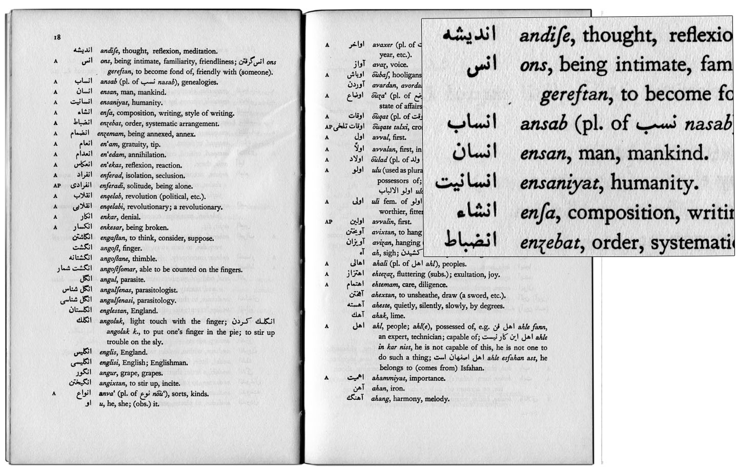
To return to the archetypal document of category one, also in bilingual dictionaries, despite their specific constraints, the successful combination of different types without apparent harmonisation is common. Indeed, it is here that the functionality of non-harmonised types should least surprise, for it is the dictionary where typographic difference is a central tenet of the design. The Persian Vocabulary by A.K.S. Lambton, first published and printed in 1954 by Cambridge University Press, is but one example to illustrate the case (figure 3). Composed in hot-metal with Monotype Series 507, the Persian lacks elegance, yet its distinctiveness to the Latin type is a desirable quality in a dictionary. Here, as in most typographic scenarios, text categories which have different functions should be visually demarcated. Notions of hierarchy, degrees of emphasis and textual-navigation all depend on typographic differentiation. Indeed, a large part of the typographer’s job is to visualise the unlikeness of the many diverse elements a text may contain, to design difference by the judicious application of unmistakably distinct typographic treatments to the text. Against this background, the applicability of harmonisation to type used in mixed settings could be questioned for its inherent risk of blurring differences.
1.3.2 Parallel settings
In parallel settings, the rigidity of the typographic grid is much alleviated. The technical constraints of mixed settings which prescribe regularity along the y-axis do not apply, providing greater flexibility in the treatment of different scripts.[12] This flexibility is apparent from the first complex typographic multi-script documents, the polyglot bibles. Their makeup demonstrates how characteristics of different languages are better served by typographic flexibility, than rigid regularity.
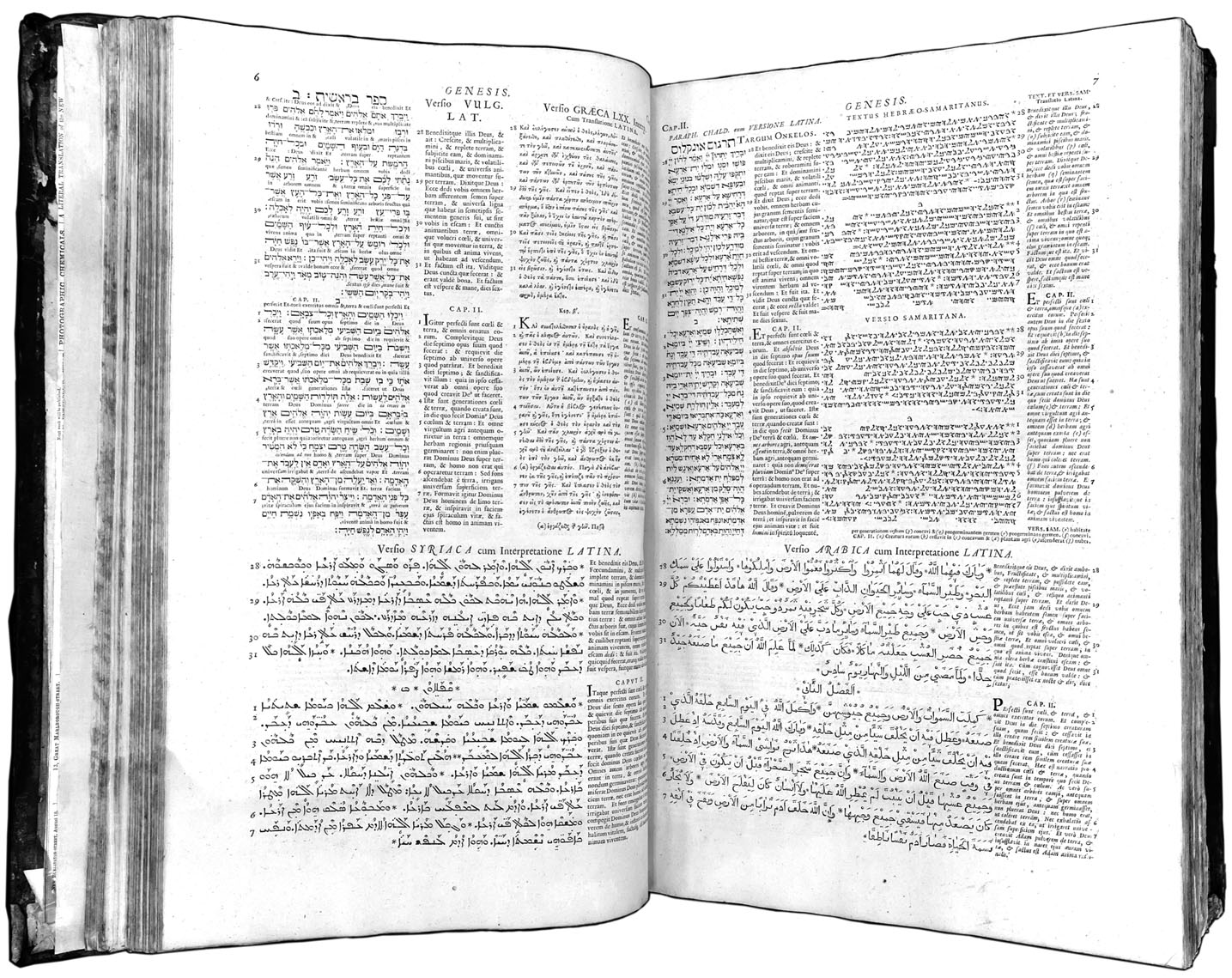
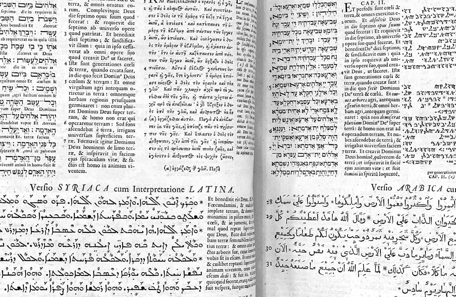
A multilingual tour de force like Thomas Roycroft’s 1650s polyglot bible, which assembles nine languages in one parallel text edition, is a case in point (figure 4, above). Here, no uniform baseline grid is possible, as the different founts are all cast on different bodies. Arabic, Persian and Syriac are set with noticeably greater interlinear space than Amharic, Greek, Hebrew and Latin, in order to accommodate for the vowels above and below the letters (figure 5, below).[13] Thus, the sizes of the text areas are chosen so as to maintain the synchronisation between languages, a difficult task which is remarkably well handled. Occasionally the width and arrangement of columns also changes, showing flexibility from spread to spread to accommodate for changing text lengths. To be sure, this does not mean that the composition of every language is ideal, as much depends on the quality of the type and the skill of the printer, which would have varied from script to script.[14] Yet the approach of these progenitors of all multi-script typography shows that parallel settings do not necessarily require regularity, but may benefit from flexibility.
Indeed, the different lengths of languages make irregular settings in multi-script editions more plausible. Arabic text, for example, tends to be shorter than its English equivalent. It follows, that although the characteristics of the script call for greater interlinear space, and possibly a larger body size, the script’s efficiency along the x-axis balances the overall space requirements. Thus, bilingual editions of Arabic and English may actually achieve better text synchronisation from page to page if type size and interlinear space are not identical, but chosen to the best effect of each script.
Parallel settings that follow a similar approach are common wherever emphasis is laid on the smoothest reading experience, rather than design dogma. The iconic Loeb Classical Library, first published by Harvard University Press in 1912, is but one of the most celebrated cases – albeit only for the relatively unproblematic pairing of Greek and Latin.[15]
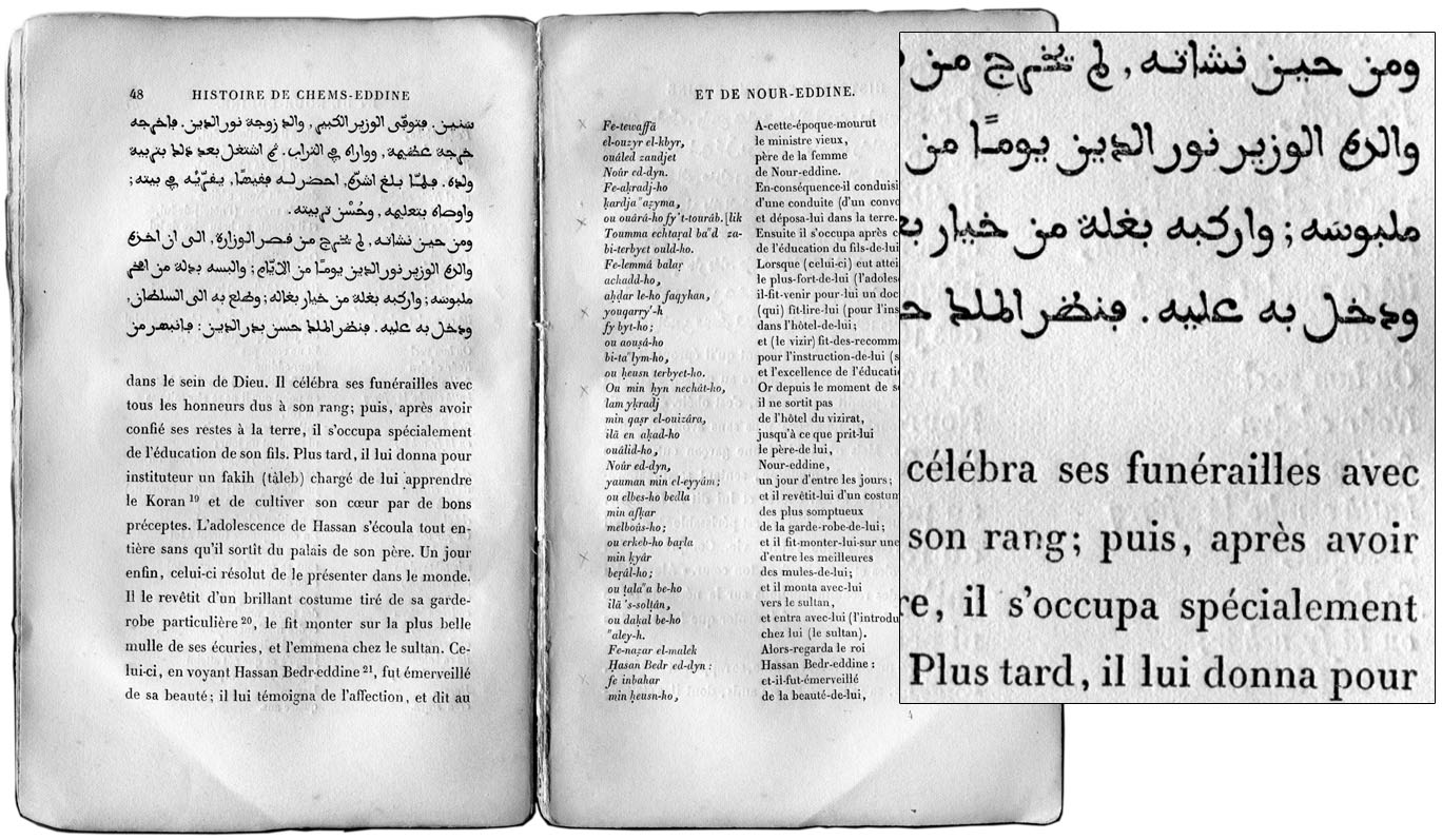
A convincing Arabic-French example from the nineteenth century is found in the Histoire de Chems-Eddine et de Nour-Eddine, (figure 6) first published by Hachette in Paris in 1853, and printed at the Imprimerie Impériale. Its spreads are organised into four text blocks of different proportions, accommodating the original Arabic (in Maghrebi orthography), a French translation, a literal translation as well as a transliteration. With simple means every text category is differentiated, maintaining proportions and spatial relationships that combine to a harmonious whole. The individual type choices merit particular attention. The original text is set in an Arabic type with stylistic references to Maghrebi scribal culture; the French translation and, on a smaller body, the literal translation, are set in a typical contemporary roman type; and the transliteration is distinguished with an italic fount. These choices suggest a search for appropriateness and authenticity within the cultural framework of each respective language, rather than a uniform, regularised aesthetic for all. Thus, the type used for the French translation makes no attempt to imitate the Arabic, and vice-versa, there is no apparent dilution of the characteristics of the Arabic script to conform to those of Latin.[16] Indeed, as the reading of each text category is bound to differ, the question as to why they should be stylistically regularised begs to be asked.
Similar cases abound before the 1980s and the digital revolution. Ironically, with hindsight it appears as if analogue typographic processes sometimes provided more flexibility, and were less prone to Systemzwang than the computer-based systems current for the last thirty to forty years. Even in the restrictive (and today little-understood) technology of hot-metal composition, exemplary cases of multi-script typography can be found. Some publications coming from Lebanon in the period from independence (1943) to civil war (1975), its short-lived golden era of Arabic printing, testify to the quality pre-digital composition could achieve.
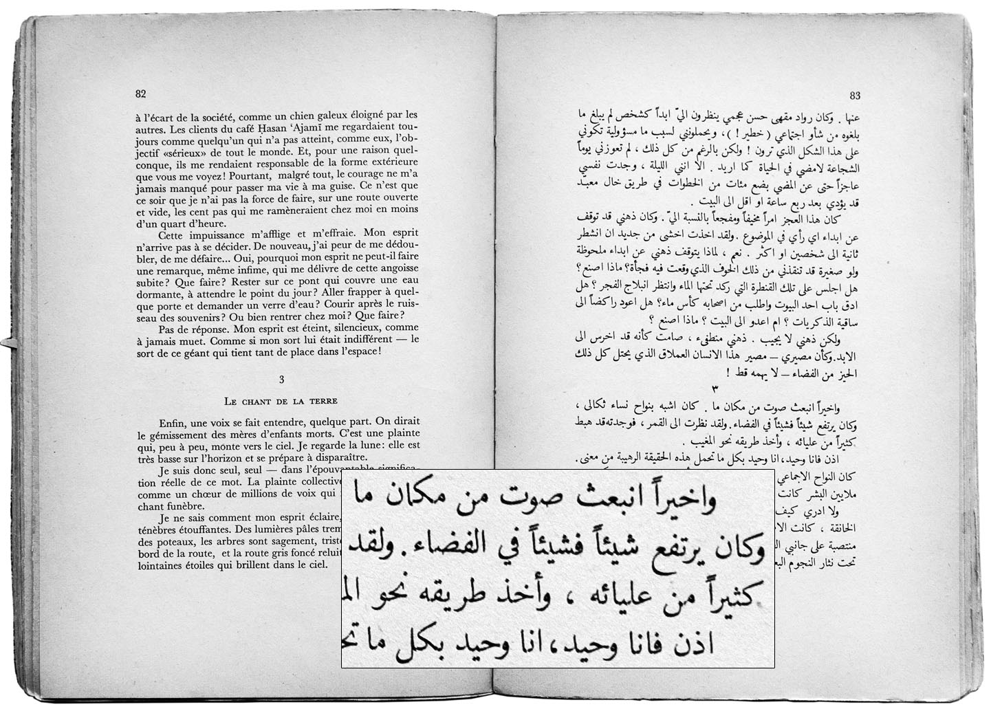
Like the aforementioned M.E.C.A.S. Grammar, the Anthologie bilingue de la littérature arabe contemporaine illustrates this point (figure 7). A collection of Arabic literature with accompanying French translations, this volume was published and printed in 1961 by the Imprimérie Catholique in Beirut. The book is composed in the original hot-metal version of Monotype Series 549, a type that became genre-defining for high-quality Arabic book typography, and a Latin type of no lesser pedigree: Monotype Baskerville. For both languages, thus, a type of proven quality was chosen and set in the point size and with the appropriate leading required for the parallel setting;[17] consistent with this approach is the flexibility of the type area, which is allowed to vary slightly in height for language synchronisation. The resulting book provides an agreeable reading experience for each language on its own terms, with indubitable aesthetic qualities.
Although only a small selection (which could easily be expanded on), the above examples demonstrate that parallel editions do not require, and may in fact gain from thoughtful type mixing, rather than regularity as sought in harmonised design. Moreover, the natural contrast of different scripts not only offers aesthetic qualities, but may, when handled sensibly, provide tangible practical advantages in composition. In document design, the case for harmonised type design relies, thus, on a strong aesthetic preference for stylistic homogeneity.
Yet, as the category of parallel settings is defined in the present context, it entails numerous other applications with requirements different to those for continuous reading. Often, these uses are more recent and have no historical examples to draw from. In the following section, a brief glance beyond document design is therefore combined with some considerations of current practice in multi-script typography and type design.
1.4 Other applications and current practice
International airports provide a typical case of multi-script typography outside the domain of document design.[18] Especially in the recently emerged travel hubs in the Arabian Gulf and Asia, signage frequently incorporates two or more scripts.[19]
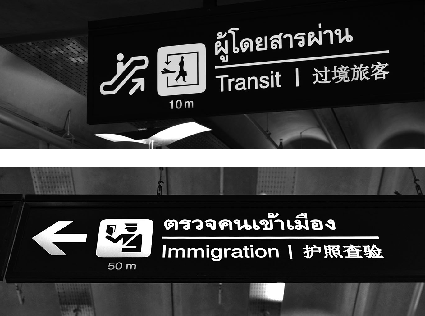
Bangkok’s Suvarnabhumi airport (figure 8) provides an interesting case, with many signs featuring Chinese, Latin and Thai scripts.[20] Their typographic treatment is instructive, for here scripts with fundamentally different characteristics meet: a bicameral alphabet, a unicameral abugida, and a logographic script are combined in what appears as a harmonious, yet not overly regularised configuration. Thai, the primary language, is set above Chinese and Latin, with ample space for vowels and tone marks above and below the characters. Its apparent size is slightly larger than the two additional scripts (justifiably so in Thailand), yet does not overpower Chinese and Latin which comfortably share the same vertical space without undue distortion of their respective proportions. Stylistically, Latin and Thai are set in matching low-contrast types, with the Chinese somewhat set apart by its more modulated design, yet to no apparent functional disadvantage. Potentially, here a harmonised design approach could contribute to a more balanced image, aligning the Chinese stylistically more closely with the two other scripts. Conversely, in a harmonised type vertical proportions would likely be more restrained, and thus run counter to the successful use of space achieved through type mixing in this example.
Unfortunately, the successful examples of parallel settings in signage are in the minority. Especially in the Gulf states, where multi-script settings are the norm, the quantity of poor examples far outnumbers the convincing cases.
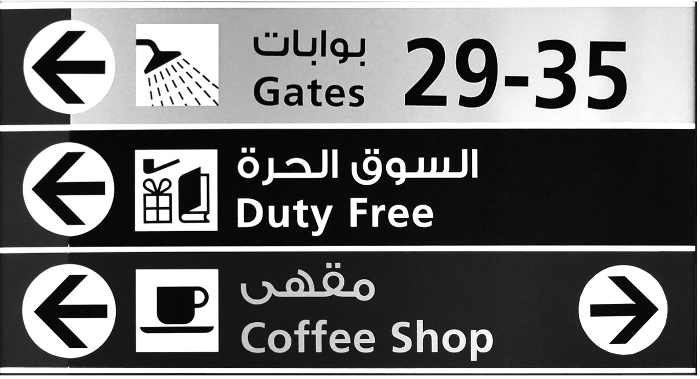
At Abu Dhabi airport (figure 9), a custom Arabic typeface designed to imitate some characteristics of Frutiger is representative for an approach to multi-script design which can be summarised under the term ‘Latinisation’.[21] Here, proportions and characteristics of the Latin script are imposed on Arabic letterforms to the detriment of their legibility. Elements below the baseline, which are significantly more frequent and important in Arabic than in Latin, are diminished to match the descender depth, whereas tall letterforms are reduced, artificially creating an x-height where there is none in the Arabic script.
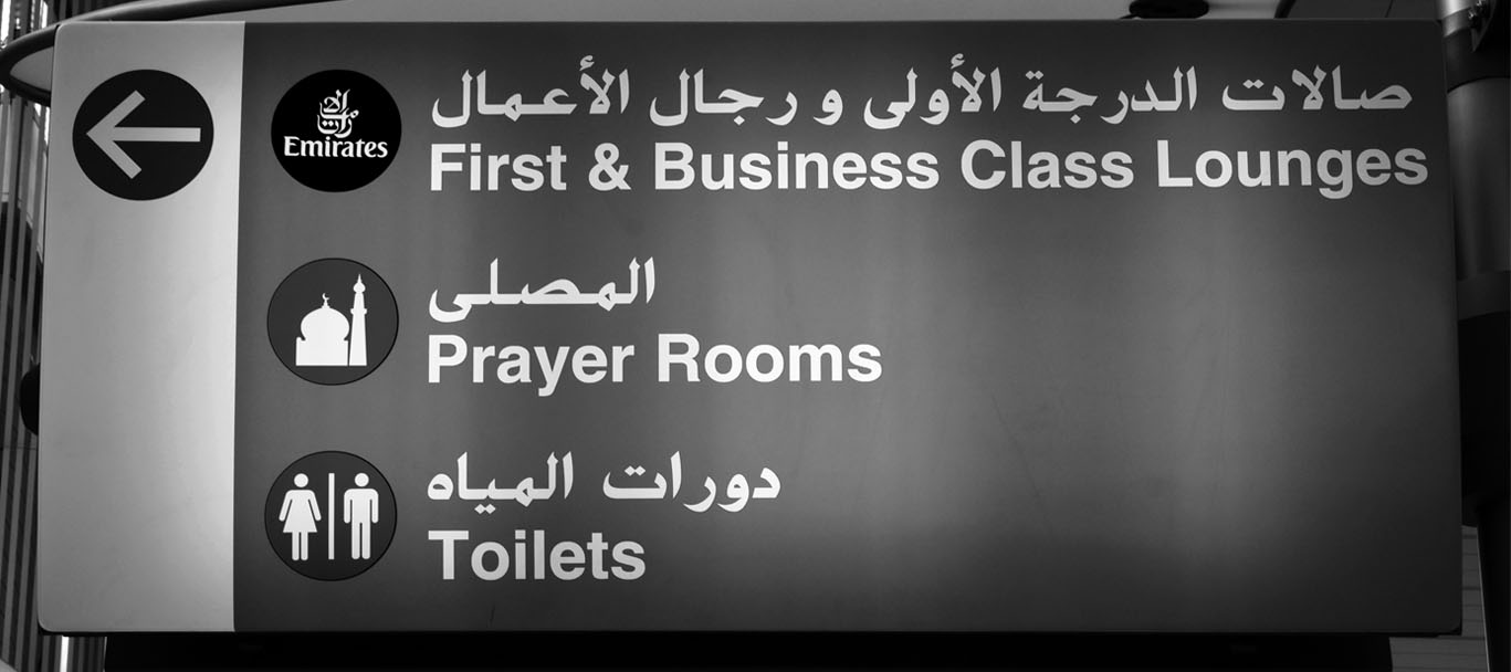
If in Abu Dhabi design dogma arguably overrides functionality, by contrast the concept for the signage at Dubai’s airport is not readily apparent (figure 10). Advertisers Naskh bold, a high-contrast Letraset rub-down lettering design conceived by Mourad and Arlette Boutros in the late 1970s, is paired with bold Helvetica, suggesting little concern for stylistic compatibility or legibility. Perhaps, it may also indicate uncritical reliance on marketing claims, for according to Boutros, Advertisers Naskh was designed ‘to work in perfect harmony with Helvetica’, and that ‘the addition of linked straight lines to match the Latin baseline level is designed to achieve harmony when used alongside a Latin equivalent typeface such as Garamond, Palatino and Times Roman’ [Boutros, 2014]. Here, one is strikingly reminded of the flexibility of harmonisation as a concept for commercial exploitation, and its success on this level is undeniable.
Indeed, in recent years, harmonised design has been adopted and promoted most vocally for marketing purposes, albeit rarely with reference to this term, or its originators. Foundries have recognised the potential market for non-Latin variants of their best-selling typefaces, and released a flurry of so-called ‘extensions’ to existing Latin designs. Din, Frutiger, Helvetica, Palatino and Univers, just to name the most prolific company in this context, Monotype, all received their Arabic version, borrowing stylistic properties and – importantly – brand-recognisability from the Latin model. Whether a non-Latin extension to a design carrying decades worth of use can truly embody the same notions and associations in a different typographic culture is open to debate, although this question is rarely raised. How such extensions are undertaken is another consideration which merits attention.
When Bigelow and Holmes proposed the concept of harmonised design, they were acutely aware of the potential for homogenisation it entailed. They tried to avoid it by a conscious and deliberate attempt to learn and embrace ‘the basic rules of each non-Latin alphabet on its own terms’ [Bigelow & Holmes, 1993, 299].[22] Thus, regularisation was attempted, but only up to a certain point which, according to the knowledge and sensibilities of the designers, stopped short of compromising the integrity of the script for ‘Latinate notions’.[23] Bigelow and Holmes drew the line in the design of the Hebrew characters thus: rather than imposing a ‘strict Latin model’, they tested different alignments, and chose the (unaligned) height between Latin capitals and minuscules for the Hebrew letters. Moreover, the designers maintained the conventional contrast of Hebrew letters in which horizontal strokes are thicker than verticals – the opposite of the Latin model – yet ‘weighted the Hebrew characters to have visual “presence” equivalent to that of the Latin.’
Whereas Bigelow and Holmes’s suggested approach appears as a sensible midway, negotiating script integrity and typographic constraints, more recently some harmonised designs disregard such caution. For example Boutros’s Tanseek type distorts the proportions of Arabic letterforms to fit the Latin x-height, and the bold weights of Nadine Chahine’s Frutiger Arabic feature the contrast of the Latin model, with vertical strokes thicker than horizontals.[24] Whether such decisions are truly successful in attaining formal harmony, and indeed what this harmony represents could only be discussed on a case-by-case basis, which goes beyond the scope of this article.
Yet, it is worth mentioning that different approaches to designing type for multi-script typography can be found in other quarters. Adobe, among others, is going a different path in its expanding catalogue of non-Latin type. Rather than extending renowned typefaces with other scripts, following a narrowly defined stylistic model and brand, most of its non-Latin designs are independently conceived as original typefaces. Designs like Adobe Arabic, Hebrew, Thai and Devanagari feature Latin glyph complements which are loosely reflecting style, apparent size and colour of the non-Latins, yet as their generic names suggest there is no pretence of direct translatability of a specific design from one script to the other. Here, it appears as if an approach was taken that prioritises design integrity, providing typefaces which can stand on their own without deference to existing Latin models, implicitly encouraging the added flexibility type mixing can provide.
1.5 Concluding remarks
As the discussion of multi-script scenarios demonstrates, the case for harmonised type design is not as self-evident as Bigelow and Holmes suggested in 1993. Undoubtedly, there are specialised applications in which pragmatic considerations and technical constraints make notions of harmonised design applicable. A typical example would be the original context of the Lucida Sans Unicode project, a type designed for a graphical user interface which for technical convenience needed to adhere to a shared set of vertical metrics, and for branding purposes to a unified visual language.[25]
The fact remains that harmonisation overwhelmingly takes characteristics, concepts, proportions and aesthetic notions of the Latin typographic world for granted, and seeks to adapt other scripts to these existing paradigms. Froshaug’s observation that ‘typography is a grid’ remains remarkably accurate in today’s digital environment, where the rectangular module still dominates design thinking and practice. And as has been argued above, regular, rectangular modules are – despite their appeal to a certain form of rationality – not as successful for most scripts, as they are for Latin.
At any rate, harmonised design in its various guises is here to stay, if only for commercial convenience. As Kinross noted [2002a], the dream of the universal typeface which could achieve ‘a world of purified communication, of meaning unencumbered by the obstacles of form’ through rational planning, has been a recurring one. And the observation that ‘like all dreams – especially recurring ones – it seems to say a good deal about the dreamer’ remains equally true in the realm of multi-script typography.
References
Bigelow, C. and Holmes, K. (1993). The design of a Unicode font, Electronic Publishing, vol 6, no. 3, 289–305.
Biľak, P. (2008) Family planning, or how type families work, https://www.typotheque.com/articles/type_families (accessed September 9, 2014), first published in CAP & Design, November 2007 (in Swedish).
Boutros™ Arabic Typography (2014) “Boutros Advertisers Naskh”, http://www.boutrosfonts.com/spip.php?article23 (accessed September 9, 2014).
Craig, J. (1998) Shemlan: a history of the Middle East Centre for Arab Studies, (Macmillan, Basingstoke).
Dreyfus, J. (1994) Into Print: Selected Writings on Printing History, Typography and Book Production, “Jan Tschichold’s Sabon: The first ‘Harmonized’ Type,” (The British Library, London) pp. 190–197, first published as “Sabon: the first ‘harmonized’ type” in the Penrose Annual, vol. 61, London, 1968.
Froshaug, A. (2000a) Anthony Froshaug: Typography & texts / Documents of a life, ed. Kinross, R., “Univers,” (Hyphen Press, London) pp. 174–176.
Froshaug, A. (2000b) Anthony Froshaug: Typography & texts / Documents of a life, ed. Kinross, R., “Typography is a grid,” (Hyphen Press, London) pp. 187–190.
Kinross, R. (2002a) Unjustified texts: perspectives on typography, “Universal faces, ideal characters” (Hyphen Press, London) pp. 233–245, first published in Baseline, no. 6, 1985.
Kinross, R. (2002b) Unjustified texts: perspectives on typography, “What is a typeface?” (Hyphen Press, London) pp. 113–130, first published in Baseline, no. 7, 1986, 14–18,
Kinross, R. (2004), Modern typography, 2nd Ed. (Hyphen Press, London).
Mosley, J. (1997). French academicians and modern typography: designing new types in the 1690s, Typography Papers no. 2, pp. 5–29.
Ulrich, F. (2014) From compressed light to extended ultra: Visual systems in type designs, http://next.fontshop.com/content/from-compressed-light-to-extended-ultra/ (accessed September 17, 2014).
Unicode, Inc. (2009) History of Unicode, ‘Chronology of Unicode Version 1.0,’ http://www.unicode.org/history/versionone.html (accessed September 9, 2014).
Figures
All figures but figure 4 and 5 show items from the author’s collection. Figure 4 and 5 show an item from the collection of the National Library of Australia, Canberra, Bib ID 1534032, which is gratefully acknowledged.
Acknowledgements
The author would like to thank Jacob Cawthorne and Ben Mitchell for their observations about the Chinese and Thai signage at Bangkok’s Suvarnabhumi airport and the reviewers for their helpful observations and suggestions.
Notes
[1] For details of its history see Unicode, Inc [2009].
[2] Note that the term had been used before, albeit for a different purpose. When Jan Tschichold’s Sabon type was first published, it was described as ‘the first harmonized type’, circumscribing its conceptual basis as a design for the main then current composition techniques: linecasting, Monotype composition and hand-composition. See Dreyfus [1994].
[3] More recently, the term ‘matchmaking’ has frequently been used for a similar design approach. Semantically, the active ‘making’ of the match may indeed be an appropriate description of the process.
[4] The next three references are from the same source.
[5] As Mosley points out, another less discussed achievement of the committee was the establishment of a systematic measurement of type sizes and proportions. The ‘Calibres de toutes les sortes et grandeurs de lettres’ defined a rationally planned and regular sequence of related type sizes, as well as the principal proportions of the alphabet: capital and ascender height, x-height and descender height. For Mosley, this system is a likely and uncredited precursor to the point systems of Fournier and Didot, endowing the designers of the ‘romain du roi’ with great historical importance; nonetheless, he also grants that the academicians ‘can possibly be charged with some lack of appreciation of the practical realities of the crafts that they attempted to explore and codify.’ [Mosley, 1997, 14].
[6] For a critical contemporary appraisal of Univers see Froshaug [2000a].
[7] For discussions of the evolution of the notion of typeface families see Kinross [2002b], Biľak [2008] and recently Ulrich [2014].
[8] Here, one should bear in mind that many of these constraints originated from the Latin script and frequently constitute less than ideal conditions for scripts with different characteristics.
[9] The following examples were chosen for their exemplary qualities within the confines of this paper. Self-evidently, they can only provide a snapshot of the virtually unlimited body of multi-script settings, yet it is hoped they will illustrate the main lines of the argument.
[10] This German term could be translated as ‘system coercion’, and denotes the inherent self-replicating power of a system, or the system’s tendency to impose its principles.
[11] The Middle East Centre for Arab Studies was an institution in the Lebanon, run by the British Foreign Office. It aspired to train British public servants in all aspects of the Arab world, and therefore attained a reputation as a ‘spy school’. See Craig [1998].
[12] In print publications which have two languages on facing pages, shine-through from recto to verso may remain an issue, but not an insurmountable one.
[13] In this particular Arabic fount, the common diacritic dots, which should be part of the letter, are cast and set separately like the discretionary vowel marks, contributing to the poor legibility of the type.
[14] In the event, the Arabic type is so incompetent as to be virtually unreadable.
[15] A recently initiated series by the same publisher extends the editorial idea of the Loeb Library to Indian literature. The Murty Classical Library of India, designed by Rathna Ramanathan of M9 Design in London, is a collection of parallel bilingual editions, pairing the major literary languages of India with English translations. Here, a combination of newly commissioned Indian types and existing Latin and Arabic types are used in a typographic approach that embraces variety over regularity.
[16] Note that this is to be seen within the typographic context which implicitly imposes paradigms and techniques that arose from the Latin script, and thus prescribes non-Arabic features by definition.
[17] Arguably, the Arabic could have benefited from more leading, which could have been balanced by a reduction of the body size, yet the limited range of founts available in hot-metal may not have allowed this.
[18] Bigelow and Holmes [1993, 293] name the signage of air travel as a factor which contributed to the familiarity of sans serif type around the world, influencing their stylistic choice in the Lucida Sans Unicode project.
[19] At the time of writing, none of the traditional western hubs in London, New York, Amsterdam, Paris or Frankfurt seem to provide any non-Latin signage.
[20] Beyond the overall impression, for this assessment the author relies on the judgements of colleagues familiar with Chinese and Thai scripts.
[21] Judging from Bigelow and Holmes’s definition of harmonised design, the signage at Abu Dhabi airport would not find their approval.
[22] The next three references are from the same source.
[23] The question remains as to how and where the line between (desired) harmonisation and (undesired) homogenisation should be drawn, and one would likely get different answers from different practitioners.
[24] Conversely, the brand Frutiger thus denotes on one hand a conventional Latin design, while on the other it features an Arabic design with inverted stroke contrast, a stylistic form not found in the œuvre of Adrian Frutiger.
[25] Note that actual script mixing is rare in a GUI as a language change commonly affects all its elements. Moreover, the question whether a certain western aesthetic conveys the same notions in a different cultural context remains to be answered, but goes beyond the scope of this paper.