Skolar Sans Arabic
Type
An Arabic partner for David Březina’s Skolar superfamily

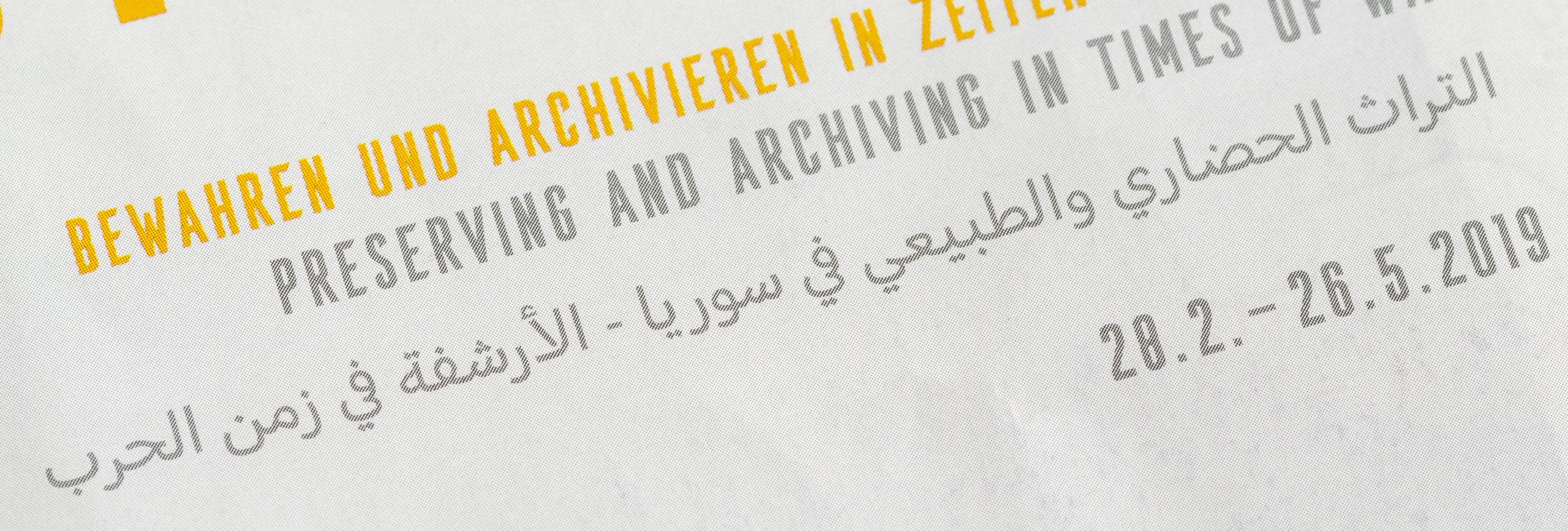
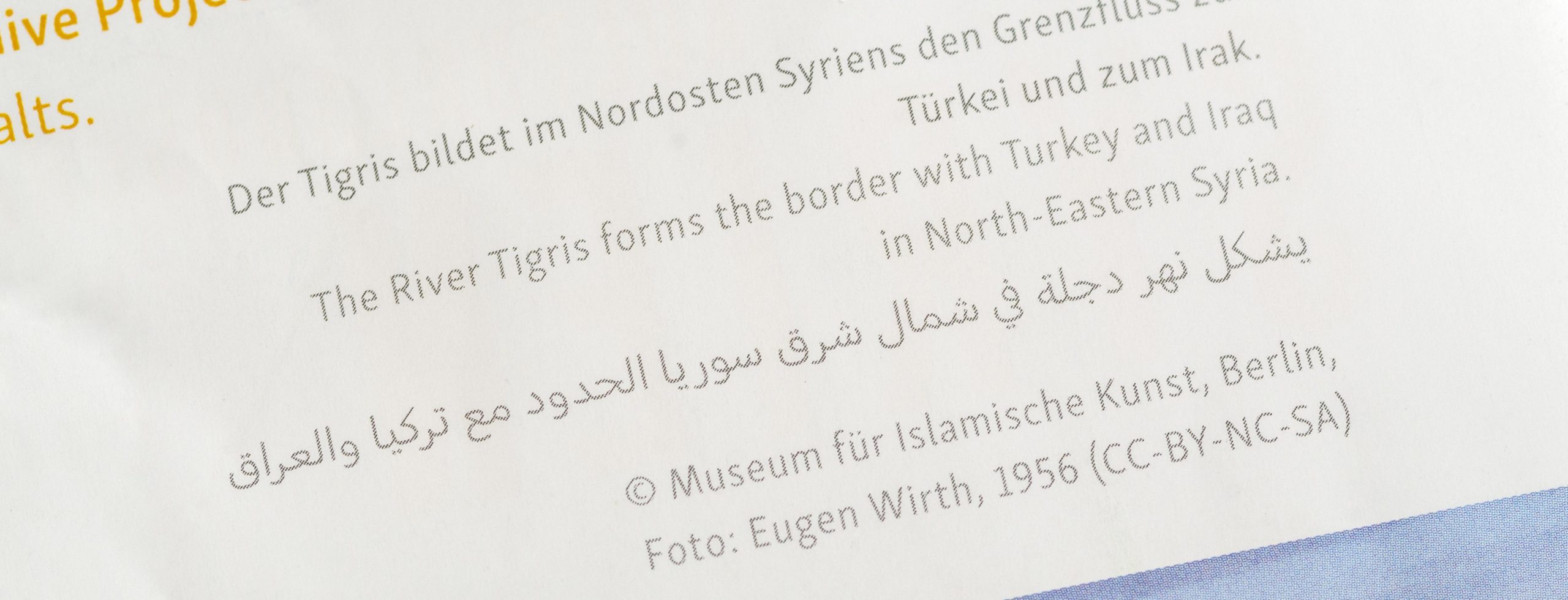
Skolar is one of the largest and most developed superfamilies that are found on the type market. For its sans serif version David Březina wanted to offer an Arabic companion to extend its language support even further. When I developed Skolar Sans Arabic, the design pushed the concept of an Arabic low-contrast design, as I described in a blog post for Rosetta in 2016.
Whereas the dominant strand of contemporary Arabic type design pursued more geometric and static approaches, Skolar Sans Arabic echoes the humanist sans genre, as established in the Latin type world. It has a gentle forward drive, retains some, albeit toned-down, traces of written forms, and avoids the overly modular appearance often found in low-contrast Arabic type.
Further to the stylistic challenge, a design like Skolar Sans opens conceptual questions that have not been solved conclusively for the Arabic script: How does a thin Arabic font look? How does the change of stroke thickness from the light to the bold weights influence the proportions? How do you treat diacritics and vowels in a low contrast design? How can you reflect the narrow proportions of the Latin design in the Arabic without unduly squeezing conventional letter shapes? This process of translation, across scripts, typographic function, styles, and weights – of which Skolar has a considerable range – is one of the principal challenges of such an interpretation. In Skolar Sans Arabic, some possible answers have been developed and serve now to complement this multilingual typeface family.


