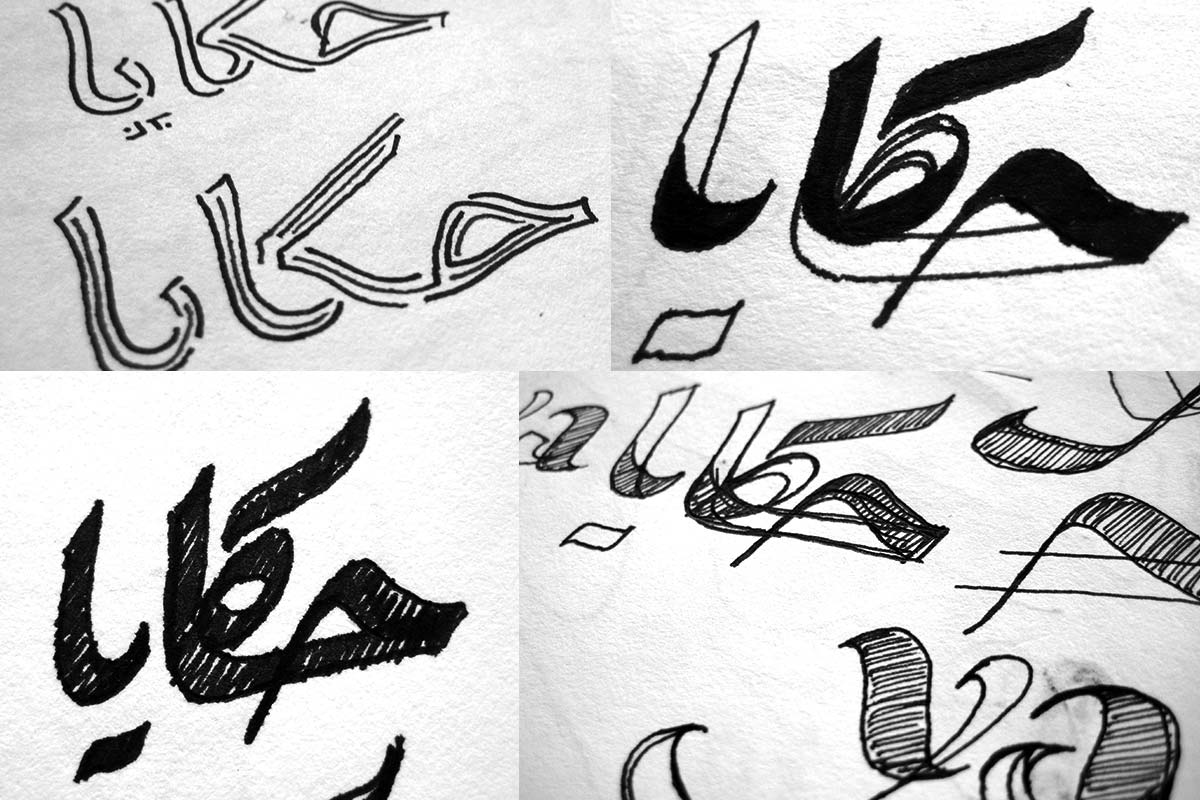
Hakaya
Logo
A logo for Arabic storytelling. ‘I am made of stories and not atoms.’
In early 2010 the Arab Education Forum launched a logo design competition for a project called Hakaya. Its description outlined that the project was to establish a platform ‘connecting organisations, groups, and individuals who believe in the centrality of “stories” in individual development and cultural growth.’ Its aim was to ‘celebrate “story-telling” in the theatre, the arts, promotion of literacy, formation of identity, and inter-cultural dialogue’, a rare and precious initiative in the often dire situations of Middle Eastern countries.
As the concept is summarised on the organisation’s website, ‘the story is the main constituent of life, the human being, culture and society; it is the main component of thought and communication. As for us Arabs, the story is one of our main tools for liberating the imagination, thought, perception and expression.’
It is a rare thing to find genuine cultural pan-Arab initiatives which are not commercial ventures, and it seemed like a beautiful project to support. Thus I set out to develop a logo which reflected the ideas and values Hakaya was to embody, something to echo an inspirational quote of a girl from Beirut: ‘I am made of stories and not atoms.’
For me the ideas Hakaya expressed in storytelling revolved around the transforming power of narratives, around a plurality of voices, various Arabic identities and, essentially, liberty. Here, the attempt was made to revive long-standing customs without catering to the dominant cultural forms, but give space to what amount to grassroots cultural expression.
How to bring this into a logo?
From the outset, it was clear that it had to value the letter, the essential element of the written word. The logo had to be a word-mark. But rather than aiming for a form close to the high-culture of Arabic calligraphy, here a more popular approach was called for. It should be the voice of a Hakawati, a storyteller in a coffee house, rather than the voice of a theologian. Thus, my choice fell on the Ruqah style, the common hand of the street in the Middle East.
I experimented with various ways to visualise plurality and a layering of voices, ending up with a logo in which the lettering was deconstructed into multiple, differently coloured elements, loosely following the strokes of the pen. The colour choices reflect the conceptual direction, with a greenish black that evokes notions of ink and Cardamom flavoured coffee, contrasted by warm, earthy terracotta, referencing the Mediterranean lands and the scent of dates. Building the logo from two complementary colours had the added benefit of reproducing nicely in two-colour printing, reducing costs for the organisation.
In addition to the logo I developed a simple and easy to implement set of stationary standards, some proposals for business cards and general identity guidelines.
Hakaya’s jury chose my proposal and swiftly implemented it in their communications, where it is still used.
