Amiens, Picardie.
A year has passed again and a new class of post-diplôme students leaves the ESAD Amiens. On Wednesday, February 8, they presented the results of their roughly 16 months of research and design work to the jury consisting of the invited Dr Fiona Ross, Thomas Huot-Marchand and the school’s regular teachers. The biggest class of this course yet — with a record-striking 5 students — it has also been a delightfully diverse bunch. Chorong Kim (김초롱), Đam Ca Phạm, Ling Fan (范凌), Sarah Kremer and Sonia Da Rocha not only share strikingly different backgrounds, but also undertook projects of very heterogeneous characters. Their projects are on show in the school’s gallery until the 24th of February.
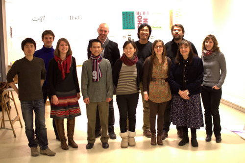
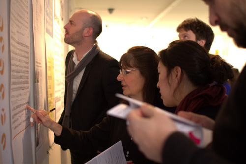
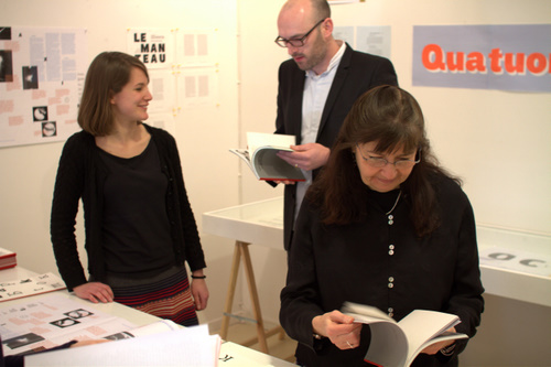
Photos kindly provided by Patrick Doan.
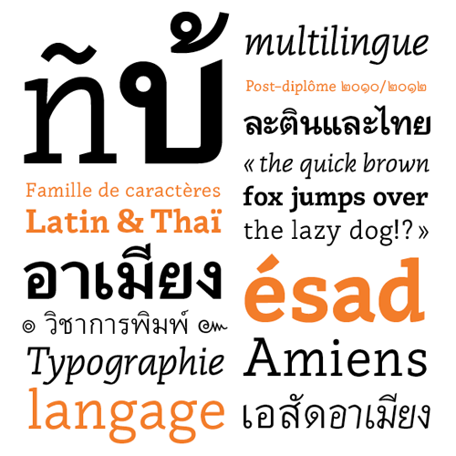
Chorong, 초롱, having already developed her interest in type during her studies in Besançon, embarked on a challenging project. Coming from Korea, multilingual publications were a known design-problem to her, and she decided to address it in her research. She singled out Thai — one of a number of scripts used in the country — as the centre of her interest for this project and went about developing a multi-script typeface family. With language studies, a trip to Bangkok and exchanges with experienced designers of Thai typefaces, Chorong went a long way to establish a solid foundation for a successful continuation of her interest.
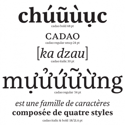
Đam Ca, a student of the ESAD for a number of years, also related his project to his home Vietnam. The particularities of the language and their representation with the Latin script were at the heart of his questions. Inspired by work conducted by Patrick Doan during his studies, he set out to develop a typeface family that would lend itself better to the specific visual patterns the monosyllabic Vietnamese language creates. To make things more difficult, he set himself the task to apply the requirements one would find in a dictionary to his design, taking inspiration from established models. His dedication and passion to the subject suggest that before long Vietnamese publishing may have a typeface family available tailored to its language requirements.
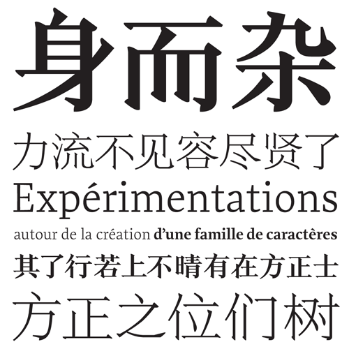
Ling, 凌, set himself something of a daunting task by exploring novel means of designing Chinese type. His experiments involved a deconstruction of characters into small, repetitive elements, in some way inspired by and reminiscent of DecoType‘s approach to the Arabic script. He investigated in great detail how notions of typographic grey, rhythm and patterns translate to Chinese, and developed a range of experimental study fonts based on components to facilitate rapid testing. As this subject was a bit of a supervisor’s nightmare as it exceeded the competences of all ESAD teachers, his exchanges with designers knowledgeable in Chinese were crucial. His continuation along these lines will be interesting to follow.
Sarah set out with a similarly applied approach, her interest in type coming from publication design. She questioned common notions of typographic families, and developed a pairing of different styles in contrastive, rather than harmonious positions. The versions of her typeface were born from different letter-making processes — calligraphy, stencil cutting, and modular design — and she aspired to retain some of the specific aesthetics derived from them. With the advancement of the year her interest in other scripts was — to little surprise — awoken, and she developed Cyrillic companions for her Roman and Italic versions. Whilst still under development, they will complement nicely this ingenious family.

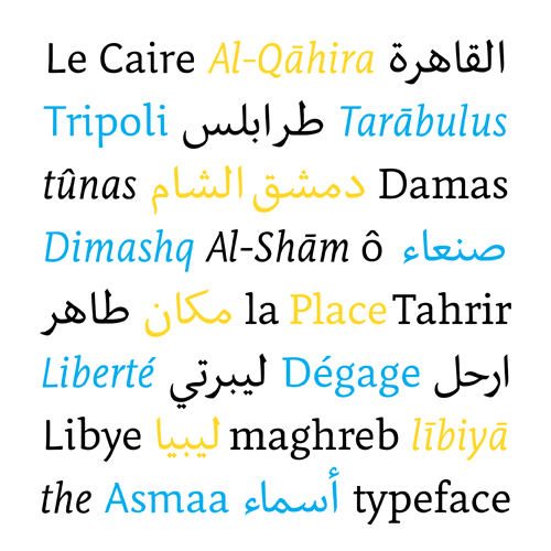
Sonia’s training in calligraphy led her to develop an interest in the Arabic script and its rich world of letter-shapes. Yet, the source of inspiration for her project was not so much calligraphy as an artistic expression, but rather the fascinating world of manuscript production in which Arabic script flourishes not so much for its own sake, but as an information carrier. Inspired by treatises on medicine and astronomy, she started her studies and learning of the script. For her project, she attempted to keep the informal nature of the hands found in such manuscripts and develop a multi-script typeface with a friendly character.
My perspective as their teacher is undoubtedly biased, but no matter what will come of these projects in the long run, I would argue they exhibit a number of qualities. Their diversity of approach and form is the first characteristic I value. Rather than following any prescribed path, quite distinct ways were taken by each individual. Another shared feature is the strong influence of research on the design process, and a continuous reevaluation of assumptions. Many ideas assumed from the outset changed or got relativised by testing and discussing them. Though, arguably, this is a feature of any education worth being called by that name, it is gratifying to see it actually happen in practice.
In what form these projects will continue remains to be seen, but I wouldn’t be surprised if we were to hear more about them in the years to come. For the path onwards, I wish them the best of luck!