Vientiane Lions
Logo
Design volunteering in Laos. A logo redesign and some exploration of the Lao script

During my stay in Laos in 2009, I had the opportunity to witness some of the great work done by the Lao Rugby Federation. The LRF is the governing body for all rugby activities in the Lao PDR, focusing on developing the sport through a school and community development programme, supporting domestic and elite teams, and providing financial and administrative support to the sport. Seeing the huge difference something as seemingly little as a game can do for the life of these kids was pure pleasure. Working for the redesign of the Vientiane Lions logo was therefore a particularly rewarding task.
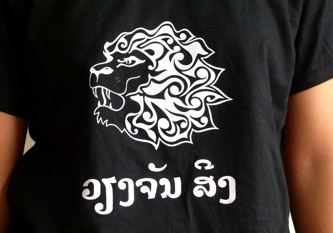
The old logo had a solid base with an interesting rendering of a Lion’s head, but the type and details of drawing and execution deserved some brushing-up.
Typography as a distinct domain is practically inexistent in Laos. Little surprise that a country that ranks 139rd (out of 179 in 2014) in the Human Development Index and that has an estimated 78 million unexploded US-bombies to dispose has other priorities. However, being a typographer, there is nothing wrong with making a minute contribution in my own domain.
I tried to approach the subject by looking at the sources. A rich lettering trade provided plenty of inspiration and writing exercises gave me first insights into the Lao script.
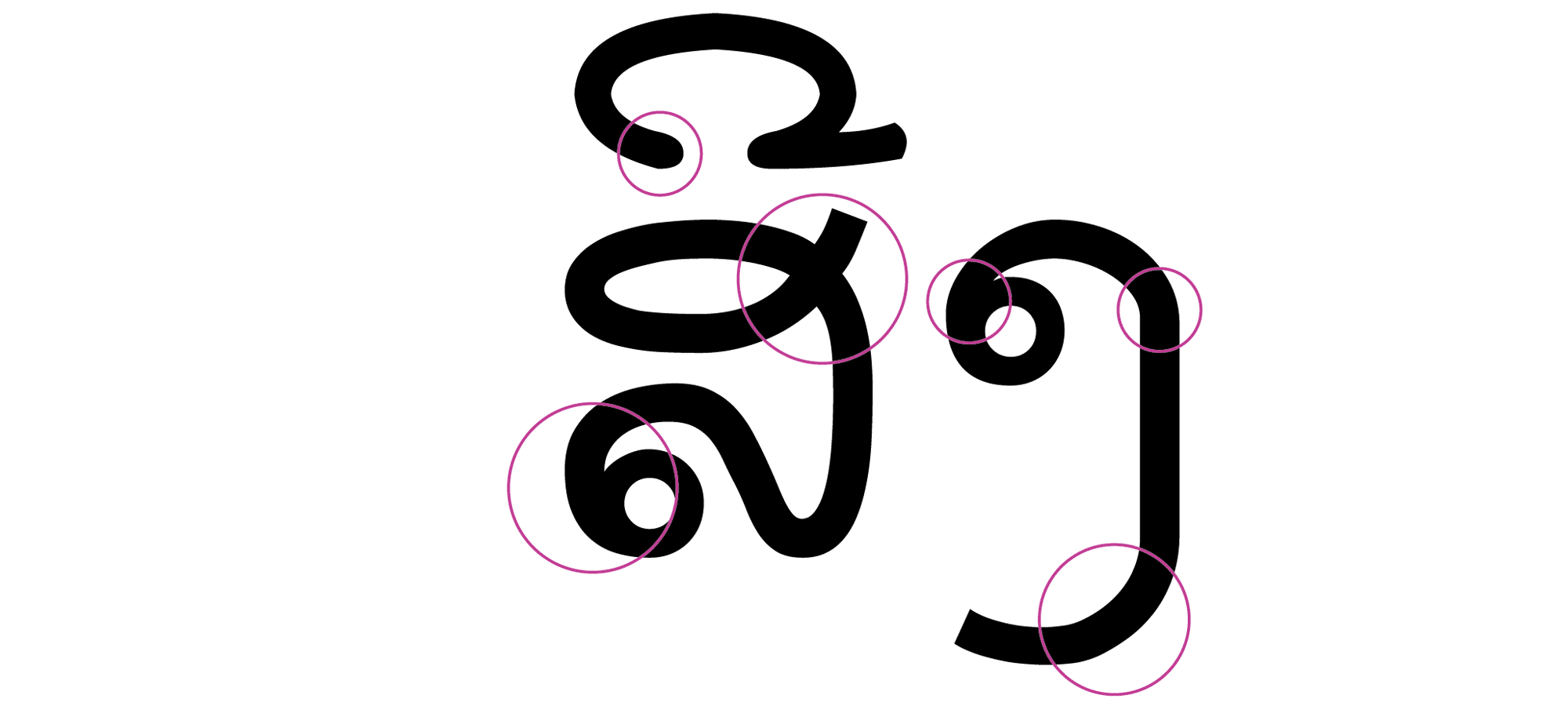
The ubiquitous Saysettha OT for the Lao script (sample below) is a free download with a very honourable and straightforward goal: making Lao script accessible for computing. Since this typeface is used in a wide range of applications, it is something like the generic typographic image of Lao script today, comparable to Arial in the Latin script world.
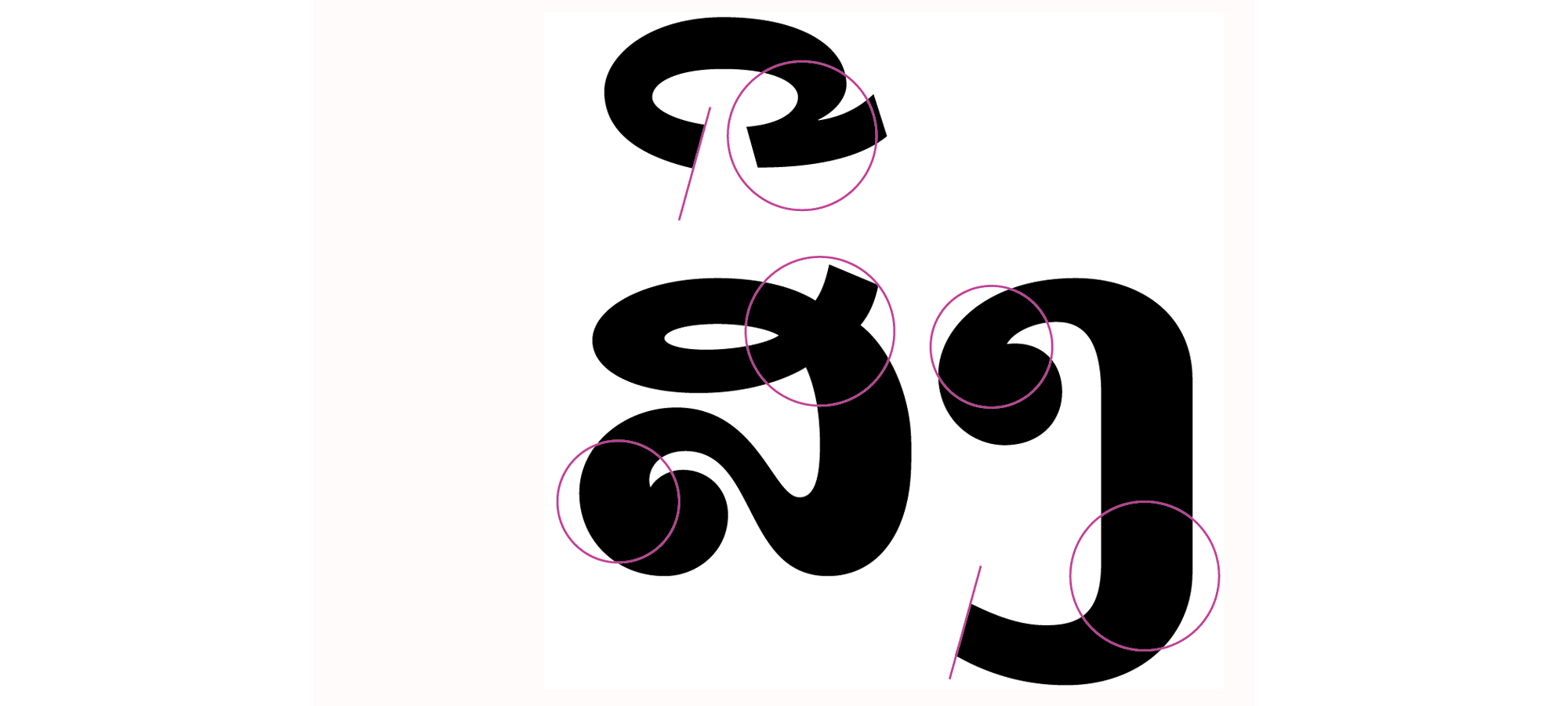
In the design of the Vientiane Lions logo, I tried to come up with a word-mark that adds a unique look while respecting conventional practice. In the analysis of Saysettha I noticed some details that had to be addressed. Especially black spots at stroke-overlaps, edgy conversions from straights into curves, inconsistent stroke treatment and faulty mark positioning were issues I tried to overcome. The final result highlights some of the elements that were addressed for a consistent, even and balanced look.
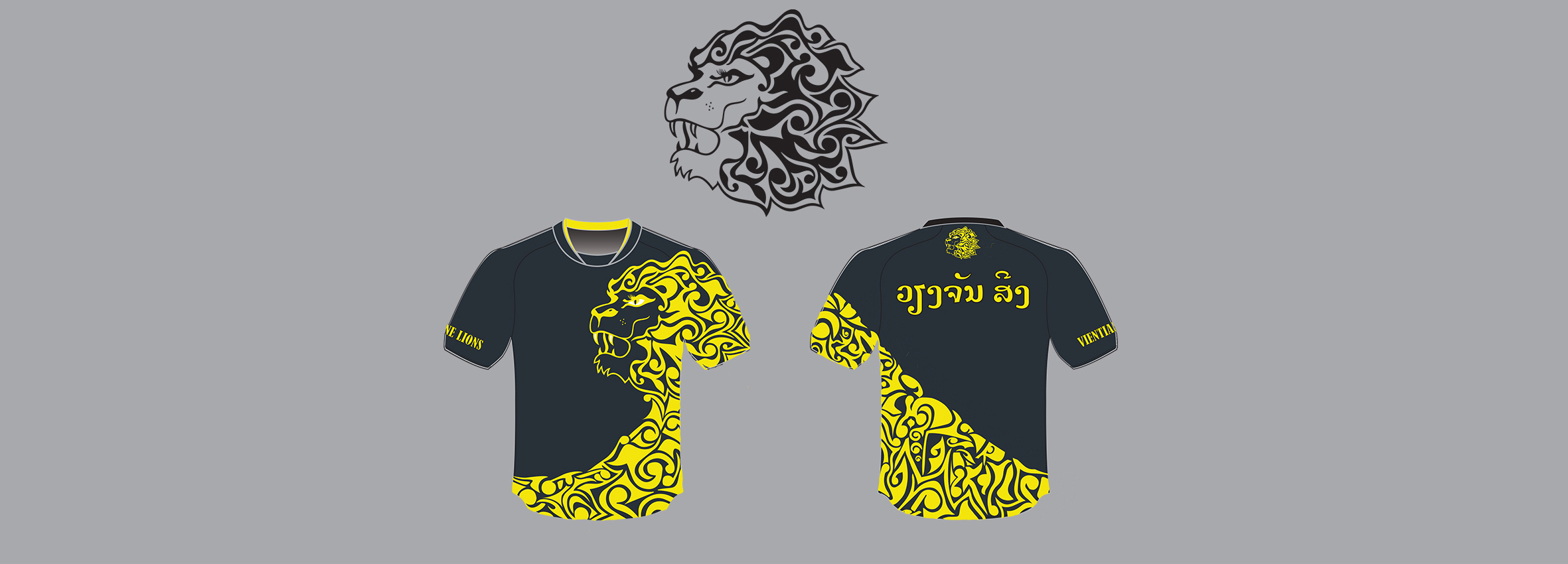
One application of the new logo is on merchandise, with the resulting t-shirts one additional means to obtain much needed funding for the continuation of Lao Rugby’s activities. The above practice jersey is manufactured by 6buttonsproductions.


