Aisha
Type
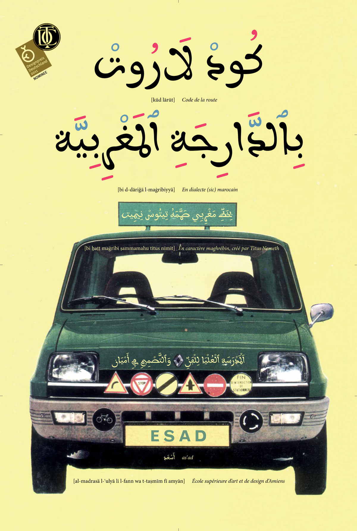
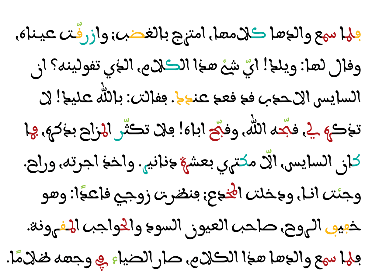
Aisha is a playful Maghrebi Arabic face with a matching Latin companion in a range of weights. From research into the Maghrebi style, Aisha turned into an original multi-script design.
- Certificate of Excellence in Type Design TDC² 2010.
- Selected for the Type Annual 2011 of UK design magazine Creative Review.
- Nominee for the Design Award of the Federal Republic of Germany 2011.
- Selected by Typefacts as one of the best fonts of 2011.
Aisha is a multi-script typeface for Arabic and Latin. While the Arabic design is a revival of a metal fount inspired by Maghrebi calligraphy, the Latin design is an original design, drawn to echo the feel and look of the Arabic. Aisha is exclusively distributed by Rosetta, which provides further information, licensing options and a pdf specimen.
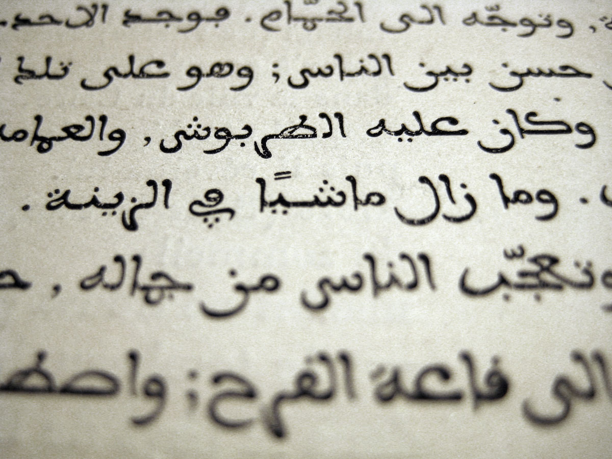
The origins of the Aisha typeface date back to the (European) academic year 2008–09, when I pursued research about the Maghrebi script and its typographic representation at the ESAD Amiens. It began with a visit of my friends at DecoType in Amsterdam in August 2008. While roaming their personal library Thomas Milo showed me a little book printed with Arabic foundry type. The type used was a curious fount I had not come across before. Its unusual and at times peculiar character attracted my attention. Upon my return to Paris, I started to investigate its history and quickly discovered that the punches for this face – the so-called Arabe maghrébin – were cut in the middle of the nineteenth century by Marcellin Legrand in Paris. Yet, apart from this, thorough information about its origins, its development and use were hard to come by and I had to pursue my own research about this typeface.
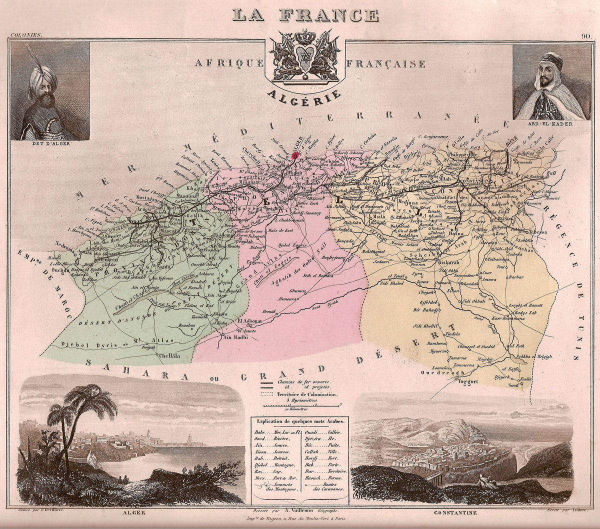
As any typeface, the Arabe maghrébin is a child of its time and has to be seen and assessed in light of its historic context. Cut, cast and used throughout the second half of the 19th century it reflects the geopolitical situation of the period in Europe and France. In June 1830 the French army invaded Algeria. The often bloody and merciless conquest was followed by an explicit colonisation policy. Large numbers of colonists followed on the heel of the soldiers and settled the land that was emptied of its inhabitants. By 1848 most of northern Algeria was controlled by the French and with the newly drafted constitution the former colony was declared an integral part of France. It was around that year that Marcellin Legrand cut the first size of his Arabe maghrébin. Given the context, this undertaking can hardly be a coincidence.
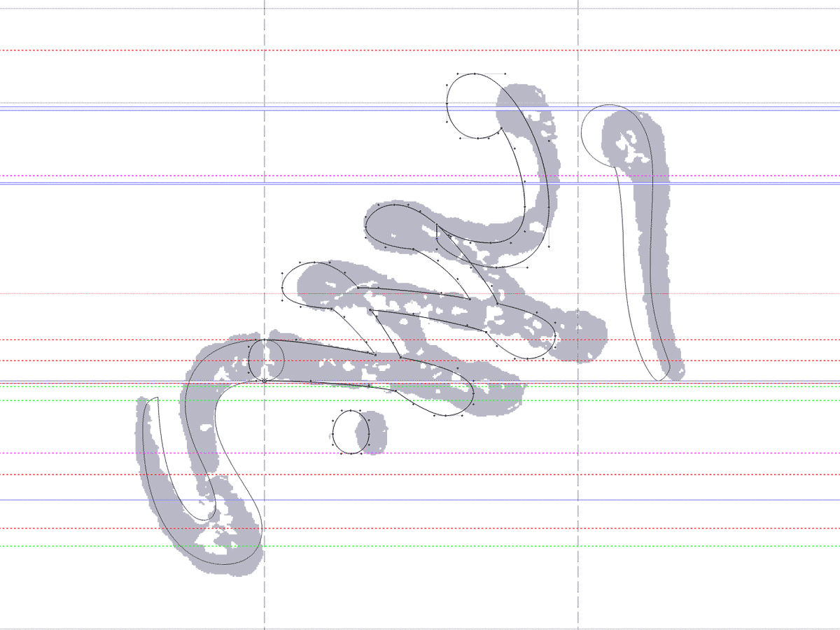
In my own interpretation, I used my sources as model, but diverged substantially from the original. My goal to develop a contemporary and relevant contribution to Arabic typography of today necessitated significant changes to design, the glyph set and, with the risk of mentioning the obvious – technological implementation. The below image illustrates in one single example the degree of difference between Legrand’s punches and my revival Aisha.
The Aisha OpenType font contains numerous ligatures, contextual alternates and stylistic variations, making it a faithful revival while taking advantage of contemporary technology to provide a useful typographic tool. The variations are accessible through a number of stylistic sets, giving the user freedom of choice in addition to the automated substitution. The Arabic glyphset covers language support (such as Berber) and regional shape variations of the Maghreb, giving justice to its origins and making it particularly suitable for applications in that area.
Starting out with the Arabic design, it soon occured to me that it would be inevitable and necessary for a contemporary typeface to expand the glyphset and the language support. Particularly in the Maghreb multilingual publications, use of Latin-style figures and language mixing are very common. It was hence reasonable to conceive a matching Latin companion to go with the Arabic script.
In the Latin design, developed after the Arabic, I mainly tried to echo and reference the feel of the Maghrebi. Having had worked on the Arabic shapes for some months, I was fully immersed in the formal vocabulary and could, without even looking at the Arabic design, develop a Latin companion of similar ‘feel’. My take on this design was entirely subjective and intuitive, rather than following any particular guidelines or rules to achieve a harmonious image between the two scripts.
In addition to the Arabic script languages, Aisha covers a standard European characterset and all standard Arabic transcription systems. Further features are six figure sets, superiors, inferiors, numerators, denominators, dynamic fraction composition and a set of ornaments.
The map shown here is in the public domain, taken from Wikipedia.
