In August 2012 I was contacted by Dafi Kühne, a colleague from Zürich. He needed a hand with some Arabic typesetting for a large poster project that was to feature at the 13th international Architecture exhibition at the Biennale di Venezia, 2012. Dafi is a poster designer and printer, and initially only needed help with allowed line-breaks in Arabic. His task was to print a substantial number of posters in many different languages. The design he had in mind he describes thus: “The concept was to make simple and plain typographic layouts, only using 4 latin typefaces plus some non-latin typefaces where needed.” The type was to be simple and functional; bold and straightforward.
Dafi had received the required Arabic sentence from the translator, set in Arial. It seemed to suggest itself as the default font. Assuming that Arial Arabic reflects the Latin counterpart, it would have been a reasonable match to the Latin. Here, however, I pointed out to him that the Arabic version of Arial did not have quite the same typographic voice. It didn’t match the feel of Akzidenz Grotesk, the principal Latin type choice; indeed, in more than one respect it is not on par with it: the design is a rather crude interpretation of Simplified Arabic making it dated, spacing is poor and its high contrast gives it a very different colour. (a full listing of its shortcomings would go beyond the scope of this article).

As coincidence had it, I was (and still am when my PhD research allows for it) in the process of developing a new Arabic typeface with characteristics that would resemble those of Akzidenz Grotesk more closely. A monolinear design of a certain sobriety with clear, straightforward and outspoken letter forms were characteristics I had had in mind in its conception. Thus, I offered to set Dafi’s sentence in the new typeface, which he then used for his poster. In a fascinating and laborious process, Dafi went about cutting all the type from MDF plates, to then glue them onto a board from which he printed his posters. The entire process is documented by means of the Thai version in this nice short film (it runs for 15 minutes and at 9:35 you even see some closeups of the Arabic).
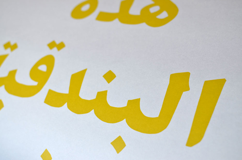
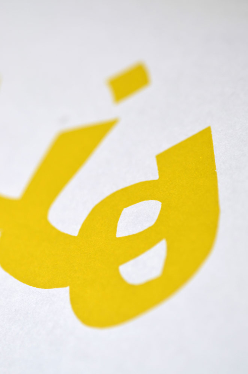
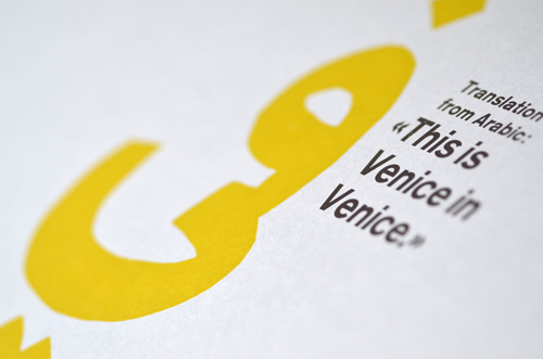
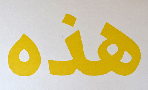
The Arabic typeface is still under construction, with its release anticipated for 2014. It is designed as a monolinear companion to Nassim and is intended as a contemporary general-use typeface in a range of weights. The following pictures, taken from Dafi’s poster, give an impression of the Extrabold weight.