‘Note on the new edition of Aisha’, first published on the blog of Rosetta in April 2014.
Innovation in type design can take a few different routes. It may follow formal experimentation, or result from the variation on existing themes. Often innovation is necessitated by external constraints, typically in the form of changing media, or the obsolescence of the tools of either type-making or composition. As I have traced in my recently completed PhD thesis, in Arabic type design historically the latter has been a dominant force. Innovation resulted from the circumstances in which Arabic type was created and from those of its use, frequently imposing constraints which prescribed design decisions. It follows that this kind of innovation, although novel, did not necessarily embody ideal solutions, but merely represented the best possible compromise within the existing (and often severe) limitations.
More recently innovation in Arabic type design is largely found on the other end of the spectrum, that is mainly in formal search for novelty. Here, the results have been mixed, reflecting the skill and taste of their creators (indeed, here one should not forget that in equal measure the appraisals of the designs echo the knowledge of the beholders). But as this kind of formal innovation is more about style than function, arguably, these plays on form steer clear from thorough critique; for who would dare to venture judgements of aesthetics in this post-post-modern age in which every view is considered equally relevant and expertise is lightly sidelined in favour of the number of ‘likes’ any one utterance might attract?
Yet, there is ample room and need for innovation of a different kind in Arabic type design. Innovation that starts at the other end, that starts with the usability and usefulness of design solutions. The number of unresolved issues of applied Arabic typography – that is the use of type rather than its design – is readily apparent for the practitioner (of which unfortunately there aren’t enough). From the open question of the sensibility of matching Arabic to Latin designs, to the more pressing lack of a concept for a canonised typeface family to express different text hierarchies, there is plenty of work to be done. Without a doubt, it will take time, and lasting innovation will be piecemeal, require iteration and validation in practice. So rather than a universal system which will solve all the questions, I would expect gradual, small improvements.
In line with this thinking it seemed like an opportune moment to do more than just fiddling with the technicalities ‘under the hood’ when I updated Aisha to conform with the increasingly picky type engines (many thanks to David Březina and Adobe’s Miguel Sousa for their help. Here, I wanted to put forward an idea I had been playing with for some time, but never found the occasion to implement.
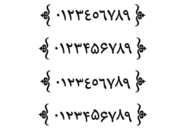
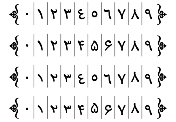
As is widely known, the numerals of the Latin script derive from the Arabic script numerals, which in turn originated in Indian mathematics. More than a thousand years ago they were adopted by Arabic scholars, and subsequently (with a few hundred years of delay) the system was introduced in Europe. Here, their shapes changed and adapted to those of the Latin script, giving birth to the so called Western-Arabic numerals which became the most widely used numerals in the world. As a consequence of their adaptation in Europe, they also underwent the countless transformations of type forms that emerged from the evolution of Western typography. Among them, the useful distinction between lining and ranging numerals arose.
However, Arabic script numerals, just like Arabic type in general, did not follow the same path. Undoubtedly as a result of the shorter and less-varied history of Arabic printing types, in the current typographical palette only lining numerals exist. This struck me as unfortunate, for Arabic has no capitals (and thus no real need for lining numerals at all), and its letterforms feature many more descending elements than the Latin script, making the ascending, uniformly aligned numerals stand out excessively. Where ranging numerals should be the default, there is not even the option of choosing them. This, I felt, was an area worthy of functional innovation.
I therefore set out to develop ranging numerals, a typographic tool that to my knowledge has never been offered for Arabic. Aisha is thus the first Arabic typeface which features an optional set of ranging numerals, designed to blend more neatly into a block of text. I tried a few different arrangements to best reflect the respective numeral shapes, and arrived at a setup which is inspired by its Latin script equivalent, yet not a direct copy. Clearly, their arrangement is a novel proposal, and it may be questioned, revised, and possibly improved on. In principle, however, I am confident that there is a genuine need and room for this new numeral set, and I hope that the proposed solution will be seen as a useful and usable innovation, contributing to better Arabic typography.
For this new edition of Aisha, I have also included something which could be called an historical innovation. In manuscript practice sequences of so-called ‘teeth’ characters were disambiguated by varying their respective heights. This avoids the unwieldy and illegible effect of such letter combinations, which in some typefaces attain the look of a garden fence. As Thomas Milo has been pointing out for a long time, these disambiguating patterns have nothing to do with beauty or ornament, but are more comparable to a reading aid. There is a commonsense explanation for this feature of Arabic script too: If the structure of the letters, rather than the diacritic configuration, instantaneously indicates their semantic value, reading should be easier. As is regularly pointed-out in the Latin script context, in type one should try to maximise the difference between distinct letters without compromising the consistency and integrity of the whole: a realisation that has long been addressed in Arabic manuscript practice. Unfortunately, though, this principle has only been implemented in a handful of Arabic typefaces. Surprisingly, many designs even homogenise the structure and proportion of most letters, a design choice which strikes me as ill-informed if one is to facilitate reading.
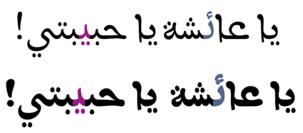
Homogeneity, however, has never been a characteristic of Aisha, and I am pleased to further build on it strengths by including this ingenious and time-tested innovation of Arabic manuscript practice.
Canberra, Australia, March 2014