Microsoft Segoe UI Arabic
Type
Microsoft Segoe UI Arabic extensions. Addition of weights based on TIRO design
A few months after I had helped John Hudson of TIRO with the Aldhabi typeface, another collaboration arose. TIRO had been commissioned by Microsoft typography to design extensions to its Segoe UI typeface, used throughout the new Metro UI of Windows 8 and other products.
John had already designed the Arabic regular and bold weights, and asked me to extend these by three further weights: Semibold, Semilight and Light. As the fonts were to be used primarily in graphical user interfaces and on-screen reading, the rendering on different devices was a major concern of this project. John had worked over a grid which reflected the primary resolutions at which the typeface was going to be used.
Similarly, the various weights had to be designed so as to appear sufficiently different in blackness at the intended sizes and resolutions. With these primary criteria, I designed the additional weights following John’s model.
In a subsequent step, the kerning also had to follow the pixel steps that we could expect in various use-scenarios, strongly limiting this aspect of the design which commonly can be adjusted much more finely.
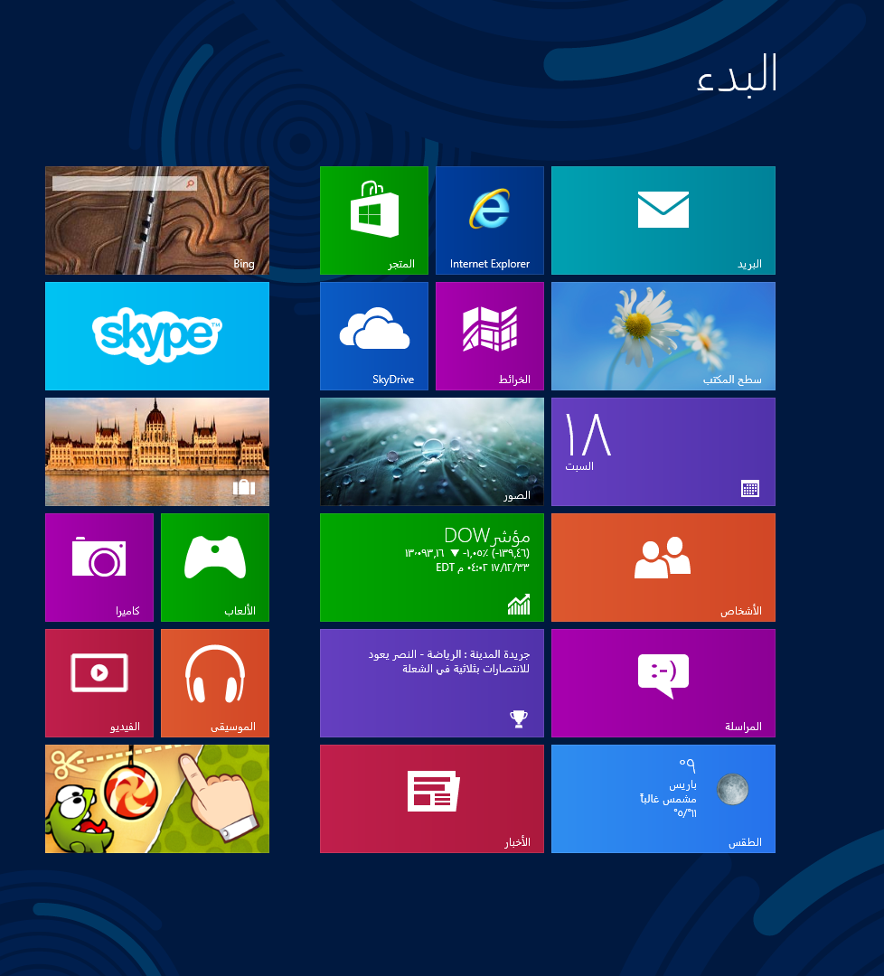
In the last image, courtesy of Ahmad Mohamed Ibrahim, one can see the nice use of the light weight in the Metro UI tiles of the Arabic version of Windows 8.